
grables and taphs
graph + table = grable?
It seems to roll off the tongue better than taphs.
The question is this: can you combine the visual power of a graph with the detail of a table? I think the answer is yes. Let's look at an example.
As I prepare for an upcoming webinar with the European Foundation Centre (EFC), I've been scouring the websites of European philanthropic organizations to understand how they are visualizing data currently. One item I came across was the following table, which is from the City Bridge Trust:
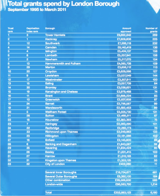
I know the text is small and hard to read. But then, that's part of the point - that you have to read it. That's one drawback of tables - because you have to read them to start to tease out information, you don't get the immediate ah ha! moment that can be so powerful with graphs. But it's sometimes hard to show as much detail in graphs as you can get cleanly with a table. For example, the table above would be a mess of uninterpretable data if you tried to put it all into a single graph.
I'll go back to my original question: what if we can pair the immediate visual information you get with a graph with the detail of the table? Introducing the grable:

I think I like it... You get some immediate information in the shape of the bars. There's more info there to read to get all the detail. Perhaps this visual is giving us the best of both worlds? Or perhaps it's utterly confusing (what are bars doing in my table???)? What do you think? Can you imagine yourself using a grable? Be brutally honest. Leave me a comment with your thoughts.
If you're interested in how I made this happen from a tactical standpoint, you can check out my Excel file here.