visualizing survey data
Having recently wrapped up our annual employee survey, we are in heavy survey-analyzing mode in my day job at the moment. This may sound strange, but I enjoy this immensely. I love working with masses of numbers and comments that can seem at the onset overwhelming and cumbersome and teasing a story out of it, with clear insights and areas to act upon and impact.
Since survey data is abundant in many organizations and good ways to show it are not always clear, I thought it might be useful to share a couple of genericized examples of how I've been visualizing some of this data.
The following examples are based on survey data collected on a likert scale that are grouped into three categories (in decreasing order of agreement): favorable, neutral, and unfavorable. Note that these are two different examples - they are not based on the same source data.
Example 1: summarizing responses
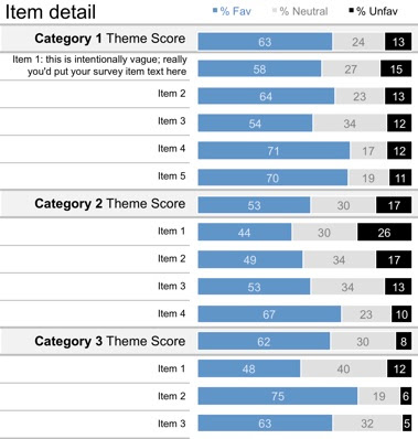
The following visual shows the breakdown of survey responses by % favorable, % neutral, and % unfavorable. In this example, related survey items are grouped into categories. The theme score represents the average across the various items in a given category. The story I ended up wanting to tell here was focused on % unfavorable, so I've organized the items within each category in order of descending % unfavorable.
Example 2: comparing to peer groups
The following visual shows the theme % favorable for the group of interest (blue markers) against the range of % favorable scores across the same categories for a peer group (grey bars). As in the last example, the theme scores are averages across a group of related items, but this same approach could be used to show specific survey items as well.

The visuals alone don't get you the whole way there. The context that you can bring as you analyze the data and pull in related information is where the story gets created. Data in a vacuum is difficult to interpret: it's the context that will help bring it to life and help your audience make sense of it. Some things to consider along these lines:
- Do subgroups within the data you're summarizing feel the same? Are there any interesting outliers worth mentioning?
- Are there any useful comparisons to other groups that could aid in the interpretation of the results?
- Is there qualitative data (for example, open text comments) that can be pulled in to help bring the data to life?
- Have any specific actions been taken that are impacting the results? If so, describe them and the impact they have on what the data shows.
For example, here's a (highly genericized) version of the final "story" I formed around the peer group comparison visual above:

I tried to connect the story to the data visualization via the colored number markers, but am on the fence on whether I like this approach. There's no question that this leads to a pretty packed visual. Maybe too packed?
In case you're interested in taking a closer look, here is the excel file (examples 1 and 2) and here is the power point file (story). Let me know what you think!