input please: competing visualizations
As part of my day job, I consult internally on data visualization. I was recently working on some mock visualizations for a project being undertaken by my team. Since I can't talk about the details here, I've created another scenario to use to explain some generalized versions of the visuals and show the iteration process that I went through to get to what I thought was clearly the best visual.
Challenge: of the four versions of the visual I put together, the project manager favors the one I like the least.
So I thought I'd try to leverage the wisdom of the crowd (you, in this case) and see where that takes us. I won't bias you by telling you which visual the PM favors and which I do (though if you've been reading for a while or have attended one of my workshops, it will likely be clear). Rather, I'll simply describe a scenario and then show you the made up data and the four mock ups that I put together. Then I'll let you be the judge.
What I'd like to know from you is: which is your favorite and why?
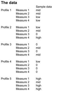
Here's the scenario*: you are going to administer a personality test and your challenge is to visualize the results to give back to the individual in a way that is straightforward to understand. There are five different personality profiles, each of which has four measures that are expressed on a scale with possible values 0, low, medium, or high.
*Note that this scenario is totally made up (to protect some confidential stuff), but should provide you the sort of context you'll need to evaluate the effectiveness of the visuals.
Here is the made up data that I used for my mock ups:
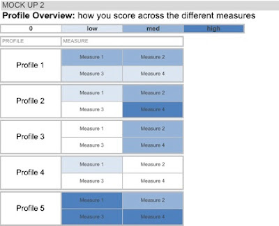
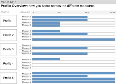
Here are the four mock up visuals I put together based on the above data:


Which do you like best? Why? Leave a comment with your thoughts!