to stack or not to stack
My husband came across the graphical focus of this post in his Google+ stream last week. The original source is a Wall Street Journal blog post summarizing a recent Forrester report, where the main story can be summed up by one of the Forrester quotes within the post, "The future is one where no single OS or vendor is dominant - Microsoft is extremely late to the market expansion into mobile and has lost its dominant position."
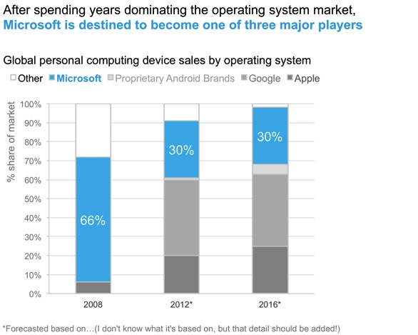
Here is the graph included to illustrate this point:

It's true that you can get the evidence to support the claim made from this graph: once you identify the light blue portion of the bar as Microsoft, we see clearly that it decreases over time as the orange portion (Google) and the yellow portion (Apple) become increasingly prominent. But I'm of course not satisfied with it. The color palette is strange. Color in general could be used more strategically here. We can eliminate the work of going back and forth between the legend and the data it describes. I'm also not sure how I feel about the stacked bar chart.
Let's look at a couple variations on this data viz. First, here's what it could look like if we preserve the stacked bar and use color a little differently (note: I didn't have the raw data, so the remakes below are based on me eyeballing the figures and likely aren't entirely accurate):
Other minor changes I made above:
Added an action title so it's clear what to look for in the graph (this was included as tiny text below the graph in the original post).
Oriented the graph title and legend text at upper left - so reader encounters how to read the data before they get to it.
Added a title to the y-axis.Always include this!
Added data labels to the Microsoft series. This acts to both draw more attention to Microsoft, as well as to give a quick numerical view of the decrease over time.
Narrowed the bars. In the original, they are bordering on too thick so that our eye starts to try to compare the area rather than the height.
When it came to color, I took a look at Microsoft's logo. I nearly always use blue to highlight the areas to which I want to draw attention. In this case, I actually tried venturing out using the red color from the logo and then the green color from the logo. But both just looked a little off (the burnt red looked overly negative to me, the green a little pukey). So I went with the blue from the logo (matching by eye - it's not perfect but close). I chose a grey palette for the remaining series.
I still don't love this, for a couple of reasons.
First, I think I just don't like stacked bar charts. This is actually probably a good use case for this graph type, since this lets us emphasize the percent of total and how that's changing over time. But I still don't love it. Because the bars aren't oriented on a consistent baseline, our eyes are forced to compare differing heights starting from different points. That's fine to get a general view, which is probably all we need here. Perhaps I'm just being overly finicky.
Second, it's still a bit of work to go back and forth between the legend and the data. If you don't recognize that the legend (left to right) is in the same order as the right-hand bar (top to bottom), it could prove difficult to see quickly which series is which.
I thought I would like a line graph of this data better - it would allow me to organize the series on a consistent baseline as well as label each directly. But then I graphed it and reconsidered:

Personally, my issues with this line graph version are greater than my issues with the stacked bar. We lose clear visibility/confidence that the lines sum to the total market, 100%. I also worry that in this case, the lines make it at first glance appear that we have more data than we do. Perhaps three points per series is too few for a line graph? If not in general, than I think that is at least true in this case. The overlapping nature of the lines creates a sort of spaghetti graph (as if I had a handful of uncooked spaghetti noodles and threw them on the ground). I tried to make this better by emphasizing the main three series (Google, Microsoft, and Apple) and de-emphasizing the others. But it still isn't great.
Given this, I'm back to the stacked bar chart. I think the information comes across most quickly with that structure.
What do you think - is a stacked bar the best choice here? Or are there additional options worth considering?
In case you're interested, here is the Excel file with the makeovers.