
think brilliant infographic
Infographics are increasingly prevalent in the media and elsewhere. At a high level, the goal of the information-graphic is to show information across various dimensions of a single topic or related topics in a way that is easier to digest than words alone would be.
The combination of art and data often yields an attention-grabbing visual. While almost always visually appealing, one point of struggle is that they are not always as easy to read as one might hope. Sexiness in many cases is valued over clarity of information.
A recent post on thinkbrilliant.com uses the infographic itself to highlight some of these issues:
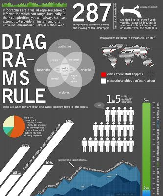
The descriptions get increasingly amusing as you move down the page. My favorite snippet is the text that accompanies the pie chart: this is the same graph only in pie shape form. this was done to overemphasize a very simple point but now you think it's really important.
When it comes to the visualizations shown on this satire - two words of advice: avoid them!