
the story you want to tell...and the one your data shows
I was working on a makeover for a recent workshop when it became apparent that the story being told wasn't quite right, or at least wasn't exactly the story I would tell after looking at the data in a couple of different ways. In the following post, I'll walk you through an anonymized version of the makeovers and my corresponding thought process.
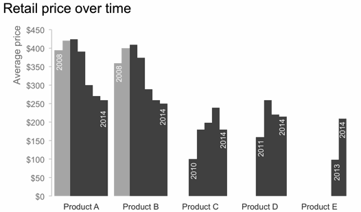
The original visual looked something like the following. It was accompanied by the headline, "Price has declined for all products on the market since the launch of Product C in 2010."

Based on the headline, what we're most interested in looking at here is the trend of cost over time for each product. The variance in colors across the bars distract from this and make the exercise more difficult than need be. Bear with me here, as we're going to go through probably more iterations of looking at this data than you might typically, but I think the progression is interesting.
For a first look, let's remove the visual obstacle of the variance in color and see what the resulting graph looks like (at the same time taking other steps to make sure things are appropriately labeled and de-clutter by removing unnecessary gridlines, tick marks, etc.):

Going back to the original headline, we're primarily interested in what has happened since Product C was launched in 2010, so let's emphasize the relevant pieces, forcing our attention there, and see what that reveals:
Upon studying this for a moment, we see clear declines in the average retail price for Product A and Product B in the time period of interest, but this doesn't appear to hold true for the products that were launched later. Plus, you've probably been thinking as you've scrolled through these bar chart iterations that we are looking at time, so perhaps a line graph would make more sense. Let's see what that looks like in the same layout as above:

If it wasn't already apparent, it probably now is with the above that it likely makes sense to graph all of the lines against the same x-axis so that we can more easily compare them to each other. This also reduces the clutter and redundancy of all of those year labels. The resulting graph might look like this:

With this view, we can much more easily see and comment on what's happening over time. Again, going back to that initial headline, I might modify it to say something like, "After the launch of Product C in 2010, the average retail price of existing products declined."

But this view also allows us to see something perhaps more interesting and noteworthy: "With the launch of a new product in this space, it is typical to see an initial average retail price increase, followed by a decline."

And perhaps we'd also want to note, "As of 2014, retail prices have converged across products, with an average retail price of $223, ranging from a low of $180 (Product C) to a high of $260 (Product A)."

Note how, with each different view of the data, you were able to more or less clearly see certain things. You can use the strategy above to highlight and tell different pieces of a nuanced story. Just make sure that the story you are telling is the same one that your data shows!
If you're interested, you can download the Excel file with the above visuals here.