teaching data storytelling
At SWD, our mission—to inspire positive change through the stories we tell with data—is one we share with professional educators, the schools and universities where they teach, and students at all stages of their academic journey. If you're an educator who is teaching from or would like to teach from our resources, please let us know so we can keep you informed!
While our shared interests have inspired a number of collaborations over the years (our team happily guest lectures when our schedules allow), our books have primarily been the mechanism through which we’ve reached the most students. More than 400 universities worldwide (and counting) use our resources as part of their curricula, with both instructors and students expressing their appreciation for the books’ straightforward content, practical application to real-world examples, and affordable price.

A sampling of universities teaching from the storytelling with data books
We are committed to helping educators teach their students how to drive positive change with data. If you’re assessing how you can incorporate the storytelling with data books as textbooks into your course, evaluation copies can be requested here. If you’re already using them, we have some accompanying resources to support you in teaching.
Real-world datasets
Exercises and case studies
Connections with instructors, students, and professionals
Short-form videos
Personalized support from the SWD team
You can find more details about these resources below. Are there other resources that you would find helpful? Complete this form to share your feedback and connect with the SWD team. We always enjoy hearing how instructors use the storytelling with data lessons. We’re eager to do what we can to help enable you and your students.
Real-world datasets
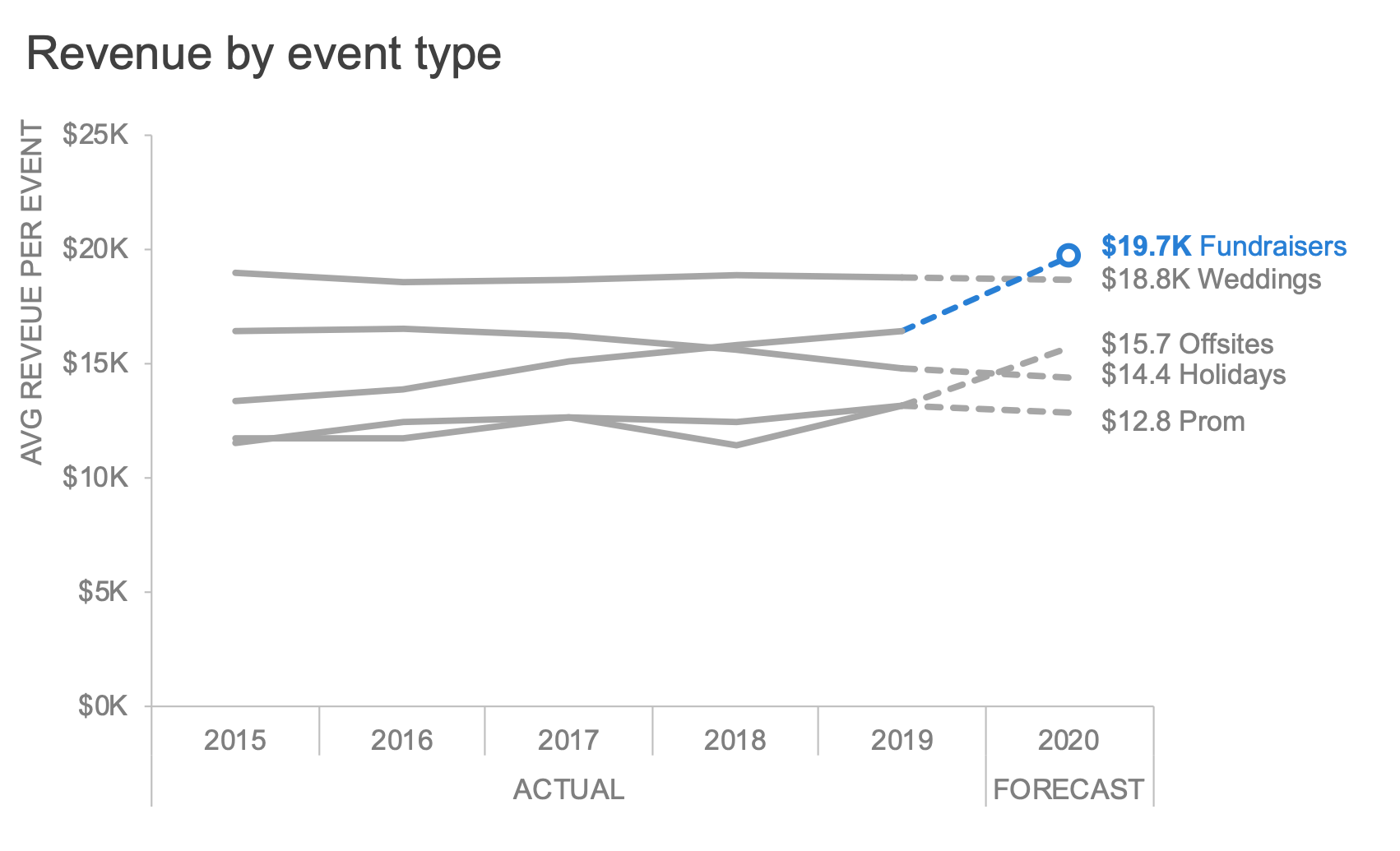
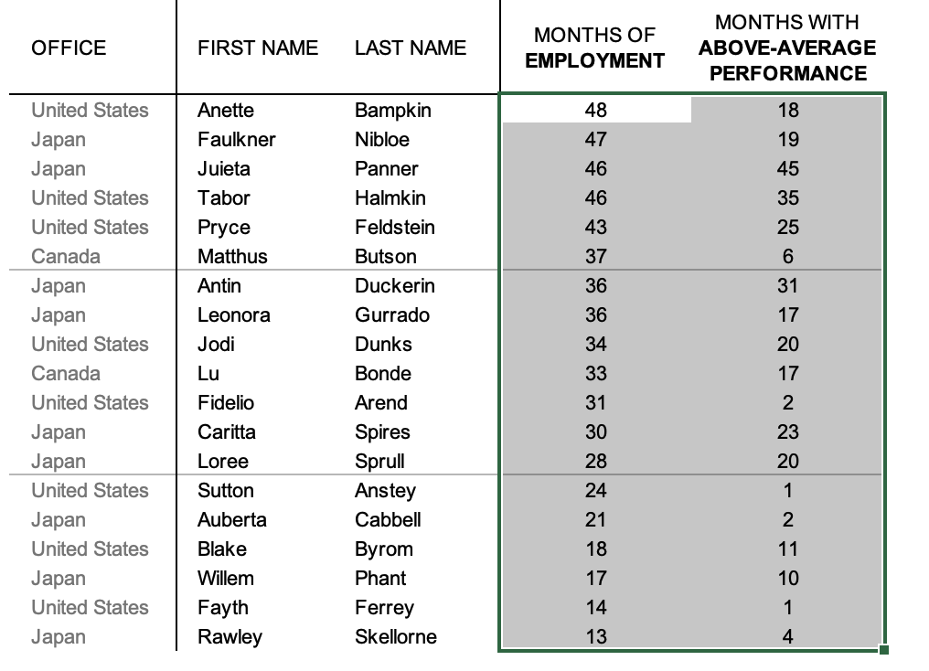
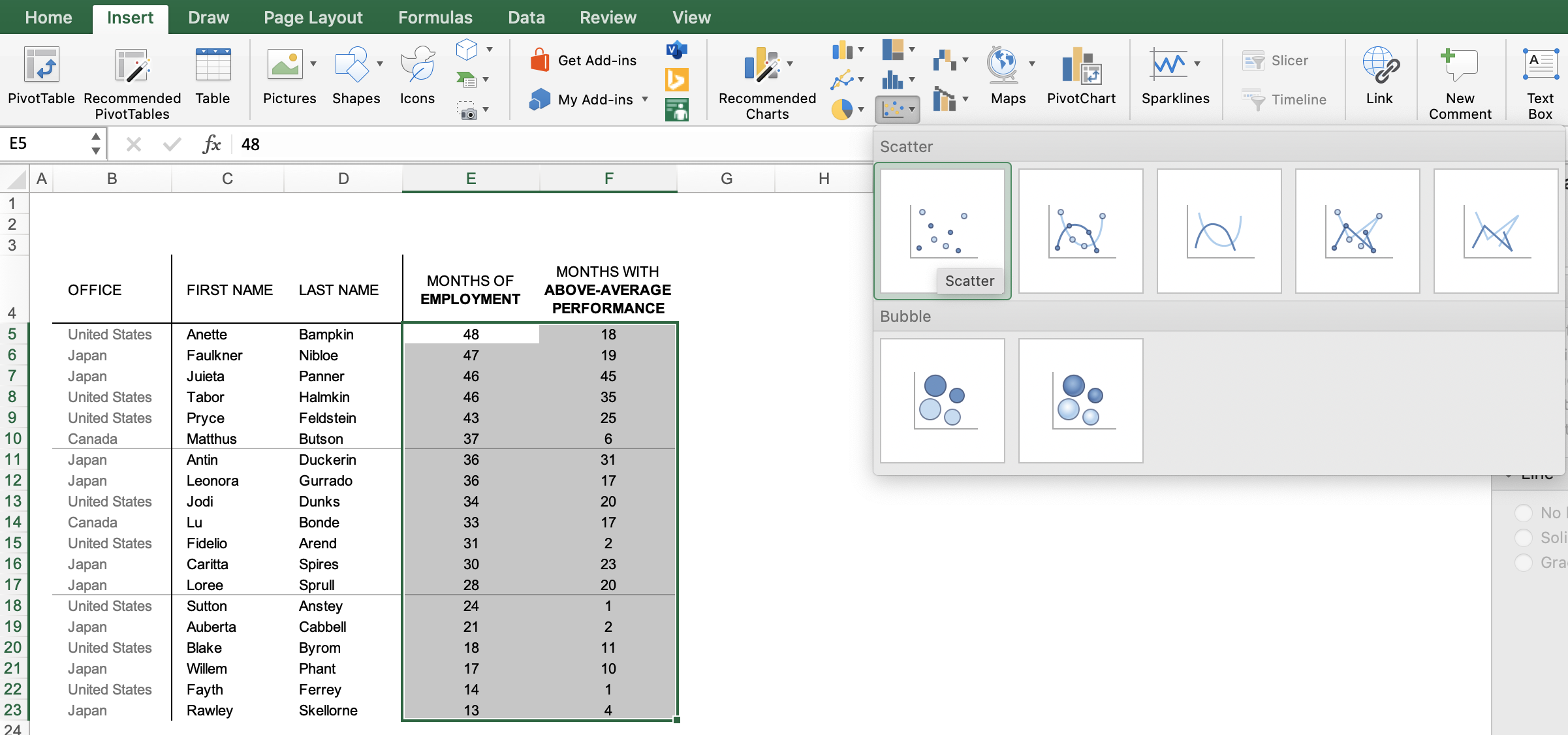
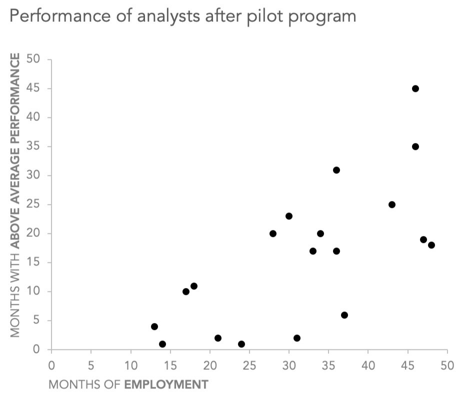
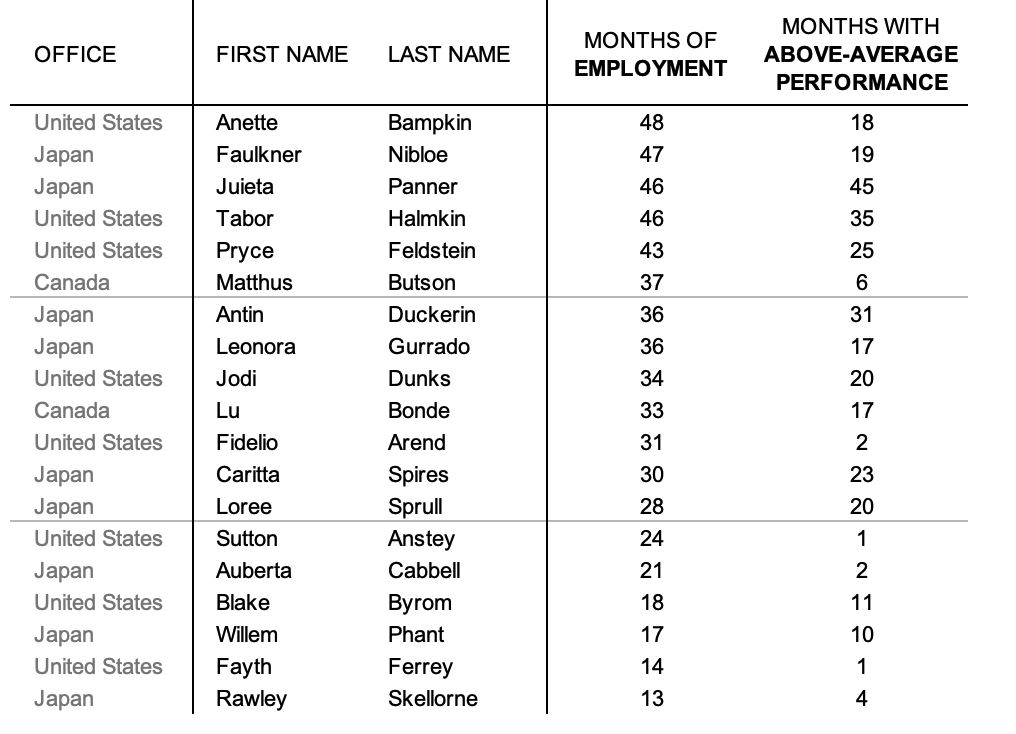
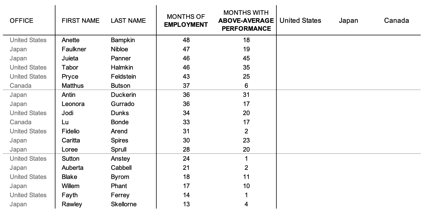
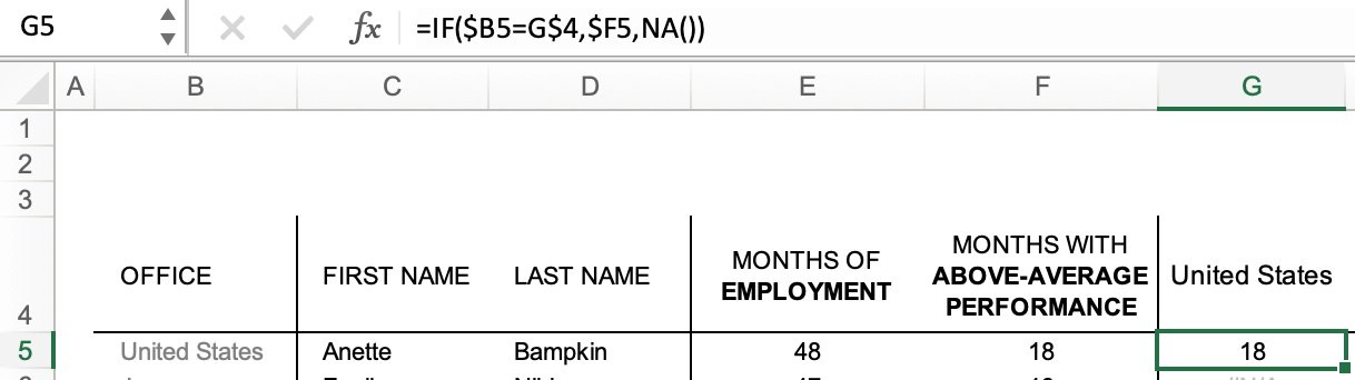
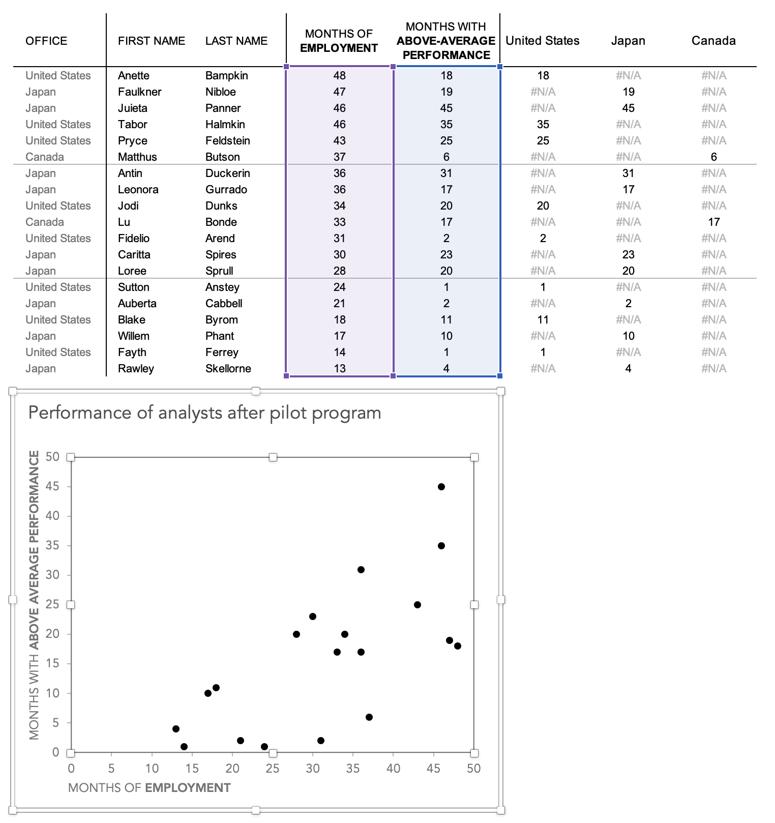
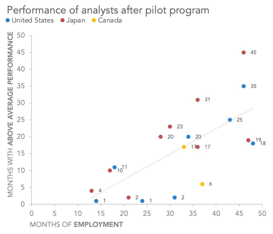
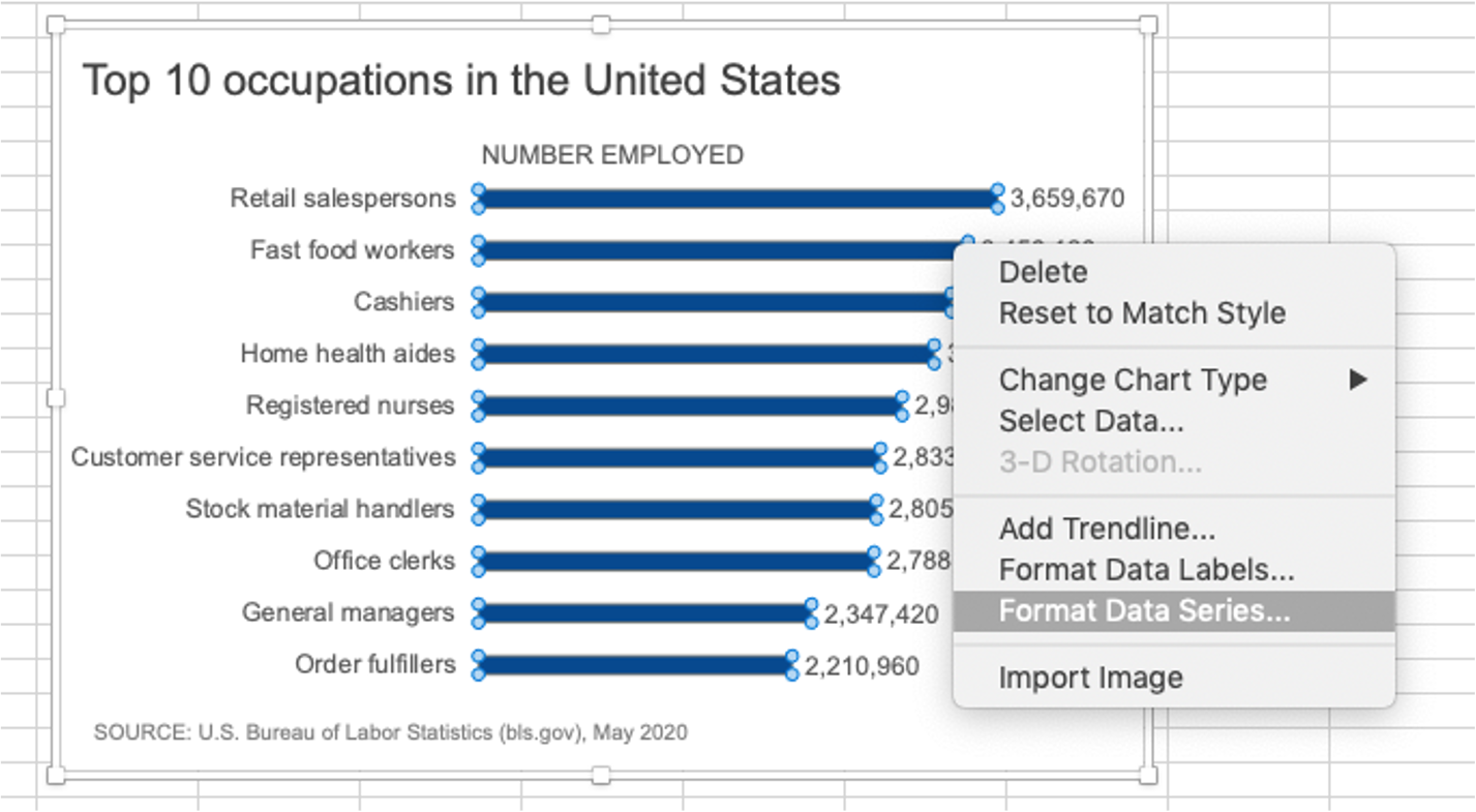
You are welcome to download the examples from the books containing data, graphs, and solutions and use them to teach (with proper attribution) from our books page. Most solutions are Excel-based, with select exercises demonstrated in other tools including Tableau, PowerBI, Python, R, Datawrapper, Flourish, Google Data Studio and more. All of the examples are anonymized from real organizations, giving your students insight into what they’ll encounter in the workplace.

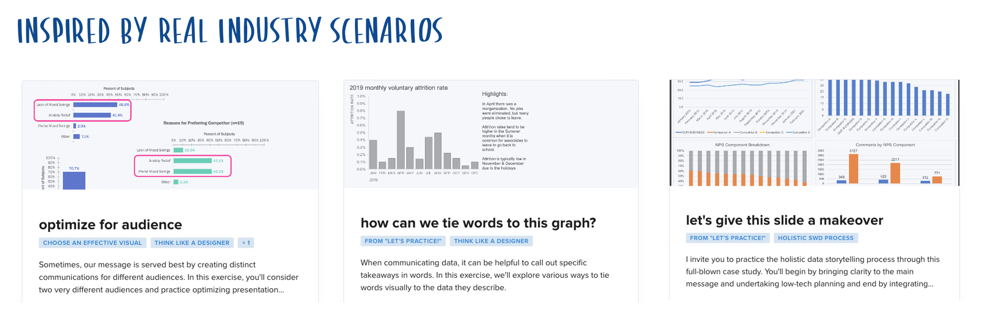
Exercises and case studies
Many instructors create assignments using the exercise bank in the online SWD community. It’s free to sign up for this low-risk, supportive environment where the data, scenario and steps are provided with solutions. Each of these practice exercises focuses on a specific data storytelling skill that will have practical application in students’ careers, and is based on a real, de-identified industry scenario.
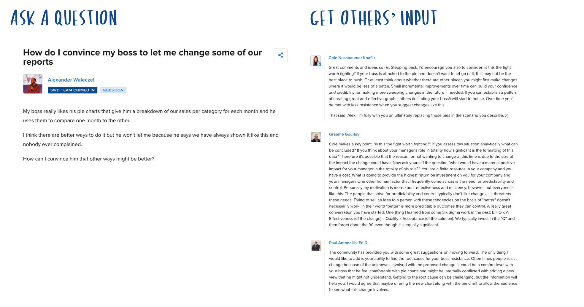
Connections with instructors, students, and professionals
In the SWD community, you can engage in conversations with other educators to ask questions or share experiences, ask your students to weigh in on a topic of discussion, or hear from working professionals on practical applications of communication techniques.
Short-form videos
If you like sharing video examples of effective data storytelling, quick tips, tool tutorials and in-depth case studies as presented by Cole and the SWD team, subscribe to the SWD YouTube channel.

Personalized support from the SWD team
Need to brainstorm ideas for developing your course? Subscribe to premium for direct access to Cole and the SWD team through weekly office hours, our full video library and in regular virtual events where you can experience first-hand how the SWD team teaches lessons in a live, interactive setting. Subscribing to premium also gets you additional perks like exclusive content, early access to special events, discounts and more.

The newest book—storytelling with YOU
If you'd like to take your students beyond data, Cole’s latest book, storytelling with YOU, explains how to plan, create and deliver a stellar presentation that makes the audience want to listen and act. You can get sample content from the book now, in advance of its release in September 2022.
Thank you very much for your support. Here’s to driving positive change by instilling this important skill set in your students!