storytelling with data...scribed!

I was in Dallas earlier this week and had the opportunity to talk about storytelling with data with a few different groups. One of those was the DFW Data Visualization and Infographics Meetup. This afforded me the pleasure of meeting Randy Krum, president and founder of InfoNewt, and John Colaruotolo from Collective Next, who (as far as I'm concerned) is able to create magic with pens and a whiteboard.

Read More

annotated line graph from Uber

With the email that hit my inbox earlier this afternoon, Uber has impressed me twice in the past week. The first time was in response to a simple comment that accompanied my '3' numerical rating (the lowest I've ever given): "With the world series game today, should have avoided stadium area." I had an email in my inbox from Uber's customer service within the hour agreeing that was a silly route given the Giants' game and reducing the price to what it would have been without the crazy traffic. Amazing.

And now they've done it again, this time via effective data viz. The annotated line graph below shows expected Uber demand over the course of the evening and into the wee hours of morning. This is one of those rare cases where they can get away without showing the y-axis values at all, since the relative peaks and valleys are more interesting (and meaningful) than the absolute numbers.

Nice job Uber. Though I must say this makes me happy to report that kiddie Halloween in my neighborhood is on foot, so no need to even think about surge-pricing here!

Speaking of which, I find it impossible to publish a post on Halloween without couple pics of my superhero family.

Happy Halloween!

things change when you have children

I just watched a video of a short chat between Nancy Duarte and Garr Reynolds about creativity and story. In it, Garr talks briefly about how having children has influenced his view and approach: "Things change when you have children."

Yes, they do.

And will continue to for me, as my husband and I are excitedly expecting baby #2 this summer!

(When you've got one who is this cute, how can you help but do it again?!?)

how long it takes to get pregnant

I love when data viz and life intersect. This happened for me recently, when I came across the following visualization - it's from a post a couple of months ago on flowing data.

How Long it Takes to Get Pregnant
Slightly modified from this post

The graph shows the odds of getting pregnant (y-axis) by the number of months one (or two as would typically be the case here) tries to get pregnant. The different colored markers denote the age (I assume of the female) trying to conceive. This shows that 25 year olds will nearly always get pregnant within a year of trying to conceive, and that this probability decreases the older you are.

How does this intersect life, you may ask? I had one empirical data point to add to the graph, denoted by the * at the (x, y) coordinate (5 months, 100%). Colored correctly, it would be somewhere between yellow and green.

For anyone who is still scratching their head to figure out what I'm talking about... 

I'm due in February!

visualizing everyday life

The data visualization in my life is primarily in the business-world. At my day job: how do we ensure that people decisions at Google are data-driven? In my presentations and workshops: who is our audience, what do they need to know, and how do we craft a visual and story to do that?

But many take data visualization into the personal sphere as well: using visualization to better understand aspects of their world or their life. I encountered one such example recently, when a data viz course participant at Google shared an example he created:

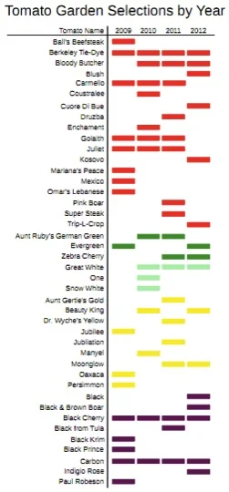
"Hi all,  Here is silly little thing I cooked up over the weekend. My wife likes fresh tomatoes, of what are called heirloom varieties (not the big commercial ones) - 16 different ones each year in our garden. We used to have trouble selecting which ones to grow each time, for the last 4 years have kept pretty good records of them, so I wanted to see if there were any patterns.

This is my first such chart after taking the basic data viz class, where I had a chance to sit and think about how to make it look. 

I did violate the color palate guidelines a bit, to color code each tomato by type. But this makes the type of tomato stand out, as well as the pattern."

Neil goes on to say, "Interestingly enough, until I graphed it, I didn't know that we rarely have a yellow tomato invited back a second year. Our by year lists (stored on a wiki at home) tended to mask that information." 

I love the use of data viz for this sort of problem solving: what type of tomatoes should I plant this year? I think Neil's next challenge will be to identify and start recording and visualizing some success measures (e.g. plant yield, flavor) to really hone his future garden crops.

This reminded me of another food-related data viz I saw some time ago, where a woman had tracked everything she ate for a year, then created a number of visualizations based on the data. You can read about that and see the visuals in this Flowing Data post.

Food for thought (pun intended!): what do you (or could you) visualize in your life?