tactical tip: embedding a vertical reference line in Excel

Today's post is a step-by-step Excel “how-to” inspired by a reader question we received following a recent post on using dotted lines in data visualizations.

Dave asked:
“Do you know of a trick for drawing vertical lines to delineate years (or actuals/historical vs forecast/future segments of the chart)? I currently have to draw them with the line drawing tool, which gets messy when moving the chart on a PPT slide. If there were a way to embed it in the data or somehow format the chart, that'd be awesome.”

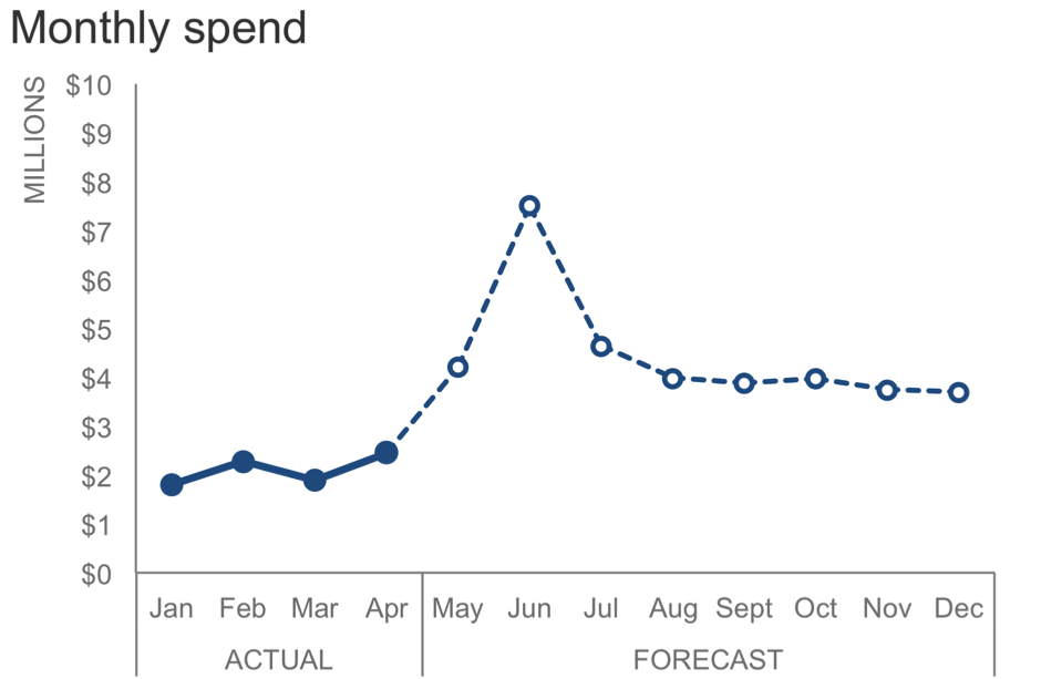
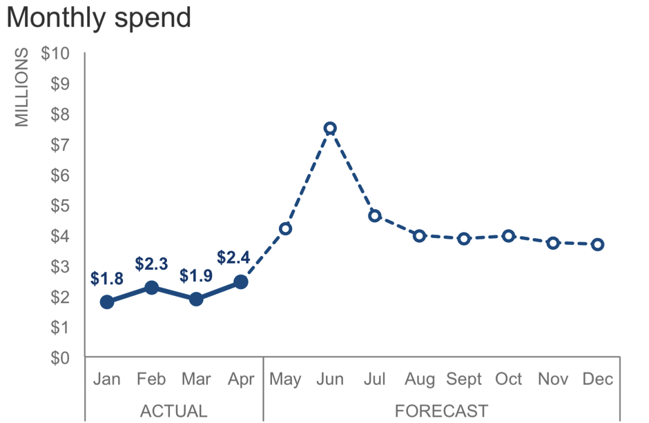
The following chart illustrates what Dave describes. The data is units of output over time where the first nine months of the series are actual data and the remaining four months of the year are a forecast. The dotted line serves as a visual cue to differentiate actual from forecast. Created in Excel, the line was physically drawn on the graph with the Shape Illustrator. While this approach might suffice as a quick method for achieving the desired effect; it isn’t ideal for recurring use of the graph, particularly if the line’s position on the x-axis might change in future iterations.

 
Picture1.png
 

After some research and playing around in Excel, I’ve devised one method for achieving this effect, which I’ll outline in this post (I’m sure there are others!). Don't be dismayed by the number of steps: it's a one-time setup after which can be easily refreshed in future iterations by changing where you want the reference line. I’m using Excel 2016 and you can download the accompanying file.

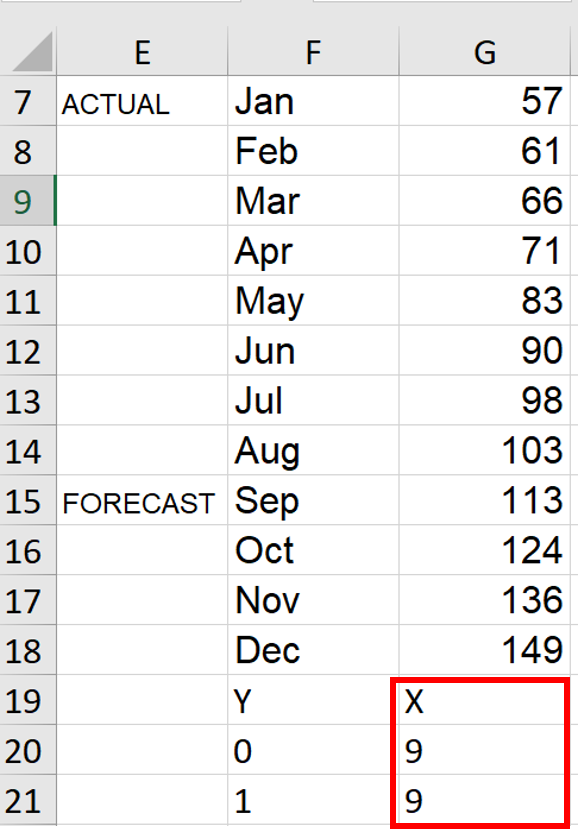
In my spreadsheet, the data for the Output over time chart looks like this:

 
Picture2.png
 

1. Go to a blank cell range and enter these values as shown in my screenshot below. I’m choosing to add these new values directly underneath my data range in cells F19:G21. This will eventually become the coordinates for a secondary scatterplot that we’ll add in a later step.

 
Picture3.png
 

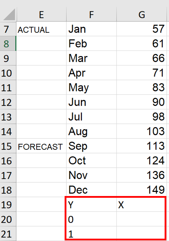
2. Choose where you want the vertical reference line to cross the x-axis and enter those values below “X”. In this example, I want the line located on the September data point, the ninth point in my data series. In cells G20:G21, I entered “9” in each, as shown below. (Note: for a more automated approach in a larger dataset, a MATCH formula could also calculate where September falls in the range: =MATCH("Sep",$F$7:$F$18,0).

 
Picture4.png
 

3. Add a new data series by right-clicking the graph and choosing Select Data:


4.  In Select Data Source dialog, click the Add button.


5. In the Edit Series dialog, enter a name for your data series (I chose “reference”) and select the X values you entered from Step 2. I selected the 9’s in G20:G21. Click OK to exit the dialog boxes.


The resulting visual looks like this:


6. Right click the new line and choose Change Series Chart Type.


7. In the Change Chart Type dialog box, select Combo section under All Charts tab. Then select Scatter with Straight Lines and check the option for Secondary Axis. Click OK to exit.

 
Picture10.png
 

The resulting visual looks like this:


8. Go to the chart, right click the red reference line and choose Select Data again. In the Select Data Source dialog, highlight reference and click Edit.


9. In Edit Series dialog, update the X values to be the original values you selected in Step 5. Set the Y values to be 0,1. Click OK to exit.

 
Picture13.png
 

The resulting visual looks like this:


The remaining steps are visual cleanup: first, I forced the red line to align with the top of the primary y-axis and second, I hid the secondary axis line and text labels.   

10. Right-click on the secondary y-axis and select Format Axis:

 
Picture15.png
 

11. In the Axis options section, type 1 into the textbox beside the Maximum option.


12. In the Text Options section, under Text Fill, choose No fill. This will remove the text labels on the secondary y-axis.


13. In the Axis Options section, under Line, choose No line. This will remove the secondary y-axis line.


Voila! The resulting visual has an embedded vertical line, which is plotted on a hidden secondary y-axis.

 
Picture20.png
 

Recall that this goal of this specific scenario was a dotted line which visually differentiated the actual and forecast sections. My last step was to change the formatting of the line to appear as a thin, grey dashed line.  

(Note: To achieve your preferred formatting, right-click the line and select Format Data Series in the context menu where you’ll find formatting selections in the resulting dialog pane.)


This method does come with some trade-offs to consider.

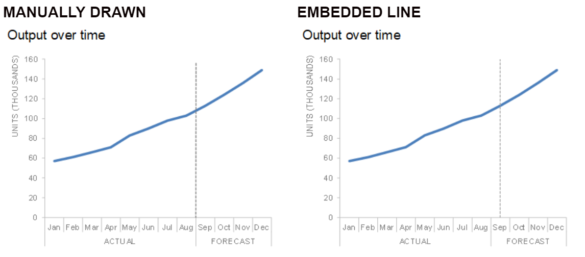
One downside is that you lose some control over the exact placement of the line where it crosses the x-axis. Below you’ll see a comparison between the manual vs embedded approach. With the manual approach, the line can be drawn exactly on the tick mark between the Aug & Sep data points, providing a clean alignment with the x-axis. With the embedded approach, the line is centered above the Sep label, resulting in a slightly less seamless effect.


On the cosmetic side, another downside is losing the flexibility to manipulate the length of the line for labeling purposes. I’ll illustrate this with a horizontal bar chart (which I also created using this method). With the manual approach, I can physically draw the line to extend above the x-axis line, aligning it closely to the “Target” text label. With the embedded approach, the line stays below the x-axis line, creating a gap between the line and the label that describes it.


You can download the Excel file to see the behind-the-scenes of these graphs. Are there other methods you’re aware of for achieving this effect? Or other considerations with embedding the reference line directly? Leave a comment with your thoughts!


Elizabeth Ricks is a Data Visualization Designer on the Storytelling with Data team. She has a passion for helping her audience understand the ’so-what?’ as concisely as possible. Connect with Elizabeth on LinkedIn or Twitter.

accessible data viz is better data viz

Accessibility in data visualization goes well beyond considerations for color blindness. This is something I personally understand much better after my interactions with Amy Cesal in preparation for bringing you the following post. Back in April, we posted a short article here with some accessibility considerations in visual design and Amy sent me a private note basically expressing, “but wait…there’s more!” I love when content posted on the blog starts conversations like this—as I continue to learn, it means there’s more great content to share with you. Just be aware that if you reach out like this, I may talk you into doing some writing and sharing: that’s what has happened here when I invited Amy to pen a guest post and she graciously accepted!

I was already familiar with some of Amy’s work (if you haven’t seen it, be sure to check out her #DayDohViz, where she is in the process of creating 100 visualizations made out of PlayDoh, including a couple she’s shared via #SWDchallenge—you can view them all here). Amy first started being interested in accessibility for data visualization through her work in the federal government, where everything has to be up to 508 accessibility standards. At CFPB, she led the creation of the data visualization portion of the design manual, which is the first style guide for the federal government that includes accessibility for data visualization. Please join me in thanking Amy for writing and sharing the following expanded post on accessibility in data visualization!


accessibility matters

Often, when we are creating charts and graphs, we think of ourselves as the ideal user. This is not only a problem because we know more about the data than the target user, but because other users might have a different set of constraints than we do.

Inclusive design principles and accessibility (often posted about with the tag #a11y) are important to take into consideration when designing data visualization because they help a broader audience understand your graphic. Designing with accessibility in mind can even help make your visualizations easier to understand for people without disabilities.

To help you understand how other people experience the world, empathy prompts provide a variety of suggestions. The Microsoft guide to the principles of inclusive design, excepted below, suggests thinking about temporary and situational disabilities as well as permanent ones.  

Being clear with text, distinctive labeling, and adding multiple ways to identify the point to your visuals will make it easier for people with impairments and those without to interpret your graphs. There are easy ways to add the principles of accessibility into your visual communications. Here are five simple ones.
 

5 easy ways to make your data visualization more accessible
 

1. Add Alt text

Alternative text (referred to as Alt text) is displayed when the image cannot be. Screen readers, the assistive technology used by people who are visually impaired, read alt text out loud in place of people seeing the image. It’s important to have valuable alt text instead of “figure-13.jpg,” which doesn’t help a user understand the content they are missing. Screen readers speak alt text without allowing users to speed up or skip, so make sure the information is descriptive but succinct.

According to the CFPB data visualization guide, which I helped create, good alt text includes: one sentence of what the chart is, including the chart type for users with limited vision who may only see part of it. It should also include a link to a CSV or other machine-readable data format so people with impaired vision can tab through the chart data with a screen reader.

If you frequently use data visualizations in Microsoft products, this guide will help you learn how to add alt text to them.
 

2. Employ a takeaway title

Research suggests that users read the title of the graph first. People also tend to just rephrase the title of graph when asked to interpret the meaning of the visualization. When the graph title includes the point, the cognitive load of understanding the chart decreases. Recently, when writing about how to effectively use words in graphs, Cole advocated for what she called a takeaway title. People know what to look for in the data when they read the graph takeaway first as part of the title.
 

3. Label data directly

One way to reduce the cognitive burden on users it to directly label your data rather than using legends. This is especially useful for colorblind or visually impaired users who may have difficulty matching colors within the plot to those in the legend. It also decreases the work of scanning back and forth trying to match the legend with the data.

Notice the difference in the following visual example. Compare how quickly you understand them and the relative ease of processing the one that is labeled directly.

An example graph using legend vs. direct labeling

An example graph using legend vs. direct labeling

4. Check type and color contrast

In the data visualization community, we’ve started addressing how to design for red/green colorblindness. This is an issue for 8% of men and 0.5% of women with Northern European ancestry. However, we should also consider users with low vision and a variety of other conditions that affect vision. The W3 WCAG guidelines specify necessary contrast and text sizes for readability on screen. There are a number of tools to help you abide by these contrast and size standards. For example, in the following screenshot the top example passes color contrast standards, where the below version is too light and fails.

Example of the for the color palette contrast evaluation tool WCAG standards

Example of the for the color palette contrast evaluation tool WCAG standards

Tools to help get you started:

5. Use white space

White space is your friend. When information is too densely packed, the graphic can feel overwhelming and unreadable. It can be helpful to leave a gap between sections of a chart. Judicious use of white space increases the legibility by helping to demarcate and distinguish between different sections without relying only on color. This can also supplement accessible color choices by helping users distinguish the difference between colors that identify separate sections.

In the following example, compare how easily you can distinguish the sections. Now imagine if you more difficulty distinguishing between the colors. The lines between them help you to visually identify each chunk.

Example graph with no line and with a white divider line between categories

Example graph with no line and with a white divider line between categories

These are just a few things you can do to help everyone easily comprehend the graphs you create. You should strive to make sure that everyone, not just you or your ideal user, understands the point of the visualization. When you consider accessibility, you create a better product for everyone.

putting graph elements in cells directly

Today's short post focuses on an Excel tip that I find myself using frequently and I get asked about a ton. While I focus on Excel here, I imagine the same could apply when working in any spreadsheet application. For additional formatting flexibility, put some graph elements in the cells directly.

This is probably easiest to illustrate through an example. Below is a visual from storytelling with data: a data visualization guide for business professionals. It's highlighted in Chapter 6 (pg. 161), which focuses on what I consider to be model examples of data visualization. I regularly get questions about how this graph was created.

Source: Knaflic, Cole. Storytelling With Data: A Data Visualization Guide for Business Professionals, Wiley, © 2015. (Original figure had data labels on the stacked bars; I've omitted those here for simplicity.)

Source: Knaflic, Cole. Storytelling With Data: A Data Visualization Guide for Business Professionals, Wiley, © 2015. (Original figure had data labels on the stacked bars; I've omitted those here for simplicity.)

There are two common questions posed about this visual:

  1. How did you format some of the y-axis labels differently from the rest? 
  2. How did you include the TOTAL % in the graph?

The trick in both of these cases is the same: these elements aren't part of the graph directly, rather they are in individual cells in Excel. In this particular graph, the only things directly in the graph element are the stacked bars. Everything else is done in cells. I do this for additional formatting flexibility. In Excel, you can only apply a single format to axis labels on a given axis. You also have to get creative (and it can sometimes be limiting) if you want to add additional numbers or labels to the visual that aren't part of the data you're visualizing directly. Using the cells allows me to break free from both of these constraints.

In case it's easier to see what I'm talking about, below is what the visual looks like if I show the gridlines in Excel (in the preceding view, all of my cells were filled with white).

FIG0605 with gridlines.png

When approaching this way, you do have to take care to ensure that everything is lined up correctly. This means precisely aligning the graph with the cells and making both cell and graph heights line up (otherwise your bars won't correctly align with the words and numbers). Also, be aware that if you shuffle your data around, you'll need to adjust the elements you've put into the cells directly. Changing the order of your data would change the graph in this case, but not the PRIORITY or TOTAL %, which would have to be done manually (unless you set up so it's pointing to the data you reshuffle). Both of these things lead me to express a word of caution: when I break the pieces apart like this, it's easier to introduce issues and have things not line up: both from a visual standpoint as well for data and labels to get out of sync. Because of this, the tradeoffs may not be worth it if you're trying to automate or it's a repeated process that you don't want to have to adjust each time. But so long as you're careful and pay attention to detail, when you need the additional formatting flexibility, consider putting some elements into cells directly.

If it's of interest, you can download my Excel workbook.

Are there other graphs from storytelling with data that you have questions about or would like a behind-the-scenes peek? Or other tricks you employ when graphing data that you'd like to share? Leave a comment!

supercategory axis labels in Excel

I have a super quick tip to share today for those reading who work in Excel. I see graphs regularly that look similar to the following:

Supercategories in Excel 1.png
 

Note the x-axis. It isn't awful. But it also isn't ideal. The years are repeated. It looks a little sloppy. "Lack of attention to detail here? What does that mean for all the steps behind the scenes that I can't see?" your audience may be wondering. Also, studies have shown that diagonal text is about 50% slower to read than horizontal text. So if efficiency of information transfer is one of your goals when communicating with data—which I would argue it should be—aim for horizontal text whenever possible.

In Excel, there is a quick trick to fix this. I get asked how to do this regularly, so figured it warrants a quick "how to" post. I'll focus on the x-axis using the above example—you could follow a similar process to create supercategory axis labels on the y-axis when that makes sense, too. Also, this example uses quarterly data but you could follow the same process with monthly data.

In the Excel spreadsheet, the data graphed above looks like this:

Supercategories in Excel 2.png
 

The current x-axis labels (DATE) are in the column on the left and the y-axis values (SALES) are in the column on the right. Start by highlighting these and creating your graph. It will look similar to the graph at the beginning of this post.

Next, we need to add a couple more columns of data to split out the year and quarter (the process would look very similar if you have monthly data). I typically add two columns to the left of my original data to do this (new columns highlighted in blue):

Supercategories in Excel 3.png
 

Once you've done that, right-click on your graph and go to "Select Data."

Supercategories in Excel 4.png
 

In the menu that comes up, "Category (X) axis labels" (highlighted in blue at right, below) will be pointed at the original DATE column (mine, as you see below, was in Column D):

Supercategories in Excel 5.png
 

Click on this and use your mouse to highlight the range of both of the new columns you've added (my YEAR and QUARTER data was in columns B and C, respectively).

Supercategories in Excel 6.png
 

Hit OK, and your graph will look something like this:

Supercategories in Excel 7.png
 

Voila! A beautifully formatted x-axis. If it would be helpful, you can download the Excel file.

Would it be helpful to see more Excel "how to" posts like this? Let me know if there are specific topics or questions of interest that we can answer here by leaving a comment. Do you have any quick tool tips you'd like to share (Excel or otherwise)? Leave a comment to enlighten us all!

axis vs data labels

A common decision point that arises when creating a graph is whether to show the axis or label the data points directly. Today's post focuses on the things I think about when making this decision and illustrates a few possibilities via example.

Probably the most common approach you'll see is where the axis is shown directly, as in the following graph.

In the above graph, we have monthly spend, in millions of dollars, on the y-axis. The x-axis is time, with Jan-Apr depicting actual data and May forward are forecast figures.

Showing both axes directly is a good default approach. This works especially well if you want your audience to focus on the shape of the data without cluttering it up with a bunch of numbers.

That said, there are circumstances that might cause you to vary from this. One consideration is the level of specificity the audience needs to have with the individual data points. If the particular numbers themselves are important, I'd suggest labeling the data points directly. In this case, you can get rid of the y-axis altogether: it's no longer necessary and becomes redundant when the points are individually labeled.

While I wouldn't typically preserve the y-axis and label every single data point (due to the redundancy previously mentioned), there may be cases where it makes sense to keep the axis and label just some of the data directly. For example, if we thought our audience would want to know how much we've actually spent each month but for the forecast we just want people to focus on the general shape of the data that illustrates our expectations, I might do something like the following:

Notice how the data labels themselves can help to draw attention to certain data points. In preattentive attribute language, these are "added marks." They act as visual cues, helping direct our audience's attention within the graph. It's like the graph is saying, "Look audience, these numbers are so important that they are labeled directly so you know what the specific values are."

We could use this strategy with data labels to direct our audience's attention to another point in the graph:

Notice that you can't help but look at the $7.5M label and the data point that goes with it. In the above, I chose a different color to fill in the data marker and also to label the data point, so as not to inadvertently visually tie together the ACTUAL data with the Jun data point (by filling it with the same dark blue as the actual data). In this case, we are drawn quickly to the $7.5M figure in Jun, while none of the other figures are labeled directly. Rather, we see the general shape of the rest of the data as context, and if we want to know rough values, can estimate those using the y-axis at the left.

This is actually an example from a recent workshop (details and numbers changed to preserve confidentiality). My final graph looked similar to the following, where in addition to the data label, I added some explanatory text:

I should note that whether to show the axis or label data directly is a decision point in most (all?) graphs. I've illustrated using a line graph here, but the same thought process can be applied to vertical or horizontal bars, scatterplots, etc.

In general, when you are deciding whether to show the axis, label the data directly, or some combination of these things: consider how you want your audience to read the graph. What level of specificity do they need to have with the individual data points? Where do you want them to pay attention? Let the answers to these questions guide your thoughtful design.

If interested, you can download the Excel file with the above graphs.

where are your eyes drawn?

I spend a lot of time in my workshops and in my new book discussing preattentive attributes. These are elements like size, color, and position on page that, when used sparingly, can direct your audience's attention to where you want them to pay it when communicating with data. There is a test I like to employ when it comes to determining whether preattentive attributes are being used effectively: the "where are your eyes drawn?" test. In this post, I discuss this test, how to do it, and we look at a number of images using it and discussing the implications for data visualization.

Read More