
a multi-level makeover: simplifying a shrinkage report
In retail, there’s an expectation that some percentage of product inventory will inevitably disappear without ever being sold to a customer. The term for this is “shrinkage,” and it includes things like shoplifting, employee theft, and various inventory control issues.
Somewhere between 1–2% of retail inventory tends to be lost to shrinkage, even though retailers work assiduously to keep that number as low as possible. Tracking shrinkage values in as close to real time as possible helps managers and owners understand which mitigation efforts are proving effective, and whether or not there are new areas of concern.
Recently, I was able to work with a national retailer on improving the readability and visual impact of their weekly shrinkage reports. Within the organization, these reports are generated across multiple dimensions, so that managers are able to see current and historical data at various levels of geographic detail (national, regional, state, and store), as well as broken out by cause (shoplifting, internal, inventory control, and overall).
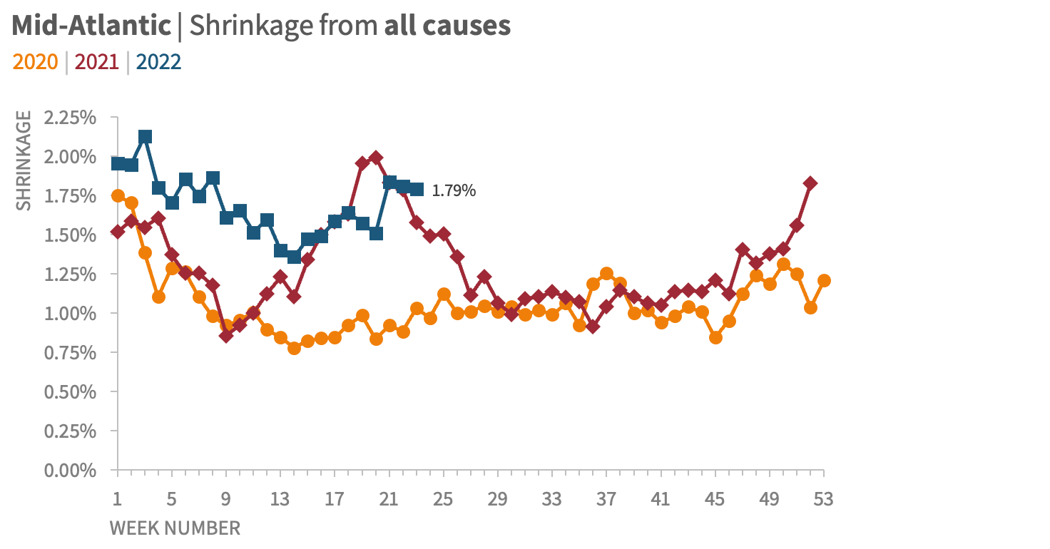
By way of example, here’s what a weekly report on the overall shrinkage for all of the retailer’s Mid-Atlantic stores looked like:

There are opportunities to improve this visual, but I appreciate that the graph is appropriately titled, that the legend is clear and easy to find, and that the most recent data point is the only one that is labeled. On its own, it’s an acceptable view of the data, albeit one that could be strengthened.
When this visual is considered in its greater context, however, the need to improve the legibility of this graph becomes obvious.
These charts are generated at multiple levels of geographic and thematic detail. Each one is then shared as part of one large report, with almost no visual variation from region to region, level to level, or week to week:

Here’s just one snapshot of a report that runs dozens of pages, including hundreds of visuals, reproduced with incremental changes every week.
Every graph on the page feels nearly identical and carries equal visual weight. When the information is presented in this fashion, it is nearly impossible for a reader to see any greater trends, to scan for important outliers, or to know where their attention should be paid.
It’s a struggle to focus on a single view for more than a second or two. (I’d be stunned if anyone could tell at a glance that of the 20 graphs in this two-page layout, four of them appear twice—and that’s with each one titled clearly and consistently.)
Given this context, it became clear that there were two distinct opportunities for strengthening this report.
Simplify the basic structure of the standard shrinkage-report graph—irrespective of level of detail—and make it easier for a viewer to see the current weekly status and any concerning trends.
Suggest an improved overall report that adds more visual breaks and reference points for someone reading the larger report, and ensures that there is both consistency in the overall layout as well as visual cues differentiating different levels of detail.
Remaking the graph
Let’s revisit the overall shrinkage graph for all Mid-Atlantic locations:

I began by simplifying the graph skeleton—everything that supports the data, but isn’t the data itself. For this visual, that included the borders, the gridlines, the axes, the legend, and the title.
Borders | This graph, like almost all graphs, didn’t need a defined border. Our eyes can easily tell where a graph begins and ends, and the border just adds visual clutter.
Gridlines | In most cases, gridlines provide little benefit in exchange for the level of visual interference they cause. I’d guess that I remove gridlines from graphs 99% of the time, since I’d prefer my data series to be presented free of distractions.
Axes | I added axis titles and faded the black lines down to a less-aggressive gray, on both the vertical y-axis and the horizontal x-axis. The y-axis didn’t NEED to go to zero, since we’re showing lines rather than bars, but the scale was so close to zero it felt misleading to stop at 0.5%. On the horizontal axis, I removed the repeated “WK” label, and rotated the text so that each week number was easier to read.
Legend | I kept the legend at the top, but incorporated it more intentionally with the graph title.
Title | Moving the title to be left-aligned, and written out in sentence case, makes it easier for a reader to scan it quickly. The alignment also provides a nice frame around the graph without resorting to drawing an actual border.
The first step of the transformation involves cleaning up the graph “skeleton”—all of the structure in the visual that allows the data to be seen clearly and understood easily.
The next step was to address some of the distracting elements in the data series themselves.
The data markers were an obvious place to start; I always think of them as the graph equivalent of boldfaced text. Markers are a great way to highlight the key points in a visual, but using too many at once undermines the whole effort by making it seem like everything is equally important. Since this was a weekly report, it seemed obvious that the current, new data point should be emphasized; additionally, year-over-year and year-over-two-year comparisons could be made more easily if those points were also marked. Finally, I made each data marker a circle; having unique markers for each year seemed unnecessary.
Similarly, I chose to include data labels for the three marked points (current week, YoY, and Yo2Y), but made the current value much larger and easier to read. I also used similarity of color to make it easy to figure out which label went with which data point.
The color in the data series was also up for consideration. Normally, I’d want to gray out all the lines except for the current year. However, knowing that there was likely to be significant overprinting in these auto-generated reports (where the 2020 and 2021 lines might be hard to distinguish from one another if both were gray), I decided instead to simply fade those colors so that the 2022 color was the most attention-getting.
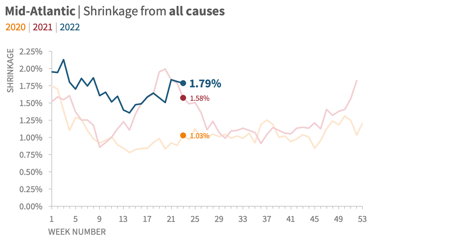
With sparing and thoughful use of data markers, data labels, and color, we can emphasize information that will be most important and relevant to a reader, while also providing visual cues that will point out pertinent comparisons.
The final step for this graph was to add some additional context.
The company had set an organization-wide target of 1.25% shrinkage or less from all causes (0.75% from shoplifting, 0.25% from employee theft, and 0.25% from inventory control). I decided to visualize that target in the plot area of the graph itself.
To demonstrate how these graphs could be used in a specific presentation, rather than in a weekly report, I created a version that used additional annotation to highlight a particular takeaway.

Adding key takeaways in text above the graph, plus incorporating reference lines in the view itself, makes it even more likely that a reader will understand both the data being presented and what future actions it might suggest are indicated.
With the graph restructured, I could then focus on making the complete report easier to understand.
Remaking the report
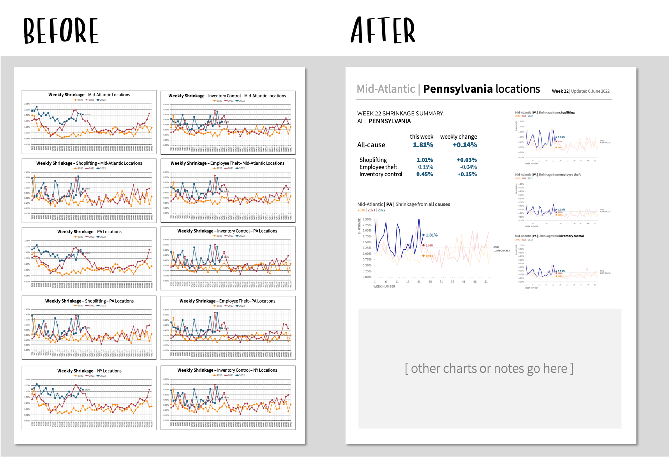
As a reminder, here is the original look-and-feel of the report:
A sample two-page view of the much-longer weekly shrinkage report.
Whether you’re building a slide deck, a dashboard, or a report, it’s critical to organize the material in a consistent, scannable, and thematically meaningful way—particularly if it’s a regularly-updated communication that people will be consuming over and over again.
While I was not able to fully redesign the report, I was able to offer a sample makeover, and suggested a few specific considerations to the retailer if they wanted to pursue that project separately:
Create a visual hierarchy. I wanted to make it clear to someone scanning the page what the section header is, what the subsection headings are, and if a graph is at an aggregated or more granular level of detail. This makes it easier for people to find the information they’re looking for, at the specific depth that interests them. To this end, I proposed that each page begin with a header describing the specific geographic region and level that the graphs that followed represented.
Be as consistent across graphs as possible. Even though the visuals would be automatically updated every week, I felt it was important that within each type of graph (all-cause shrinkage, shoplifting, internal, inventory control), the y-axis would have the same scale, regardless of geographic level of detail. That would make it easier to compare across stores, states, regions, or overall. The alternative would be to have the scale for each graph defined automatically by that week’s data, and that minor inconsistency would add just a bit more cognitive burden to a reader than is necessary.
Repeat layout and positioning across pages. Ideally, the first thing someone would see on a single page would be the header, clearly identifying the region; then, the overview/summary statistics for that region would follow in the top left; next, just below those statistics, comes the “all-cause” graph (which would be larger than the other graphs); and finally, smaller and aligned on the right-hand side of the page, the sub-category graphs. Any space below these graphs could be used for other insights, recommendations, or additional graphs.
Compared to the existing document structure, this would add whitespace, visual breaks, and thematic structure that would make it easier for someone reading the report to find and consume any particular graph of interest.

In this sample redesign of the report, the breaks between levels of detail are clear; there is both variation and consistency to help a view stay oriented within a graph, a page, and across multiple pages; there’s more white space for ease of reading, and there’s a clear visual hierarchy to make the entire document much more scannable.
Strengthening a communication can happen at multiple levels. Depending on your needs, your availability, and the intended use of the end product, you may find yourself focusing on small details in a single visual, the overall structure of the larger document, or a little of both.
The good news is that many of the considerations for improving communication at the tactical level…

…also apply at the strategic level.
If you enjoyed this makeover, we encourage you to check out this collection of other walkthroughs on our blog, which we’ve developed based on our real-world client work; if video is more your speed, you may prefer to explore some of the live graph transformations that we’ve collected on our YouTube channel.