displaying numbers of different magnitudes
Recently, I was watching CBS Sunday Morning with my in-laws that included a segment on Warren Buffett. They reported that someone who invested $1,000 with Warren Buffett in 1966 would have $6.5 million today. This point was illustrated by the following graph:

See full CBS Sunday Morning segment here.
I'm not going to list all of the issues with this visual (there are many!). But let's spend a moment on the visual comparison between the two numbers. I'm not totally sure if I'm meant to compare the stack of dollar bills (as a sort of bar chart) or the beginning and end points of the green line. In either case, the visual comparison is misleading:
- Dollar stacks: There's no way that they are at the right scale relative to one another to visually compare them. If the stack at the right represents $6.5M, the stack at the left is much too big to reflect $1,000, which is a mere 0.015% of $6.5M.
- Green line: With a single series and only two data points in a line graph, the maker of the graph can make the slope of the line be whatever they want by manipulating the scale of the y-axis. In this case, I actually think the visual increase is underemphasized by the slope of the line and the real magnitude of difference between the two numbers is lost.
But I don't think the solution is as easy as right-sizing the dollar stacks or changing the y-axis scale.
This example made me think about a question I often get from workshop participants: how do you best display numbers of very different magnitudes?
Let me start off by saying that I don't have a perfect answer to this question. But I thought I'd share a few ideas I have as well as open it up to you for your input. Here are a few ideas to get us started:
Use the numbers directly
This can work if you only have two or a few numbers - the sheer difference in size of the numbers written out can help demonstrate the difference in magnitude. For example, in the case of the Warren Buffett scenario, you could do something like:

Note in this case that I suppressed the urge to make the $6.5M figure in larger font than the $1,000 figure - while this may seem like a good idea to emphasize the increase, it runs into the same issue as the stacked dollars in the original visual: there's no way to make the size ratio between the numbers reflect the actual difference in magnitude of the numbers (since as discussed, $1,000 is a mere 0.015% of $6.5M, which means the font would be too tiny to read even if $6.5M is written very largely).
Compare areas
I'm typically not a fan of area graphs (due to the difficulty our eyes have accurately ascribing quantitative value to two dimensional space). But if the numbers are of very different scales and we are more interested in big-picture comparison than being able to quickly estimate the precise value visually, I will allow that there is benefit here in the additional dimension you get with area vs. a single point. This basically gives you more "room" to make the comparison in a condensed space. My inspiration for this idea is David McCandless' Billion Pound-O-Gram that depicts the scale of the budget deficit in the center of the British economy:
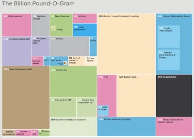
www.informationisbeautiful.net; original version here.
I played with turning the figures from CBS Sunday Morning's segment into an area comparison. I first tried having the square representing $1,000 embedded within the (many) squares representing the $6.5M figure, but thought this was unclear, so separated them out and landed on the following:

Each (very) small blue square above represents $1,000. The grid on the right is 81x80 of these little squares (I decided $6,480,000 was close enough to $6.5M, since I couldn't figure out a good way to color an additional 20 squares blue without it looking funny). I still don't love this. It could perhaps be aided by some explanatory text, or by someone talking through it with the first $1,000 blue box appearing and the others following.
The next two ideas don't work well for the Warren Buffet scenario, but could potentially work in other situations for comparing numbers of vastly different magnitudes:
Turn number(s) into a rate
If you're looking at growth, for example, you can use a starting period as a baseline and turn the numbers you're comparing into growth rate. Or leverage other ways to scale or normalize your data. Note: this solution is pretty context-dependent and I'm not coming up with many good examples off the top of my head, so if you have other ideas here please leave a comment.
Use a logarithmic scale
I'm not a big fan of this solution, as most people aren't used to interpreting log numbers. But given the right situation and right audience, I could be convinced it could work. Again, specific examples where you've seen this done or where it could be applied would be appreciated.
This is a partial list at best. What do you think of the ideas above? What ideas do you have for visually comparing numbers of very different magnitudes? Where have you seen this done well? Please leave a comment with your thoughts. Thanks for your input!