
In the SWD podcast, bestselling author and graph guru Cole Nussbaumer Knaflic talks with experts & explores topics that will help you become a more effective communicator of data
Rid your world of ineffective graphs and mediocre presentations, one exploding 3D pie chart at a time! The storytelling with data podcast covers topics related to data storytelling, better presentations, and all things data viz. There is a story in your data—listen and learn how to develop the skills and confidence to tell it!
Listen to the SWD podcast on your favorite platform
Subscribe to never miss an episode, or scroll down for individual episodes. Like what you hear? Please rate & review. Thanks for listening!


RECENT EPISODES
Catch up on the latest episodes for insights, strategies, and stories to help elevate how you communicate with data.
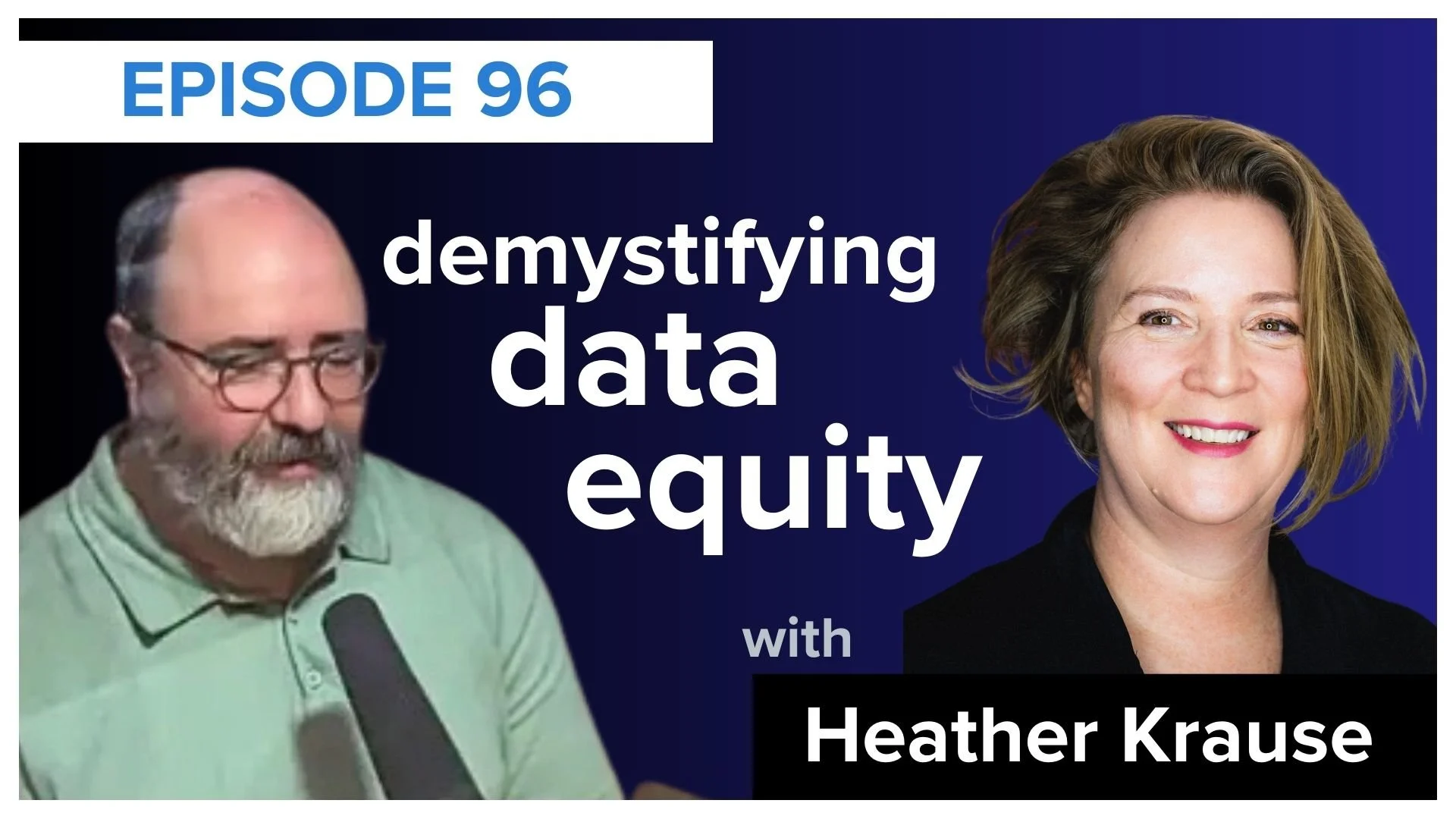
demystifying data equity
In this episode, Mike chats with Heather Krause, to unpack a powerful concept: data equity. Together, they explore how every step of a data project involves decisions that impact what’s measured, who’s represented, and what conclusions are drawn. LISTEN
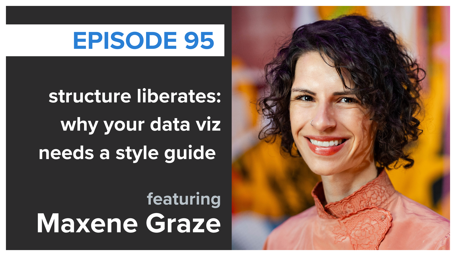
structure liberates: why your data needs a style guide
How do you keep your data visuals effective and on brand? In this episode, Simon chats with Maxine Graze about building data visualization style guides, providing several ideas on how to bring clarity and consistency to your data storytelling. LISTEN
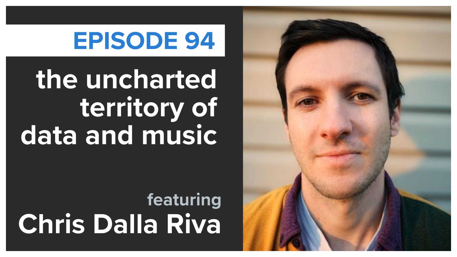
the uncharted territory of data and music
Mike is joined by Chris Dalla Riva, who shares his journey of listening to every #1 hit on the Billboard Hot 100, and analyzing what he found, in his new book, Uncharted Territory: What Numbers Tell Us About the Biggest Hit Songs and Ourselves. LISTEN
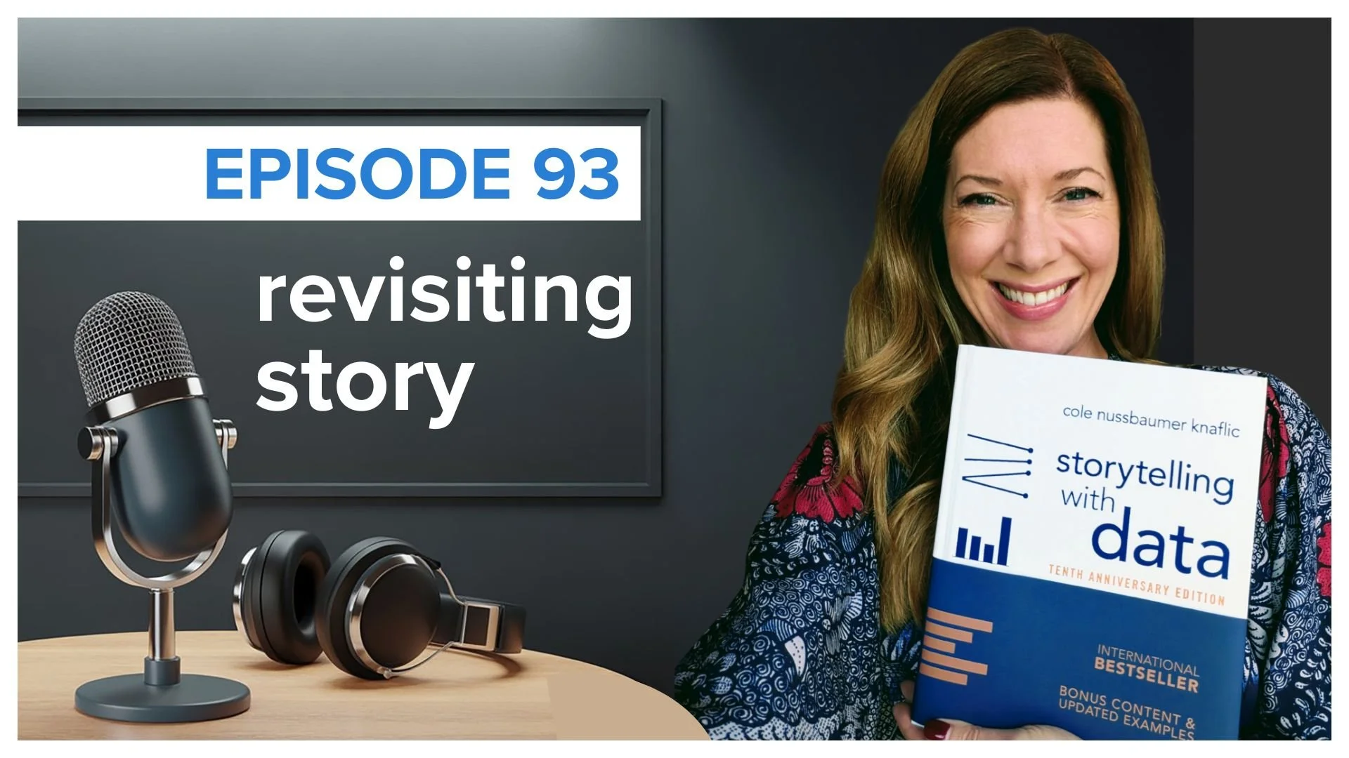
revisiting the magic of story
Cole marks the 10th anniversary of her bestselling book and shares updates on the new anniversary edition. She also reads aloud a fan-favorite chapter, exploring how timeless story structures can transform the way we communicate with data. LISTEN
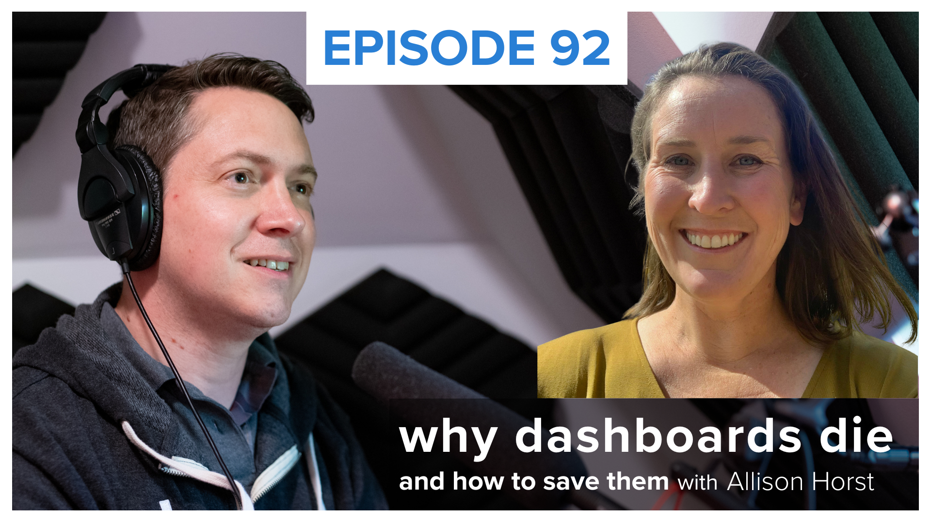
Why dashboards die—and how to save them
Data storyteller Simon Rowe chats with Allison Horst of Observable about why so many dashboards fail, how collaboration and early feedback lead to data products that get used, and why curiosity can drive lasting impact in data visualization. LISTEN
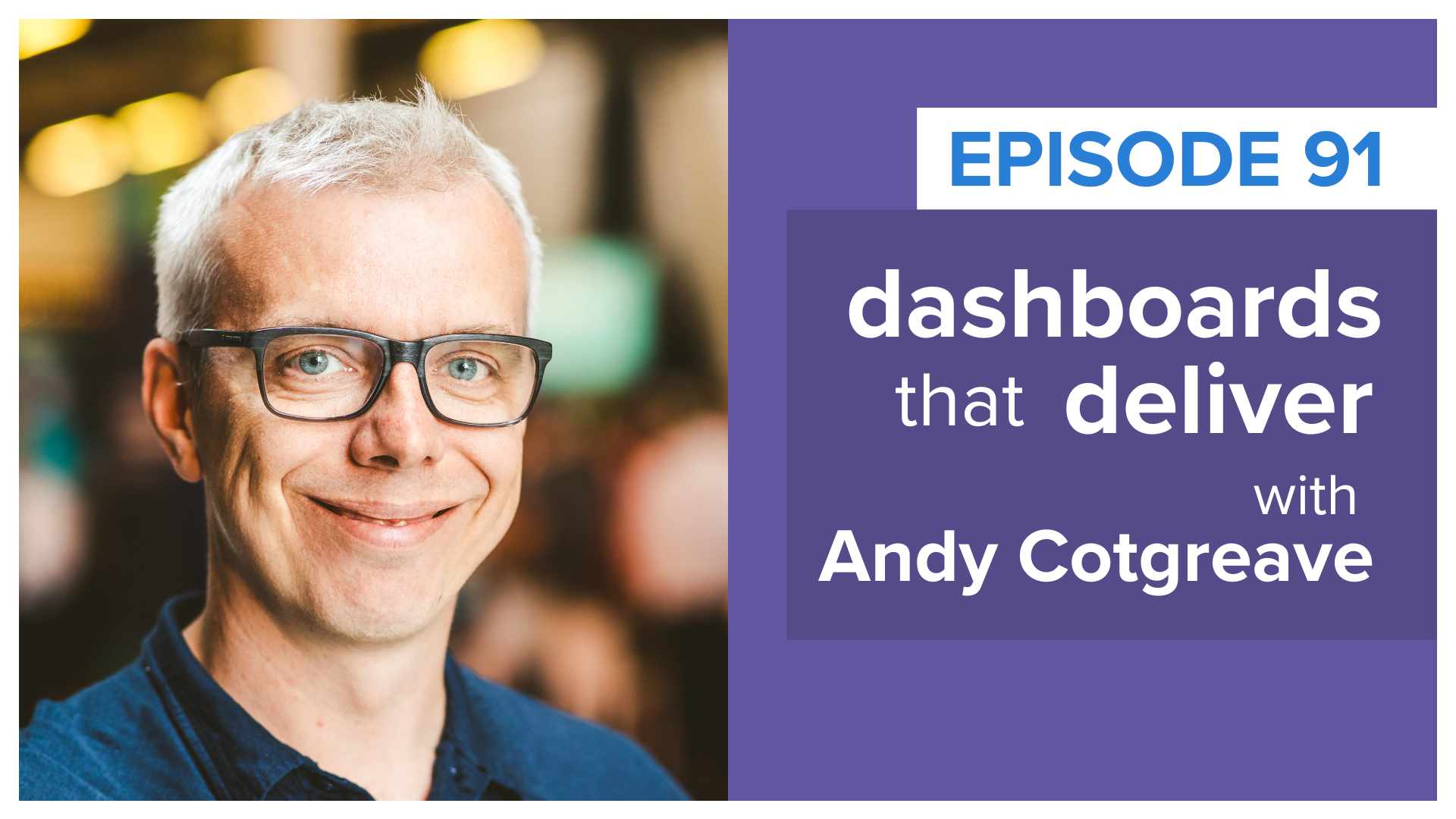
Dashboards That Deliver
Andy Cotgreave joins data storyteller Mike Cisneros to talk about his new book, Dashboards That Deliver, and much more! LISTEN

ask smart questions
Cole covers queries to pose and answer during the analytical process and more to consider when you are getting ready to explain data to others. LISTEN
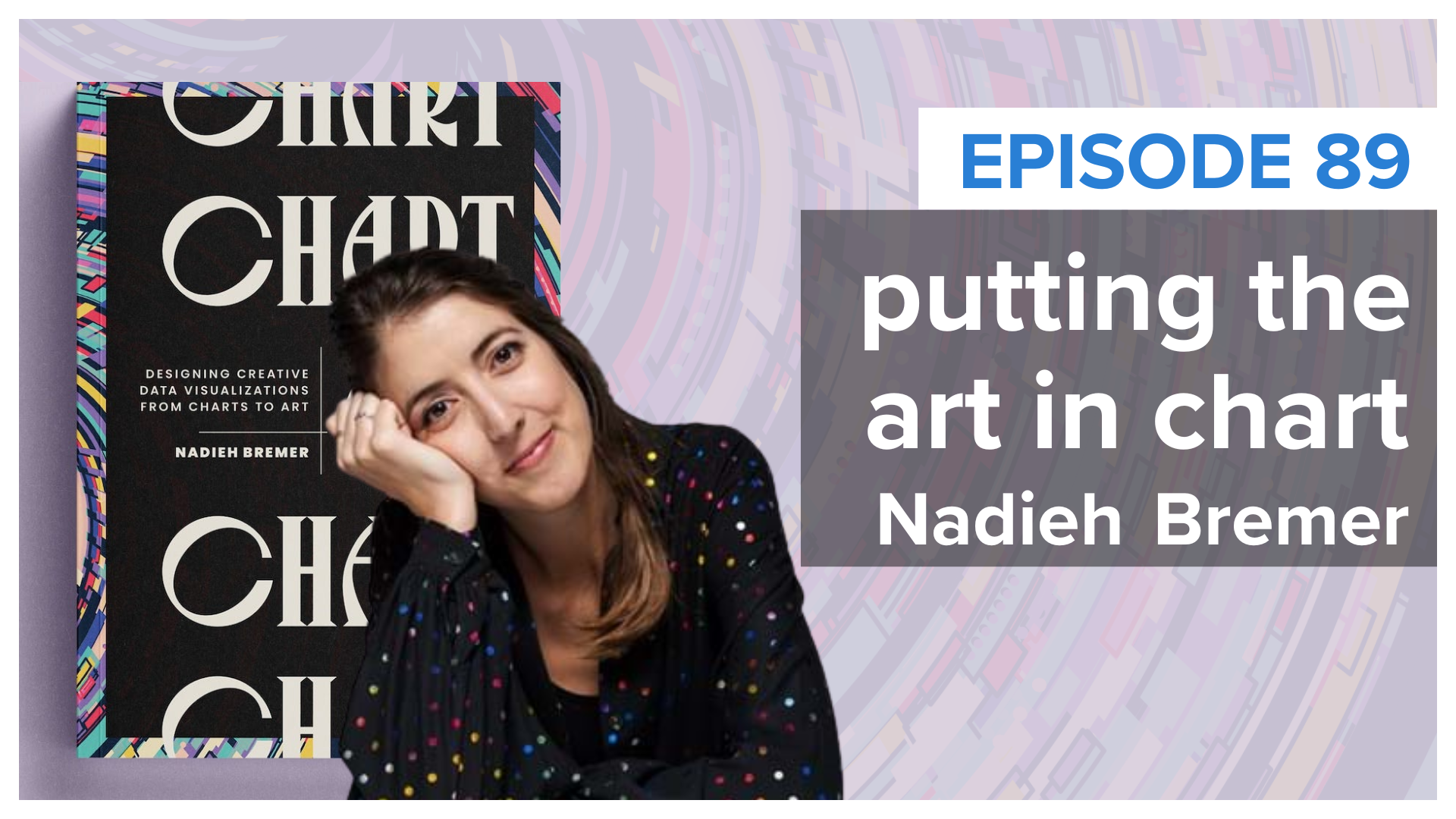
Chart Art with Nadieh
Alex talks with award-wining data visualizer Nadieh Bremer about her new book, Chart: Designing Creative Data Visualizations from Charts to Art. LISTEN

Swimmer & storyteller
Randy talks with MySwimPro CEO, Fares Ksebati about scaling a global remote company, navigating the tech ecosystem, and staying relentlessly curious. LISTEN

AI-powered insights
Randy talks with Insight7 founder & CEO, Odun Odubanjo about how he helps organizations turn quantitative data into meaningful business insights. LISTEN
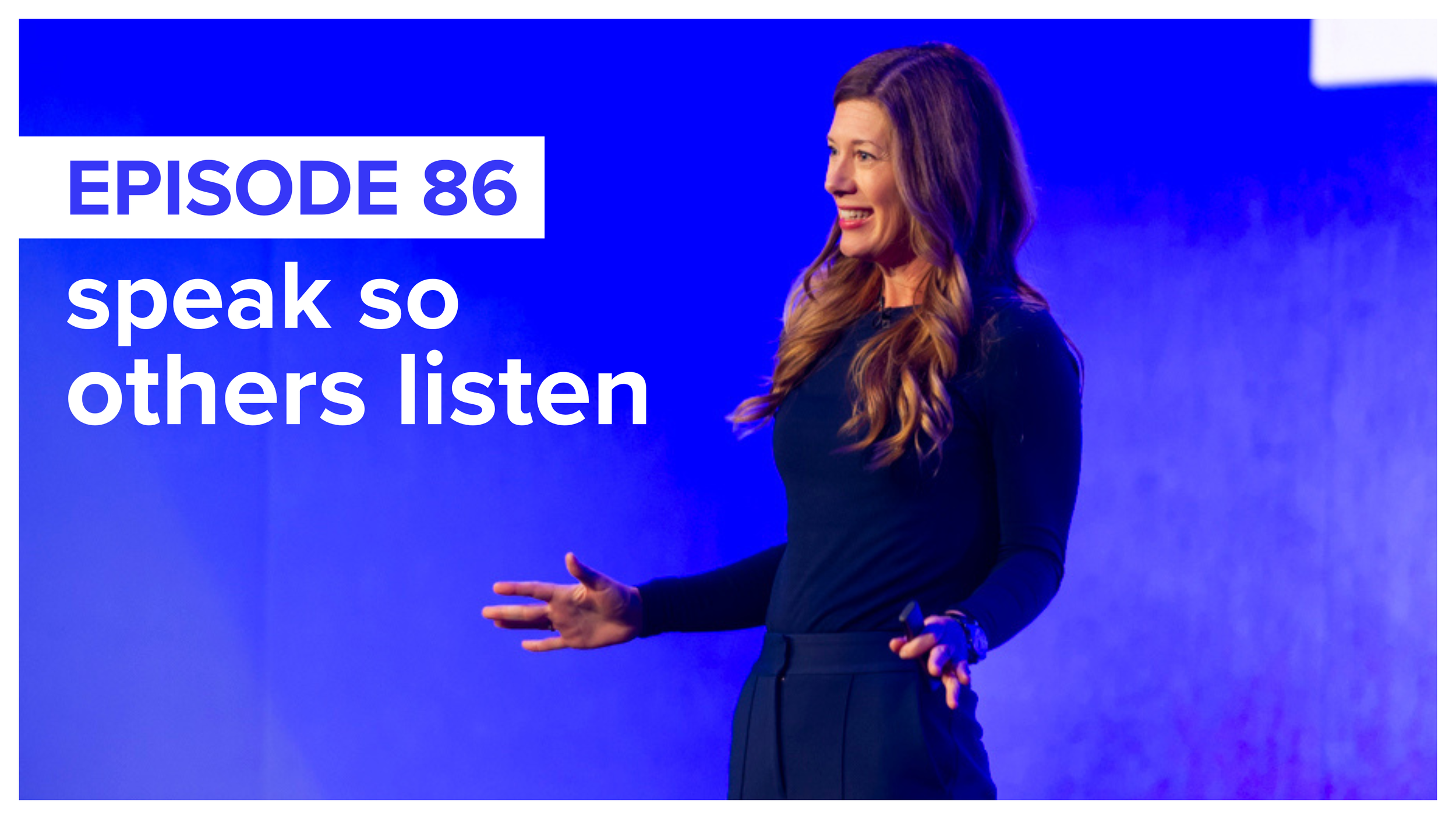
speak so others listen
Cole dives into the art of confident speaking—how to command attention with your voice and body, project confidence when you don’t feel it, and more. LISTEN

reflect & refine
Cole explores statio—a meditative pause during transitions—and how it can lead to more thoughtful, impactful decisions when analyzing and communicating data. LISTEN

everyday design & data viz
What do wrapping paper and speed bumps have in common? Cole uncovers how the design of everyday objects can inspire better graphs and slides. LISTEN
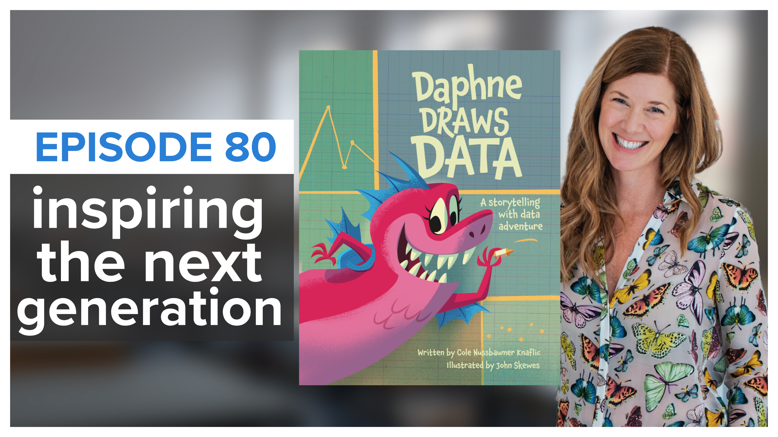
inspiring kids with data
In this special episode, Cole unveils her new children's book, a vibrant adventure aimed at making data, numbers and graphs accessible to young minds. LISTEN
POPULAR EPISODES
From data viz to effective communication strategies, Cole shares insights & actionable takeaways to help you tell better data stories.

deliver with confidence
Discover how to signal confidence, even before feeling it, and learn about real-time data collection techniques to continually refine your speaking skills. LISTEN
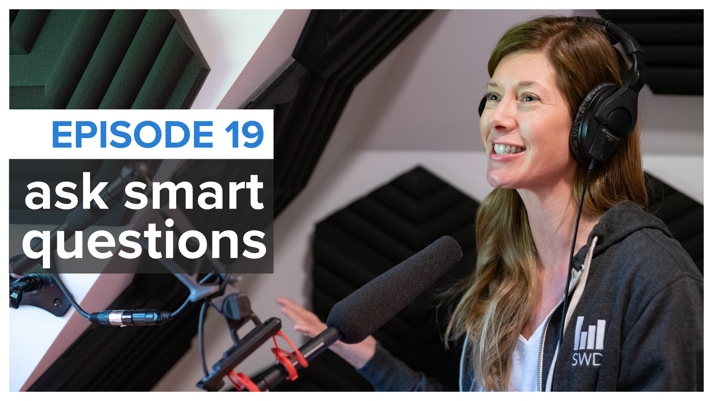
ask smart questions
Cole shares five questions to ask and answer as you’re analyzing data, and five more to consider when you’re explaining information to others. LISTEN

don’t! (what to do instead)
Cole shares a number of data viz and communication questions that could be answered simply with, “Don’t!” plus ideas on what you might do instead. LISTEN
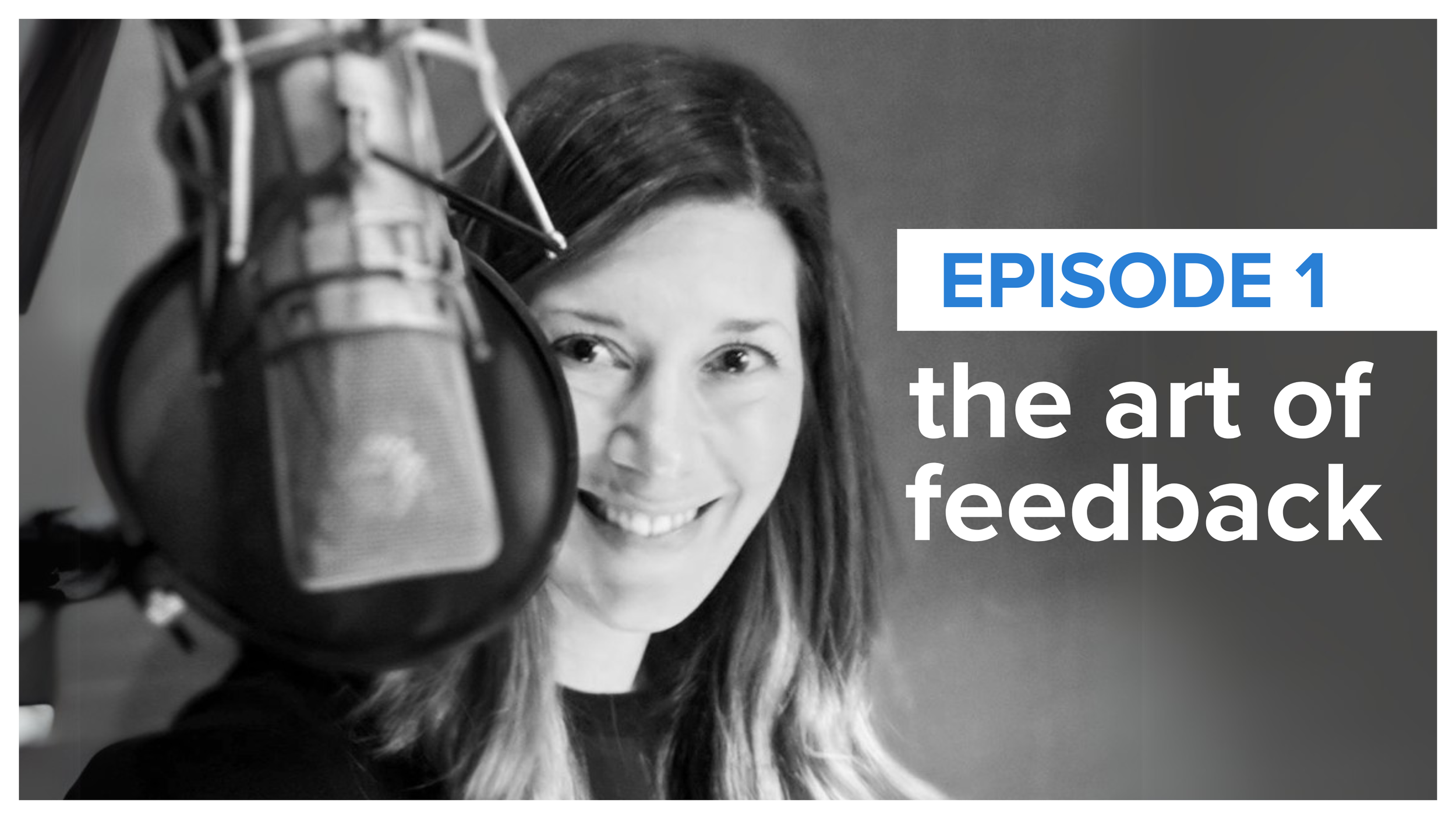
the art of feedback
In our debut episode, Cole explores feedback—how to offer it, receive it, and use input from others to transform your data viz into powerful stories. LISTEN
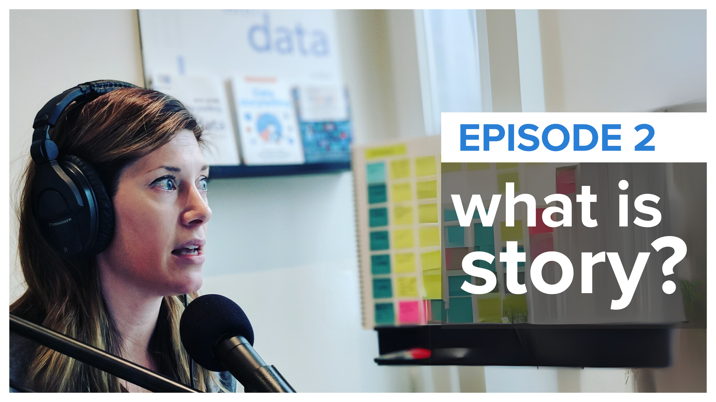
what is story?
Cole shares what makes a story, why those working with data should care, and how story can be used to improve how you communicate with data. LISTEN

what is data viz?
Why do we visualize data and what makes data visualization good? Tune in to listen to Cole lend her thoughts on these and related questions. LISTEN
FEATURED GUEST EPISODES
Cole talks with experts in data viz, design, and communication to explore fresh perspectives, practical strategies, and inspiring stories.

Kat Greenbrook & The Data Storyteller Handbook
Cole talks with New Zealand-based data storyteller, Kat Greenbrook, about her new book. Tune in to learn about frameworks that can help you plot time and character data stories, how to keep things honest, bridging knowledge gaps between you and your stakeholders, and more! LISTEN
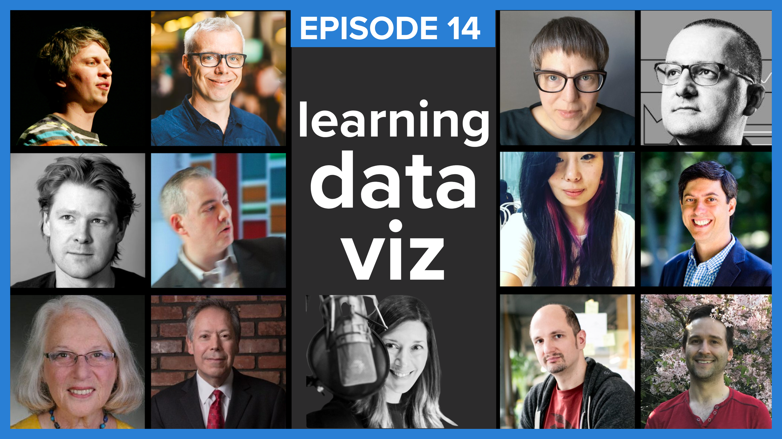
learning data visualization
How did you learn to visualize data? Professionals in this space hail from a variety of backgrounds and in this episode, you’ll hear a dozen responses to this question, from artists, mathematicians and more. Listen to their captivating stories and anecdotes—while learning lessons to hone your own skills. LISTEN
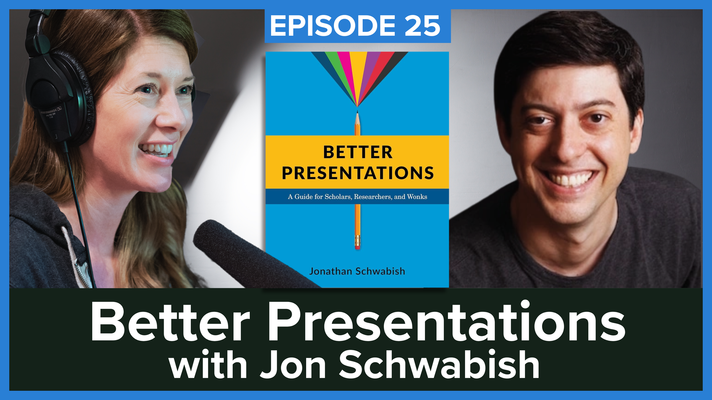
Better Presentations with Jon Schwabish
Giving a presentation is like selling an idea—it’s a skill that must be learned. Cole talks with author and economist Jon Schwabish about ways we can improve our own work and influence those around us. They discuss meeting people where they are, the Pyramid Philosophy, and more. LISTEN
EPISODE ARCHIVE
EPISODE 96 demystifying data equity
EPISODE 94 the uncharted territory of data and music
EPISODE 93 revisiting the magic of story
EPISODE 92 why dashboards die—and how to save them
EPISODE 91 Dashboards That Deliver
EPISODE 90 ask smart questions
EPISODE 89 putting the art in chart with Nadieh Bremer
EPISODE 88 Swimmer, startup, storyteller
EPISODE 87 AI-powered insights
EPISODE 86 speak so others listen
EPISODE 85 storytelling & resilience
EPISODE 84 mastering time
EPISODE 83 reflect & refine
EPISODE 82 everyday design & data viz
EPISODE 81 how to make math magical for kids
EPISODE 80 inspiring the next generation
EPISODE 79 recast: Cole on ExperienceMKE
EPISODE 78 Visualize This with Nathan Yau
EPISODE 77 Chart Spark with Alli Torban
EPISODE 76 deliver with confidence
EPISODE 75 Data Storytellers Handbook with Kat Greenbrook
EPISODE 74 planning your presentation
EPISODE 73 stand up
EPISODE 72 Alberto Cairo and The Art of Insight
EPISODE 71 pre-reads are risky business
EPISODE 70 prepare to present
EPISODE 69 feedback you hate to receive
EPISODE 68 tips for successful data stories
EPISODE 67 storytelling withOUT data
EPISODE 66 designing in light & dark
EPISODE 65 EMPHASIZE it!
EPISODE 64 beginner mistakes in data viz
EPISODE 63 bad news & good feedback
EPISODE 62 tension in data stories
EPISODE 61 AI, quantified self & fingernails
EPISODE 60 scale with purpose with Brendan McGurgan
EPISODE 59 Questions in Dataviz with Neil Richards
EPISODE 58 don’t! (and what to do instead)
EPISODE 57 storytelling with YOU
EPISODE 56 graph draft!
EPISODE 55 Functional Aesthetics with Dr. Vidya Setlur & Bridget Cogley
EPISODE 54 storytelling, folklore & data with Joshua Smith
EPISODE 53 Shashank Kalanithi interviews Cole
EPISODE 52 you asked…
EPISODE 51 the path to trusted advisor
EPISODE 50 data viz research with Steven Franconeri
EPISODE 49 become a data viz superstar
EPISODE 48 the challenges of change
EPISODE 47 the art of the interview
EPISODE 46 questions about questions
EPISODE 45 the power of post-its
EPISODE 44 The Big Picture with Steve Wexler
EPISODE 43 misleading graphs
EPISODE 42 there is still an art to feedback (replay)
EPISODE 41 maps with Kenneth Field
EPISODE 40 Data Sketches with Shirley Wu & Nadieh Bremer
EPISODE 39 Better Data Visualizations with Jon Schwabish
EPISODE 38 hi, my name is…
EPISODE 37 it’s for THEM
EPISODE 36 presenting data
EPISODE 35 a conversation with Maarten Lambrechts about xenographics
EPISODE 34 Sprint and Make Time with John Zeratsky
EPISODE 33 the power of drawing with Catherine Madden
EPISODE 32 a conversation with Andy Kirk about visualization
EPISODE 31 presenting virtually with Andy Cotgreave
EPISODE 30 influencing change
EPISODE 29 think like a reporter
EPISODE 28 working from home
EPISODE 27 what is data visualization?
EPISODE 26 Avoiding Data Pitfalls with Ben Jones
EPISODE 25 Better Presentations with Jon Schwabish
EPISODE 24 Andy, Jeff, & Steve and The Big Book of Dashboards
EPISODE 23 Nancy Duarte & DataStory
EPISODE 22 Alberto Cairo & How Charts Lie
EPISODE 21 a special conversation
EPISODE 20 think like a designer
EPISODE 19 ask smart questions
EPISODE 18 recast: dataklubben
EPISODE 17 which graph should I use?
EPISODE 16 develop your team
EPISODE 15 Info We Trust with RJ Andrews
EPISODE 14 learning data viz
EPISODE 13 goals like Google
EPISODE 12 a conversation with Elijah Meeks
EPISODE 11 #MakeoverMonday with Andy Kriebel & Eva Murray
EPISODE 10 right place, right graph
EPISODE 9 recast: Data Stories
EPISODE 8 the many myths of data visualization
EPISODE 7 a conversation with Alberto Cairo
EPISODE 6 say it out loud
EPISODE 5 the beauty of constraints
EPISODE 4 it depends…
EPISODE 3 how I’m building this
EPISODE 2 what is story?
EPISODE 1 the art of feedback
Listen to the SWD podcast on your favorite platform
Subscribe in your favorite podcast platform to never miss an episode.
Like what you hear? Please rate/review. Thanks for listening!