Ready to move beyond standard Excel graphs? Browse our free collection of step-by-step videos and articles to learn how to build custom, professional data visualizations directly in Microsoft Excel.
Learn to create custom and effective charts in Excel


Design & present complex charts
Tackle a set of novel graphs in our latest on-demand learning offering. Design and present complex charts in PowerPoint will walk you through a series of step-by-step video lessons with over 100 minutes of content. You'll master scatterplots, box plots, bubble graphs, radar charts, and horizon charts. Each chart module contains lessons on understanding, creating, designing and presenting them effectively.
Add emphasis and context
EMPHASIZE A
DATA POINT
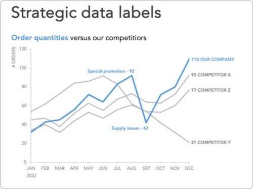
DIRECTLY LABEL DATA

ADDING A SHADED RANGE
ADDING A
VERTICAL LINE


VISUALIZING UNCERTAINTY
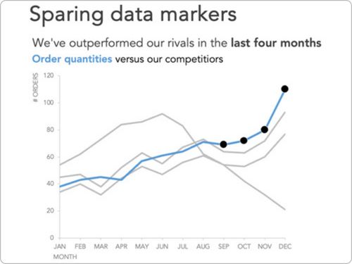
ADDING SPARING DATA MARKERS

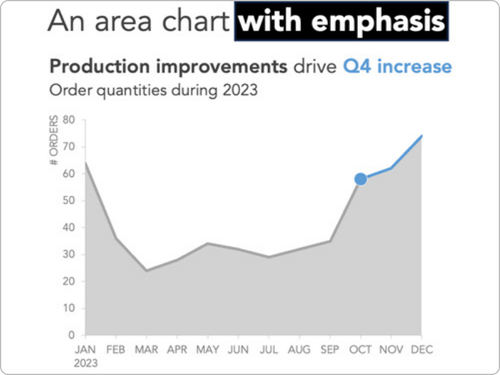
ADDING EMPHASIS TO AREA CHARTS
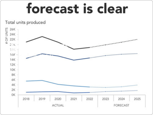
DISPLAY ACTUALS
& FORECASTS
DATA SERIES ORDER
PARTIAL SHADED REGION


FORECAST WITH A SHADED AREA
AXIS VS. DATA LABELS


DISPLAY PARTIAL DATA

Go behind the slides
If you’re looking to level up your PowerPoint skills, check out our specially curated on-demand learning course. Behind the Slides: good to great PowerPoint presentations will teach you how to create compelling and effective slides at your own pace with access to 5 learning modules containing 30+ video lessons to master new skills.
Move beyond default outputs
MOVING A
CHART AXIS
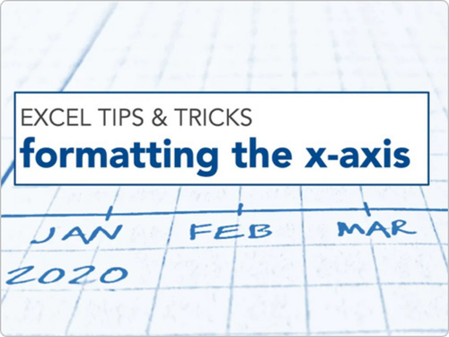
FORMATTING
THE X-AXIS
DISPLAYING A VALUE IN A RANGE
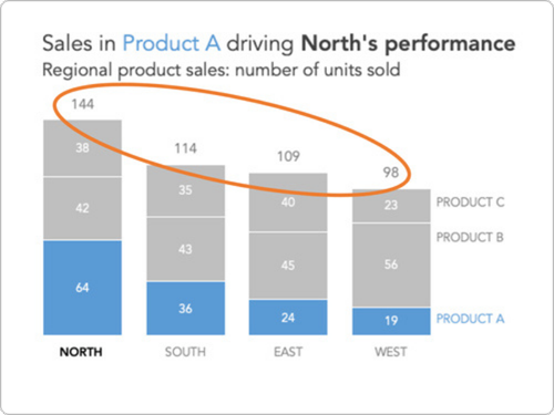
ADDING TOTALS TO STACKED BARS

DON’T STRETCH YOUR GRAPHS!
USE COLORBLIND FRIENDLY COLORS

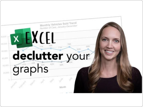
ELIMINATE GRAPH CLUTTER
AVOID DEFAULT LEGENDS

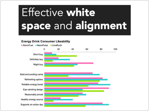
USE WHITE SPACE
AND ALIGNMENT
EIGHT WAYS TO
EDIT A LEGEND
SUPER CATEGORY
AXIS LABELS
ADJUSTING
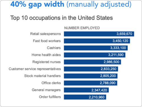
BAR WIDTH
GRAPH ELEMENTS DIRECTLY IN CELLS
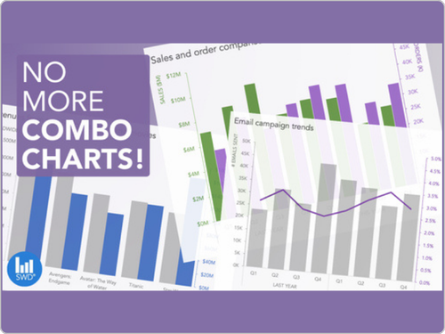
COMBO CHART CHALLENGES
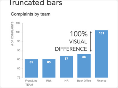
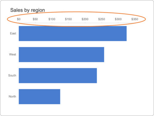
DON’T TRUNCATE YOUR BARS!
Additional ways to learn with us
CORPORATE TRAINIINGS
YOUTUBE CHANNEL
SWD COMMUNITY


You are welcome to use these resources to learn or teach with proper attribution:
Knaflic, Cole. storytellingwithdata.com. © 2025