data visualization: a reflection of personal taste?
When baby Avery took a slightly longer than expected nap earlier today, I found myself able to escape to one of my favorite spaces: the lounge chair on the patio in the sun with a copy of Dwell magazine. I find inspiration in the design of physical things: spaces, furniture, gadgets. There was a paragraph in one of the articles I was reading that gave me pause -
"But there is a clear difference between the thoughtful selection of furnishings and the heedless accumulation of 'stuff.' Good furniture at its best is the intersection of art, craft, and industry. The 'right' pieces address the needs dictated by our behavior and predilections. That's the lofty ideal. Of course, complications arise when one starts calculating the pesky realities of space, time, and budget. And so begins the tradeoff."
- Many Voices, Many Rooms. Dwell Magazine, Vol 13, 6/13.
I can see many parallels between what editor-in-chief Amanda Dameron says here about furniture and good data visualization. I guess it all comes down to thoughtful design. But personal taste must enter the equation as well, right?
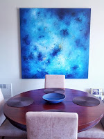
Upon reading this, I started thinking about how my own personal taste when it comes to physical items is reflected in the data visualizations I create and in my stylistic approach to data visualization in general. In the spaces in which I live and work, my tendency is mostly minimalist. The color palette tends to be neutral, with sparing, bright splashes of color. No one who is familiar with my data viz style will be surprised that the dominant color is blue.
When I started thinking about it, I realized that my design of the physical spaces in which I spend time has many similarities with the data visualizations I create. So interesting!
I'm curious: how does your personal style influence your data visualization? Leave a comment with your thoughts!
Painting pictured above is by Jill Henry, ceramic bowl by Heath Ceramics.