leverage animation: what you present vs. what you circulate
A common challenge in storytelling with data is the following conundrum. When presenting content live, you want to be able to walk your audience through the story, focusing on just the relevant part of the visual. However, the version that gets circulated to your audience - as pre-read or takeaway, or for those who weren't able to attend the meeting - needs to be able to stand on its own without you, the presenter, there to walk the audience through it. Too often, we use the exact same content and visuals for both purposes. This typically renders the content too detailed for the live presentation (particularly if it's being projected on the big screen) and sometimes not detailed enough for the circulated content.
I often tackle this topic in my workshops and have written about it here a couple of times before (look for any posts including the word "slideument," for example this one). In the following post, we'll look at a strategy for leveraging animation coupled with an annotated line graph to meet both of these needs.
Let's assume that you work for a company that makes online social games. You are interested in telling the story around how active users for a given game, let's call it Moonville, have grown over time.
You could use the following visual to talk about growth since the launch of the game in late 2012.

But in doing so, you run the risk of your audience focusing elsewhere in the data while you're talking. Perhaps you want to tell the story chronologically, but your audience may jump immediately to the sharp increase in 2014 and be thinking about what drove that. When they do so, they aren't paying attention to what you're saying.
Alternatively, you can leverage animation to walk your audience through your visual as you tell the corresponding points of the story. For example, I may start with a blank graph (which forces the audience to look at the axis details with you, vs. jump to the data; it can also help build anticipation that will help you to retain your audience's attention). Then I can subsequently show or highlight only the data that is relevant to the specific point I am making, forcing my audience's attention to be exactly where I want it to be as I am talking.
I might say - and show - the following progression:
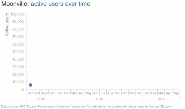
Today, I'm going to talk you through a success story: the increase in Moonville users over time. First, let me set up what we're looking at. On the vertical y-axis of this graph, we're going to plot active users. This is defined as the number of unique users in the past 30 days.
We'll look at how this has changed over time, from the launch in late 2012 to current, shown along the horizontal x-axis.

We launched Moonville in September 2012. By the end of that first month, we had just over 5,000 active users, denoted by the big blue dot at the bottom left of the graph.
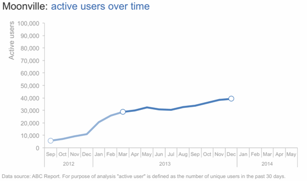
Early feedback on the game was mixed. In spite of this - and our early practically complete lack of marketing - the number of active users nearly doubled in the first four months, to almost 11,000 active users by the end of December.

In early 2013, the number of active users increased along a steeper trajectory. This was primarily the result of the friends and family promotions we ran during this time to increase awareness of the game.

Growth was pretty flat over the rest of 2014 as we halted all marketing efforts and focused on quality improvements to the game.
Uptake this year, on the other hand, has been incredible, surpassing our expectations. The revamped and improved game has gone viral. The partnerships we've forged with social media channels have proven successful for continuing to increase our active user base.
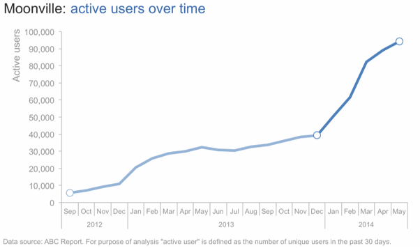
At recent growth rates, we anticipate we'll surpass 100,000 active users in June!
For the more detailed version that you circulate as a follow up or for those who missed your (stellar) presentation, you can leverage a version that annotates the salient points of the story on the line graph directly, as shown below.

This is one strategy for creating a visual (or in this case, set of visuals) that meets both the needs of your live presentation and the circulated version. Note that with this approach, it's imperative that you know your story well to be able to narrate without relying on your visuals (something you should always aim for regardless).
If you're leveraging presentation software, you can set up all of the above on a single slide and leverage animation for the live presentation (with the final annotated line graph positioned on top so it's all that shows on the printed version of the slide). If you do this, you can use the exact same deck for the presentation and the communication that you circulate. Alternatively, you can put each graph on a separate slide and flip through them; in this case, you'd only want to circulate the final annotated version.
If you're interested, the Excel file with the above visuals can be downloaded here.