axis vs data labels
A common decision point that arises when creating a graph is whether to show the axis or label the data points directly. Today's post focuses on the things I think about when making this decision and illustrates a few possibilities via example.
Probably the most common approach you'll see is where the axis is shown directly, as in the following graph.
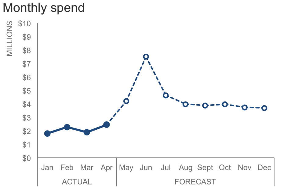
In the above graph, we have monthly spend, in millions of dollars, on the y-axis. The x-axis is time, with Jan-Apr depicting actual data and May forward are forecast figures.
Showing both axes directly is a good default approach. This works especially well if you want your audience to focus on the shape of the data without cluttering it up with a bunch of numbers.
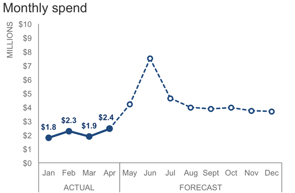
That said, there are circumstances that might cause you to vary from this. One consideration is the level of specificity the audience needs to have with the individual data points. If the particular numbers themselves are important, I'd suggest labeling the data points directly. In this case, you can get rid of the y-axis altogether: it's no longer necessary and becomes redundant when the points are individually labeled.

While I wouldn't typically preserve the y-axis and label every single data point (due to the redundancy previously mentioned), there may be cases where it makes sense to keep the axis and label just some of the data directly. For example, if we thought our audience would want to know how much we've actually spent each month but for the forecast we just want people to focus on the general shape of the data that illustrates our expectations, I might do something like the following:
Notice how the data labels themselves can help to draw attention to certain data points. In preattentive attribute language, these are "added marks." They act as visual cues, helping direct our audience's attention within the graph. It's like the graph is saying, "Look audience, these numbers are so important that they are labeled directly so you know what the specific values are."
We could use this strategy with data labels to direct our audience's attention to another point in the graph:

Notice that you can't help but look at the $7.5M label and the data point that goes with it. In the above, I chose a different color to fill in the data marker and also to label the data point, so as not to inadvertently visually tie together the ACTUAL data with the Jun data point (by filling it with the same dark blue as the actual data). In this case, we are drawn quickly to the $7.5M figure in Jun, while none of the other figures are labeled directly. Rather, we see the general shape of the rest of the data as context, and if we want to know rough values, can estimate those using the y-axis at the left.
This is actually an example from a recent workshop (details and numbers changed to preserve confidentiality). My final graph looked similar to the following, where in addition to the data label, I added some explanatory text:

I should note that whether to show the axis or label data directly is a decision point in most (all?) graphs. I've illustrated using a line graph here, but the same thought process can be applied to vertical or horizontal bars, scatterplots, etc.
In general, when you are deciding whether to show the axis, label the data directly, or some combination of these things: consider how you want your audience to read the graph. What level of specificity do they need to have with the individual data points? Where do you want them to pay attention? Let the answers to these questions guide your thoughtful design.
If interested, you can download the Excel file with the above graphs.