baby steps
Today’s quick post is an example of an incremental improvement to an existing graph that makes it easier for the audience to read. When practicing being a better communicator with data at work, it’s easy to become consumed by the desire for perfection and talk ourselves into thinking it’s an all-or-nothing approach. Rather, the opposite is true: incremental improvements are achievable baby steps we can take to become better data communicators.
Consider the following visual and imagine it’s part of a semi-annual update to senior leadership. The data displayed is total dollar volume of an organization’s funding amongst its various initiatives. Within each initiative, the stacked bars break down the dollar volume into three stages: distributed, pending and funded.
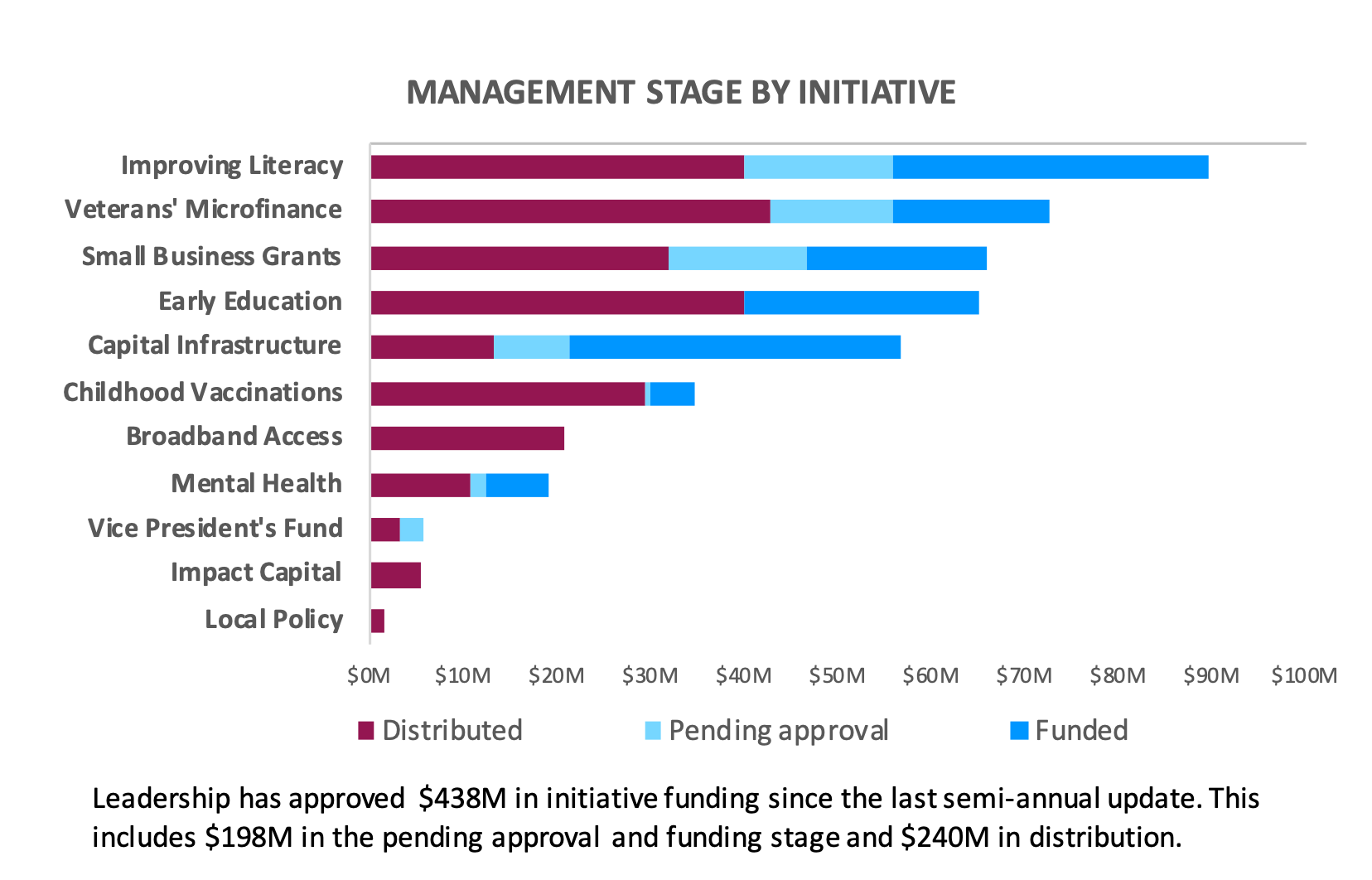
Assume a stakeholder asks you for an updated version by the end of the day. Given the tight deadline you don’t have time to make big sweeping changes—however, you can use this as an opportunity to make an incremental and impactful improvement. Study the visual and ask yourself: what is one change that would make this graph easier to read?
Do you have your change in mind? Read on to see what mine is!
My incremental improvement is to reposition the words to the top. More specifically, I’d choose to left-align the chart title and supporting subtext while moving the legend and x-axis labels to the top of the graph. The benefit is that my audience sees how to read the graph before they get to the data! You can see this change reflected below.

There are certainly more modifications I’d make given ample opportunity but time constraints are real. Continually evaluating our graphs for readability and implementing small incremental changes sets us up for improved future iterations and, ultimately, success. You can download the Excel file to see how I made these changes.
What was the incremental change you’d make given limited time? Leave a comment with your thoughts! Now, consider your own work: what baby step could you apply to make an existing graph easier to read?