the accidental misdirect
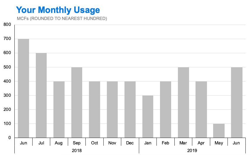
A friend of mine, Mark Bradbourne, recently posted a picture to Twitter showing a bar chart that his local utility company included in his most recent bill. He entitled the picture “Let’s spot the issue!”
So as to protect the utility company in question, I’ve recreated the chart below, as faithfully as possible. (There are, of course, many changes I would make in order to render this a storytelling with data-esque visualization, but for the purposes of this discussion it’s important that you see the chart as close to its original, “true” form as possible.)

The chart from Mark’s utility bill, recreated from the original photograph as posted on Twitter.
The internet immediately latched onto the seemingly absurd collection of months portrayed in this chart. The bill, dating from June of 2019, included 13 prior months of usage from as early as August of 2016, as recently as March of 2019, and in a random order.
Soon, our non-U.S.-based friends pointed out that the dates made even less sense to them, as (of course) their convention is not to show dates in MM/YY format, but in YY/MM format.
And with this, the truth of the matter became obvious: the dates were in neither MM/YY format nor YY/MM format; they were in MM/DD format, and excluded labeling the year entirely.
Whenever we run across these kind of so-called “chart fails,” it helps to keep in mind that whoever created the chart wasn’t setting out to be confusing or deceptive. The utility company clearly wanted its customers to be aware of their recent usage, and went so far as to show that usage in a visual format so that it would be more accessible.
The danger, though, is in the assumptions we make when we are the ones creating the chart. Specifically, in this case, there were likely assumptions made about how much information needed to be made explicit versus how much could be assumed.
The energy company likely thought:
The chart says that it’s showing monthly usage; and, since it shows 13 bars, the homeowner will know, or at least assume, that the bars represent the last 13 months in chronological order.
And in general, yes: that is what our first assumptions would be, if there had been no labels whatsoever.
In this case, the company chose to label the bars with a MM/DD convention, excluding the year—probably to denote what specific day the meter was last read, or on what specific day the last water bill was issued. But we very rarely see dates in MM/DD format when they cut across two different years. We’re trained to see date formats in the style of XX/YY being representative of months and years, not months and days. To interpret the chart correctly, we would have had to ignore and resist our personal experience with this convention.
So on the one hand, logic told us that the chart showed the last 13 months; on the other hand, our experience and the direct labels told us that it was mistakenly showing us 13 random months. What other elements of the chart, or other design choices, could have nudged us towards one of these interpretations over the other?
Perhaps if the chart had been a line chart rather than a bar chart, we would have been nudged into thinking that the data was being shown over a continuous period of time; this could have been enough to make the chart more easily interpreted.

The original chart recreated as a line, rather than a bar.
Or, if the labels had used abbreviations for the months, rather than numbers, we almost certainly would have seen the orderly progression of months more clearly.

The original bar chart, but with the months on the horizontal axis labels shown with three-letter abbreviations instead of numbers.
Another solution, one which would have almost certainly eliminated all confusion, would have been to include the actual year in the labels, or as super-categories below the existing labels.

With super-categories for the years along the horizontal axis, confusion is likely minimized.
We could also ask the question: Do we need to be so precise with our X axis labels that the specific day of the month is shown at all?
It doesn’t seem like it; especially considering that the data on the Y axis has most likely been rounded off, and is presented to the audience at a very general level.
Look at the level of granularity on the Y axis; although it ranges from 0.1 to 0.7 (in 1000s of units), every bar is shown at an exact increment of 0.1. It’s unlikely that a homeowner’s actual monthly utility usage is always an exact multiple of 100.
In this case, the labeling of the specific date on the X axis implies a specificity of data that the Y axis does not support.
Bar chart with more consistency of specificity between the horizontal and vertical axes.
The bottom line, though, is that the creator of the chart made assumptions about what they needed to show versus what they could exclude; and in making those assumptions, they inadvertently misled their audience in a manner that was very confusing.
It is important to focus your audience’s attention on your data in your visualizations, and to remove extraneous clutter and distracting elements—including redundant information in labels. This case, however, highlights the danger of taking your assumptions too far, and inadvertently adding confusion rather than clarity.
Sometimes we get so familiar with our own work, and our own data, that we lose track of what is, or isn’t, obvious to other people. During your design process, it can be valuable to get input from people who aren’t as close to your work. This helps to identify, and avoid, situations like this one, where familiarity with the data led to design choices that were confusing, rather than clarifying.
Putting yourself in the mind of your audience, and soliciting feedback from other people who aren’t as close to your subject, will help you to avoid these kinds of misunderstandings in your own work.