strip away the non-essential
I’m going to keep words in this post to a minimum, challenging you to first to practice the art of decluttering and then illustrating my process. Stripping away the non-essential is a critical step along the path to communicate effectively with data. Antoine de Saint-Exupery said it beautifully—and Catherine Madden captured it well—in the following image from Let’s Practice!

Chapter 5: Think Like a Designer | Knaflic, Cole. Storytelling With Data: Let’s Practice! Wiley, © 2019.
Let’s practice achieving this sort of perfection with a graph. Consider the following visual. What non-essential elements would you strip away? What other changes would you make? Grab a pen and paper. Make a list. Make assumptions freely for the purpose of the exercise.

Do you have your list? How many changes would you make?
There are nine changes I would to make to eliminate clutter from this graph and ease the processing of the data, plus a couple more to further improve effectiveness. The following shows my decluttering progression.
STEP 1: remove graph border

STEP 2: remove gridlines

STEP 3: change y-axis to millions of units and add title so this is clear

STEP 4: clean up x-axis by making years a super category

STEP 5: upper-left-most orient graph title and make it more descriptive

STEP 6: replace all those bars with a single line

STEP 7: reduce thickness of Plan Units line and render in more muted color
STEP 8: remove future months

STEP 9: label data directly

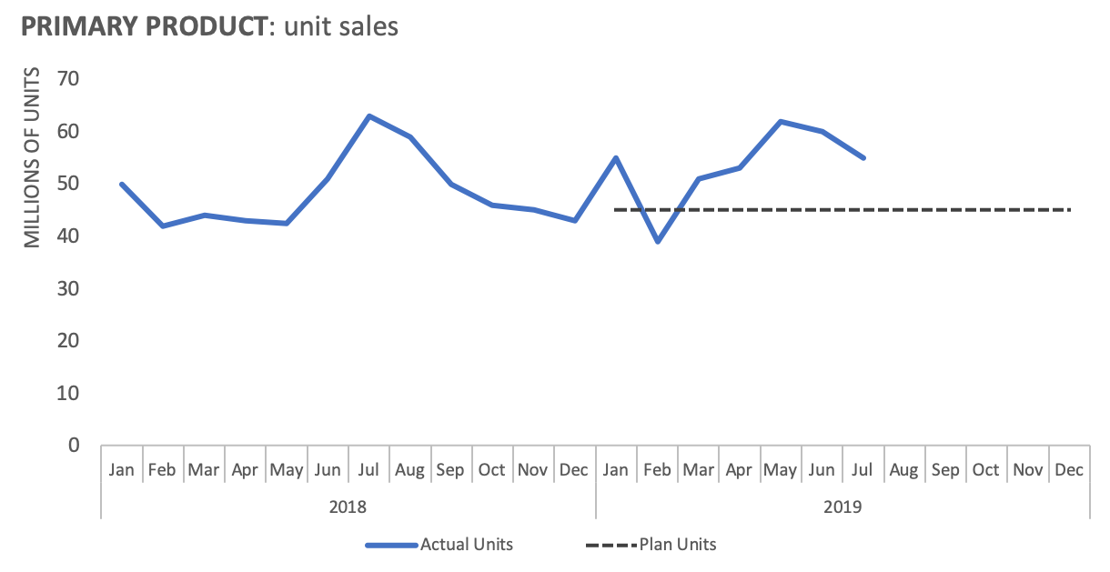
I’ve stripped away a number of non-essential elements and been thoughtful in my design. I don’t think we’ve quite reached perfection yet, however. Let’s take things a step further and also make the point clear.
We could focus on year-to-date plan:

Year-to-date actual unit sales have exceeded plan:
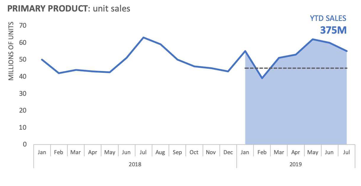
Let’s bring it all together—a decluttered graph where the primary takeaway is clear:

With the addition of some shading and words, we can highlight a specific takeaway: unit sales have exceeded plan so far this year. This is a success story! And it’s much easier to see now that we’ve stripped away the non-essential and made some other thoughtful design choices.
You can download my Excel file or view the GIF.
If you appreciated this illustration, be sure to pre-order your copy of storytelling with data: Let’s Practice!, where you’ll be guided through exercises to practice applying this and many other lessons for communicating effectively with data.