thoughts on trendlines

What are your thoughts on trendlines? This question was recently posed to me. While I briefly touched on this in a previous post, today I’ll expand my thoughts on trendlines and share an example.
A trendline is a line drawn on a chart highlighting an underlying pattern of individual values. The line itself can take on many forms depending on the shape of the data: straight, curved, etc. This is common practice when using statistical techniques to understand and forecast data (e.g. regression analysis). Determining the best fit and forecasting is beyond this article's scope, so if you’re interested in learning more, I recommend Anna Foard’s Stats Ninja website. Instead, I’ll focus on various considerations related to visualizing trendlines when communicating data.
Generally speaking, trendlines—and most statistical details for that matter—are more distracting than informative when shared in a typical business setting. There are exceptions to this, but we encounter far more cases with too many statistical details than necessary compared to the opposite scenario. Let’s look at an example from a recent workshop (details have been changed and withheld to preserve confidentiality).

If I observe my own process taking this data in, my eyes are drawn immediately to the two parallel lines. After that, I glance at the data markers. In this particular case, the trends and data markers are of relatively equal weight—both are bolded and solid in color, which influences how I process the data. Because we are predisposed to pay attention to contrasts and outliers, my eyes start darting between the individual points and the nearby trendline—meaning I’m assessing variability. This may make sense when exploring data, but is this ideal for an audience?
There’s likely more value in scanning the trend over time (eyes moving left to the right, unobstructed) or the difference between the two brands (eyes moving up and down between the two sets of dots, not pausing at the trendlines).
We could achieve either of those scenarios by establishing a visual hierarchy between the trendline and the actual data points.
Is the underlying pattern the main takeaway? If so, make the trendline the focal point and push the dots to the background.
Is the trendline more of a visual guideline, a supporting detail? Then emphasize the data points, and push the trendline to the background. (Be cautious here: if the trend isn’t visually obvious, you’ll likely be met with resistance.)
Check out the difference after adjusting the points of emphasis below. Notice the change in how your eyes move around the charts.

Consider, also, how minor design decisions influence interpretation. Trendlines can be easily misinterpreted by an unfamiliar audience. Is there a chance your trendline may be perceived as a matter-of-fact, rather than as an estimation? If so, clarify this through your design choices, so that the right conclusions are made (for instance, you could use a dashed line to convey uncertainty rather than a thick solid line).
On the topic of intentional decisions, footnotes can play an essential role when communicating technical elements in a graph—like a trendline. In the rare case when I’ve included a trendline, it’s been because I’m designing for a technical audience. In addition to the line, I might also add supporting details to help my audience buy-in to the trend. Consider sharing how you’ve treated missing values when fitting your line or any related statistics and information that is important. This transparency will set you up to have a more productive conversation with your audience instead of defending your analytical choices, as in this scatterplot example (an oldie, but good reminder of how statistics and visuals should complement one another).
Now that I’ve shared some considerations when using trendlines, let’s examine the case when including one doesn’t make sense. Will you have to spend more time explaining trendlines than the main takeaway? If so, maybe leave them out. In the example we’ve been looking at, we could remove the trendlines, and instead connect the individual points over time.
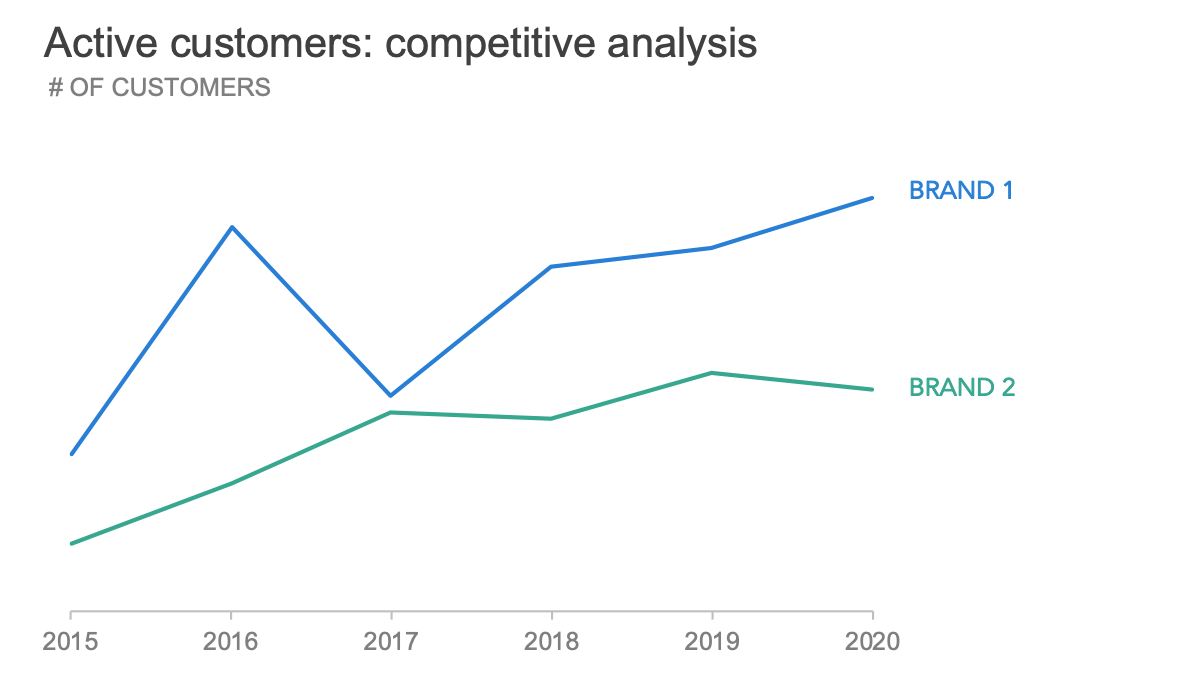
This minor change reveals important insights that were previously hard to see. Brand 2 has leveled out in recent years compared to Brand 1, which steadily gained (and maintained) active customers. Another benefit of removing the trendline: we now have more options for displaying this data. There is additional white space in the graph that could be used to annotate and provide important context. We are no longer constrained to showing the full history, so maybe a slopegraph showing the change from 2015 to 2020 could work. I could also imagine using a vertical connected dot plot to tell a story about the differences between the lines.
Any of these described views—including the ones with trendlines—might be an appropriate choice depending on the context. When it comes to communicating data, recognize that the views and techniques you leverage during the exploratory analysis phase may not make sense for explanatory analysis. While a trendline can help identify insights in your data, understand that for someone looking at your graph for the first time, that trendline may invite more questions than answers.
If you’re interested in learning more about choosing an effective visual and related formatting tips, check out Cole’s upcoming live event on graphing data.