alternatives to diagonal axis labels
There is one common phenomenon in graphs that I recommend actively avoiding: diagonal axis labels. They are often observed on the x-axes of graphs, where many tools automatically rotate text when the labels become too long to fit horizontally. While this might seem like a kind favor, there are usually better options. Beyond looking messy, diagonally rotated text is slower to read. In this short post, I’ll highlight two common scenarios that lead to diagonal x-axis labels—long category names on bar charts and long date labels on line graphs—and a couple ideas to try instead.
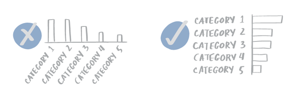
When category names are long, an easy change is to transition from a vertical bar chart to a horizontal one, where you simply have more space to write the labels legibly. I typically right align the axis labels when employing this solution, particularly if the label lengths vary. Doing so avoids the trapped white space that left- or center-aligned text would create between the words and the axis and data.
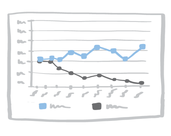
In the situation where date labels are crowding the x-axis, changing the way the axis is labeled will typically solve the problem. Often, the issue is that the date is format includes both month and year. Because we don’t need the year to appear with every single label, an alternative method I use frequently is to pull the year out as a super category (so it appears just once for each year) and abbreviate month labels so they fit horizontally. I often elect all capital letters for the latter; I like the rectangular shapes that result.

To take a turn employing x-axis alternatives to diagonal labels in your tool of choice, check out the latest exercise in the SWD community, which asks you to do exactly that for a provided example.
Speaking of tools, how to achieve the super-category labeling that I described above in Excel is a question people ask me frequently, so I’ve recorded a step-by-step video that walks you through two alternate approaches for labeling dates on a crowded x-axis that will help you avoid a diagonal x-axis.
While this may seem like a minor change, it’s little modifications like this that can sum up to create an overall better experience for our audiences.