words are your friend—when you choose them wisely
Have you ever looked at a graph and thought, I'm not sure what I'm meant to get out of this?
When communicating with data, we sometimes forget the importance of words. We might assume that numbers—and the charts that visualize them—speak for themselves. Quite the contrary! Words have a very important place when communicating with data because they help our graphs make sense to your audience (who doesn’t live in your head).
Here’s an example, excerpted from storytelling with data: a guide for business professionals. Check out how the text makes the data more accessible in the graph on the right compared to the original.

Before: intention is unclear

After: action and supporting context is clear
Let’s turn our attention to a cautionary tale. When we don’t choose our words carefully, they can have the opposite effect—resulting in our audience having to do unnecessary work to understand our graphs. This example is inspired by a recent graph makeover from one of our workshops (details have been changed to preserve confidentiality).
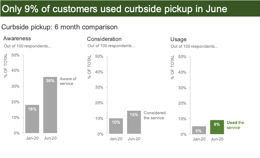
Consider the following visual. Before you study the data, read the headline, and make a note of what you expect to see in the graph.

If you’re like me, I expected to see a chart depicting a lack of awareness with a corresponding data point showing that 91% of surveyed customers have never used the service. Upon further examination, I figured out that these three charts holistically represent the inverse measures(s)—awareness, consideration, and usage—compared to what’s annotated as the takeaway title. With some mental math, I then reconciled the 91% non-usage rate to the 9% usage rate in June 2020 (far right data bar) but only because I had enough patience and time to undertake this task!
On a positive note, the designer of this original graph took care to put the main takeaway in words in a prominent place at the top. To further improve, we can alleviate some of the mental effort our audience might encounter with this visual by making a few alternative design choices.
One option would be to reword the takeaway title to reference usage rates and employ similarity of color to provide a visual cue to the data it describes.
Another option—particularly if the conversation is better suited towards where we can improve—is to preserve the original title but change the graph to a 100% stacked bar to visually show the magnitude of opportunity.

Both alternatives are shown below. Consider how the words chosen in these two views better enable you to see evidence of what they describe. You can download the data to see how I designed these two visuals in Excel.

This cautionary tale shows that if we don’t word our takeaways carefully, then our efforts (both in the analysis and the communication) might be for naught. In data visualization, words are our friend—but only if we choose them wisely.
For more examples of using words effectively, check out a power pairing and transforming slide titles. Take it a step further and build your data storytelling muscle with an actual dataset in the SWD community exercise words help data make sense.