a combo chart makeover
Every chart has its perfect use case—yes, every chart. I was reminded of this while working on a recent client makeover that included a combination chart.
For those reading who aren't familiar with combination charts (combo charts for short), these graphs display data in multiple forms within a single view. It could include a mix of bars, lines, dots, or areas. The most common variation merges bars and lines along two separate axes (also known as dual-axis or secondary y-axis charts).
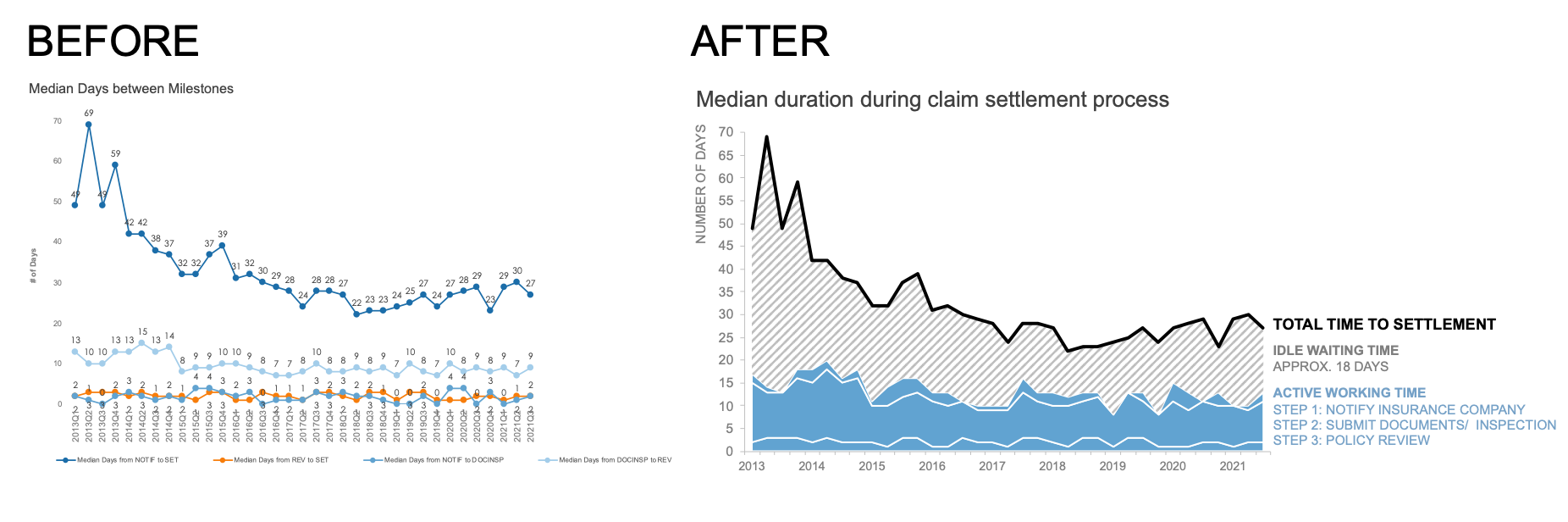
When sharing a makeover, typically I’ll show a side-by-side “before” and “after” view. This is a powerful moment for many audiences as they witness the dramatic impact of an effective graph. I share this with you, because until recently if a combination chart was found within my makeovers it represented the “before” state. That's because most combo charts are hard to read, so I tend to revise them into something simpler—like this makeover.
Today's article shows the inverse of that process, where, in order to make a visual more informative and easier to understand, I chose to transform the original, a “simple” line chart, into a more “complicated” combination chart.
Let's jump into the scenario. I'll take you through my journey and thought process, starting with the original line chart.

While the chart type itself was simple, the overall visual felt complicated. The data markers and labels added an unnecessary amount of visual clutter. Adding to that challenge, the tiny font size was impossible to read without squinting and/or zooming in. As I searched for context in the accompanying text, I struggled to make sense of the data; the meaning of the legend and title weren’t immediately obvious to me, particularly because I wasn’t aware of the acronyms.
I wanted to experiment with different views of this data, but first I cleaned up the original graph and modified the surrounding text to help clarify what I was seeing.

Writing out the acronyms and crafting a more specific title made it clear that the graph was describing an insurance claim settlement process. Amazing, isn’t it? Taking just a little bit of time to format the graph and add more descriptive language can make an impenetrable view so much more accessible to a wider audience.
After completing this step, I saw a pattern to the data that took too much mental effort to uncover in the original line chart. Do you see it? Let’s zoom in on the data labels.

Like any process—claims settlements included—there is a natural order amongst the steps. It’s important to retain this order in the visualization so an audience can connect the data in the graph with the actual real-world process. The challenge is that in a line chart, you cannot control the order of the series.
One way to gain control with lines would be to use multiple line charts, creating panels, and rearrange them accordingly. Panel charts offer additional space for annotations and encourage the reader to process each line separately. Depending on the scenario, this could be an alternative to the original line chart.
In this instance, I wanted to keep all my data in a single chart, for several reasons. With a unified view, it was easier both to see the median time spent for each step in the process over time, and to compare durations across the steps. Putting myself in my audience’s shoes, I knew I’d want to be able to answer questions like which part in the process is the most time-consuming, and how does it contribute to the total duration?
Speaking of the total, I was inclined to do some math to confirm that the sum of the incremental steps added up to the overall settlement time. (Every time we put numbers in front of an audience, if there’s math that can be done, your audience will do that math; moreover, they’ll use it as an opportunity to judge your credibility, so make sure your numbers add up!)
When I did that, I realized that the incremental steps always added up to less than the total amount of time. A story was starting to emerge!
To help emphasize this discrepancy, I chose to modify the view to display the steps in order from beginning to end, and then show how the total exceeded the sum of the three stages. I accomplished this with a combination chart—one composed of a line chart for the total duration and a stacked area chart for the other series. That looked like this.
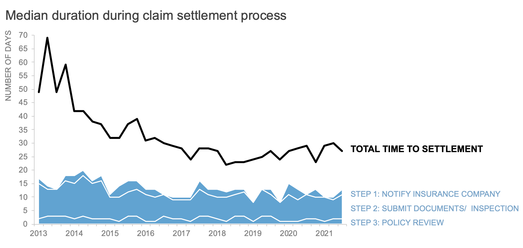
Using a stacked area chart gave me complete control over how I ordered the steps. Also, notice that I took the opportunity to remove the multiple colors and further refine the labels while adjusting each series. By using solid black for the total line and a single blue hue for the steps, I created the beginnings of a visual hierarchy within this chart.
I should also mention that I ordered step one to step three from top to bottom. You could argue to structure the first stack at the bottom and build incrementally to the total time spent. I prefer the top to bottom approach as this matches how I scan the graph, so it feels most natural. Another person may make a different, yet totally reasonable, decision to start from the baseline.

I was drawn to the mix of lines and areas because it not only allowed me to control placement within the graph, but also display the part-to-whole relationship between the steps and the total time. This was critical to reveal the insights that I wanted to bring to light.
Imagine that I’m sharing this graph as a way to call attention to the gap that exists between the active working time (steps one through three) and the total amount of time until a claim is settled. Perhaps I want my audience to consider how we might reduce the amount of time that a claim sits waiting to be worked on by an adjuster. With a few additional formatting steps, I could (and did) highlight that opportunity using this line-area combo chart.
Here is the final version of my combination chart, formatted to emphasize that gap between the active duration of each step during the claim settlement process and the idle time in between steps:

It’s always exciting when a data viz makeover brings you on an unexpected journey. I rarely use stacked area charts, let alone in combination with lines! That said, for this specific dataset and message, a more complicated combo chart felt more intuitive to process—to me and to the client— versus the original standard line chart.
The moral of this data viz makeover: never rule a graph type out. As soon as you do, the perfect use case may reveal itself.