my bars don't start at zero
Spoiler alert: I made a bar chart that does not have a zero baseline. I should add that this was intentional and not for teaching purposes, but rather because it seemed like the more appropriate solution for my given scenario.
It’s worth mentioning that there aren’t many hard rules to follow when building a graph, but starting your bar charts at zero is one that most data viz practitioners stand by. To that point, the SWD team emphasizes this rule in nearly every workshop we do. We’ve blogged about it. I even listed this zero-baseline rule as one of my design tips in the comprehensive what is a bar chart? article.
However, when I was recently remaking examples for a client workshop, I deviated from this advice. In today’s post, I’ll outline the scenario that caused me to break the rule.
The example: a sensory study
Here’s some context about the example we’ll explore. Details and numbers have been modified to protect confidentiality.
The client conducted a controlled study to better understand how baristas preferred alternative milk in milk-based coffee drinks. Historically, this company had been hesitant to include non-dairy alternatives on their drinks menu. In response to several customer requests, they are now open to adding a single non-dairy alternative but they want it to be as comparable to traditional whole milk as possible, and well appreciated by their baristas. The study compared almond, soy, oat, and pistachio milks against standard whole milk (the control). Baristas ranked their preferences along a 9-point hedonic scale from dislike extremely to like extremely.
The results of this test were originally displayed in a vertical bar chart that summarized the overall liking scores for each milk option across a handful of dimensions: appearance, taste, mouthfeel, and ease of steaming.
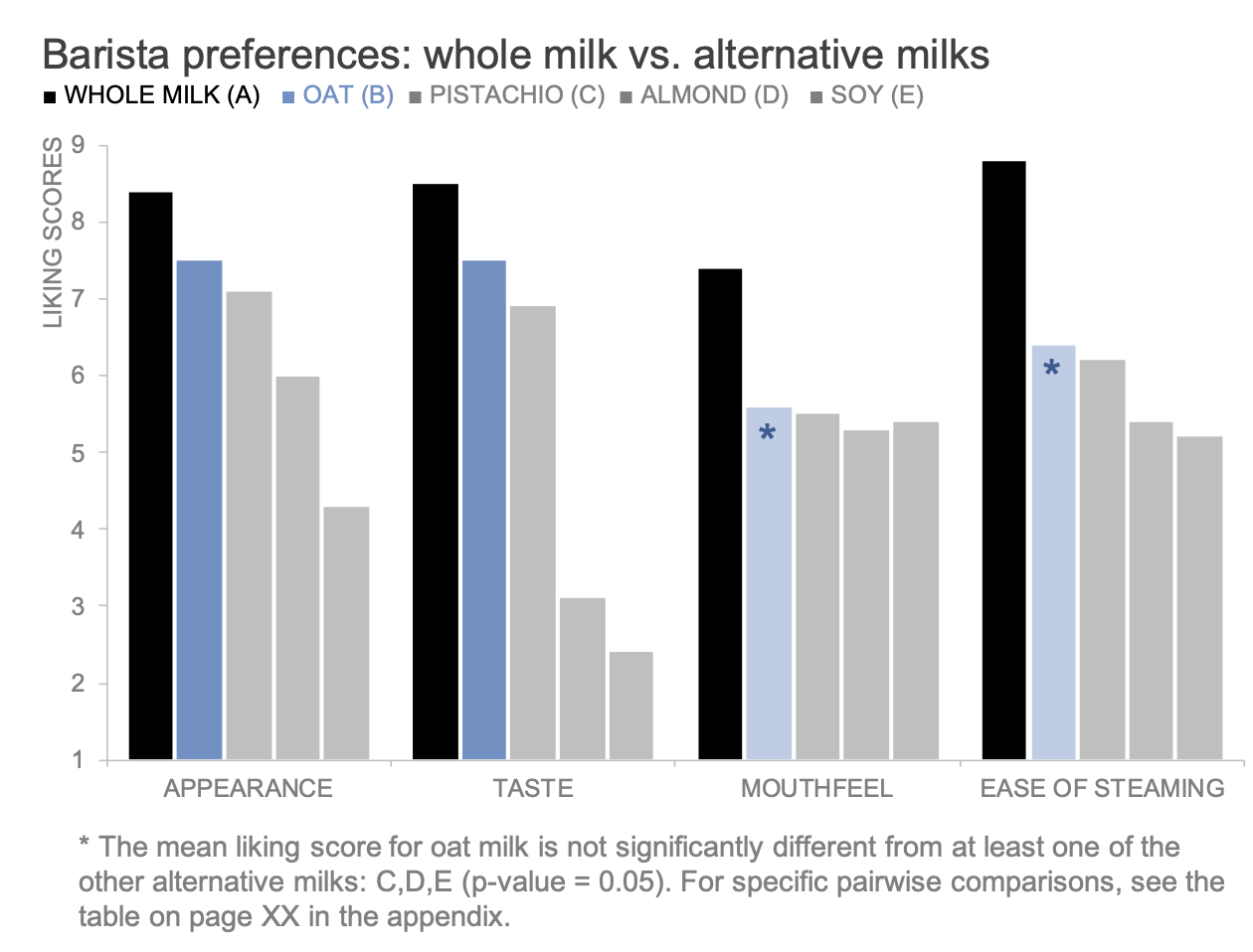
Two milk options are highlighted: whole milk is shown in black, and is the baristas' preferred milk across all dimensions. Oat milk is in blue, and scored favorably for appearance and taste compared to the other alternative milk options. The client used this data to make a decision about which alternative milk to add to their menu.
There is a lot to appreciate about the above chart, but at first glance, it seemed like a large offense to start the bars at one instead of zero—even if one is close to zero.
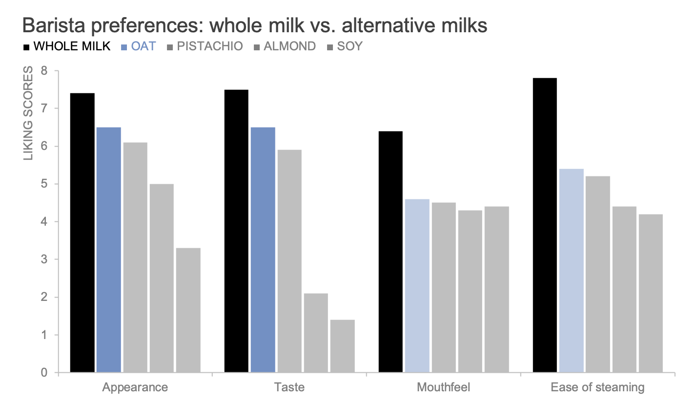
Before I share a version of the graph that starts at zero, it’s important to understand the data. The quantitative values (liking scores) on the vertical axis are a numerical encoding of categories, where one represents the lowest sentiment, dislike extremely, and nine represents the highest sentiment, like extremely. In other words, the numerical values are somewhat meaningless; any 9-point range of numbers like 0–8 or 16–24 could be used.
Let’s remake the chart, starting the baseline at zero this time.

With a better understanding of the data, I found the above “corrected” version problematic. Because the whole numbers map to categories, now the graph implies that there are ten possible categories, when in actuality there are only nine.
For this reason, I started to appreciate the original design. That said, I still was hesitant to fully accept a bar chart that doesn’t start at zero, so I continued iterating to see if I could find an alternative that wasn’t going to be so controversial. I’ve already foreshadowed that I opted for non-zero bars, but I’ll share my process of acceptance below along with some helpful learnings along the way. There are likely other solutions I didn’t consider—I’m curious what others have done in similar cases!
Option #1: adjust the scale
First, because the numerical scale represents categories, I considered using a different scale that starts at zero instead of one (zero to eight). That looks like the following.
This solution felt underwhelming and unnecessary. The only value is that it puts my concerns at ease because I’ve created what I consider to be a “correct” bar chart that starts at zero. I can’t comfortably say that the benefits outweigh the drawbacks.
The new scale from zero to eight risks introducing confusion for the audience because the graph no longer matches the original analysis and study results. Also, anytime you start transforming data—even with a simple offset adjustment—you risk human error and sacrifice clarity.
I decided to keep iterating and maintain the original scale of one to nine.
Option #2: hide the numerical axis
This solution may seem minor and a bit of a cheat, but: if the non-zero axis is the problem, why not just get rid of it?

I liked this version better than the previous one, but it doesn’t completely solve the zero-baseline problem. Without a vertical axis, readers might assume that the bars start at zero.
Also, it wasn’t until after I removed the axis that I realized its value. Showing the full range of options (one to nine) implies that this data has a ceiling and floor—it’s along a scale. Without the vertical axis, it felt like any numerical ratings were possible. I also lost the context of whether 8.4 was a good or bad result.
Going forward, I knew two things: I preferred the original numerical scale of one to nine over an alternative range, and I wanted to preserve the axis to show the full scale of options.
Option #3: use category labels instead of numbers
Adding the vertical axis back in, I decided to opt for the category labels instead of the numerical values. This was a challenge to fit in the vertical orientation, so I decided to display three labels with all nine tick marks: extremely dislike, neutral, and extremely like.

I also played with flipping the bars horizontally. This gave me a little more space to spell out the categories and make the labels easier to read (horizontal text is faster to read than vertical text).

For a couple of reasons, I liked the above iteration better than I anticipated. It takes into account the natural tendency to associate leftwards with negative feelings and rightwards with positive sentiments. Adding the category labels helped convey that these results are plotted along an ordinal scale. I also found the category labels to be a nice workaround for the non-zero baseline.
That said, this approach won’t work for everyone. Some audiences—mine in particular—prefer to see the numerical ratings along with their categorical mappings. My next and final iteration reintroduced numbers to the axis labels and was inspired by the previous horizontal orientation.
Option #4: use a different chart
I explored using a horizontal dot plot. Dot plots encode data by relative position in space rather than length, so the baseline of a dot plot doesn’t need to start at zero.

Personally, I love dots! They are exciting to look at, but they also make it easy to compare multiple dimensions (both horizontally and vertically). Also, out of all of the iterations, the dot plot has my favorite axis: a numerical and categorical combination. That said, this is not my favorite dot plot. Given the shape of the data and the number of values, it’s a lot to take in.
This was the client's sentiment, too. They noted that bars were simpler and also easier to make when they thought about replicating these charts on their own. That’s a fair comment and an important consideration when teaching about data visualization.
My final solution: bars that don’t start at zero
Each of my iterations taught me something new and allowed me to explore how minor design changes influence the way my audience interacted with the data. My audience had an attachment to the bars, which meant my final view would include bars, even if it felt wrong to me. I also explored new ways to show the axis, so that if I had to create bars that don’t start at zero I could make it seem like an intentional decision and not a glaring oversight.
Will I start making more non-zero bar charts in the future? No!
But this specific example illustrates that data visualization is as much an art as it is a science. It’s about thinking critically about the underlying context, the message, the audience, and best practices and using all of that information to guide your design. Sometimes this means you’ll break a rule or two, and if you do, do so thoughtfully.
My final makeover looks like the following.

I’ll be curious what others think about this scenario. Do you agree, or do you have different thoughts about how to show this data? Share your thoughts in the related community conversation.