how to do it in Excel: adjusting bar width
Elevate your skills with our on-demand learning course
Are you looking to create outstanding graphs and slides? Check out our new on-demand video course behind the slides: good to great PowerPoint presentations. In this comprehensive course, you'll gain lifetime access to 5 engaging learning modules featuring 30+ detailed lessons with over 75 minutes of high-quality video content. Learn at your own pace and master the skills you need to take your PowerPoint presentations to the next level. Enroll today!

Today’s post is a tactical one: how to adjust the widths of bar charts in Excel (and why you should).
Before we get into the step-by-step, I should mention that there aren’t any strict rules for optimal spacing between bars. Rather, it’s personal preference similar to wearing white after Labor Day (in the U.S., that’s the first weekend in September). As a resident of the muggy Southeast, I’ll be rocking white until fall temperatures arrive in mid-October. However, if you live in cooler climes and consider Labor Day the symbolic end of summer, your preference might be to say sayonara to white until Memorial Day.
The same gray area goes for optimal spacing between bars. The actual width is not set in stone. Our goal is to enable our audiences to compare the lengths of the bars (instead of the area between them), so general guidance is to thicken the bars to minimize the surrounding white space.
Let’s turn now to how to accomplish this in Excel. In the spirit of Labor Day, I’ll use some data from the Bureau of Labor Statistics (BLS) showing the top ten occupations in the U.S. as of May 2020.
Compare the bar spacing in the two visuals shown below:
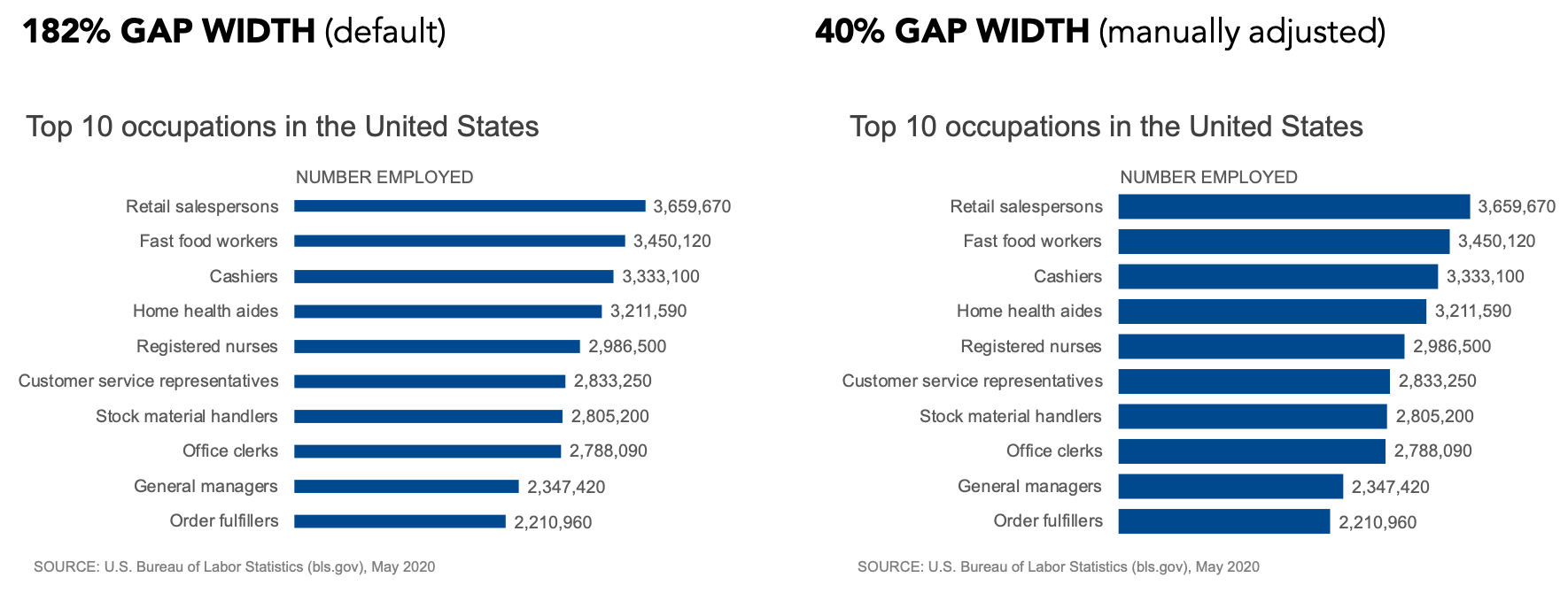
On the left, the gaps are attention-grabbing and create an unnecessary shimmer to the visual. The adjusted version puts emphasis on the length of the bars. Download the Excel file to following along with these steps to manually adjust:
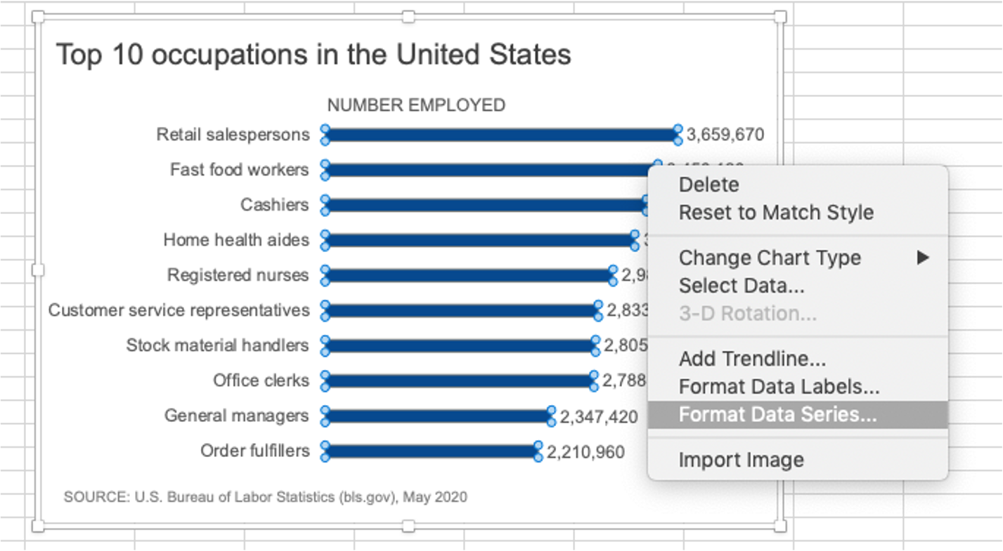
Highlight all the bars, right-click and choose Format Data Series:
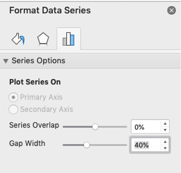
2. In the Format Data Series menu, under Series Options, adjust the Gap Width dialog box:
The result is this:

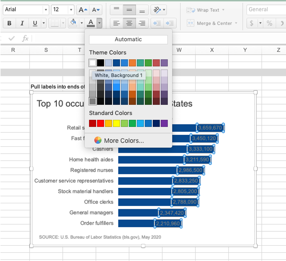
Another benefit of doing this is that now there’s enough space to pull the long data labels into the ends of the bars. This is just one of the decluttering steps we can take to reduce perceived cognitive burden. Here’s how to achieve this:
3. Click on any data label to highlight them all, then right-click and choose Format Data Labels:

4. In the Format Data Labels menu, select Label Options, and in the Label Positions section, choose Inside End. (While you’re at it, in the Label Contains section, uncheck “Show Leader Lines.” These are almost never necessary.)

My graph renders like this, due to my color scheme. I’ll adjust the font color so that the labels have sufficient contrast against the dark blue bars. (TIP: you can use the online WebAIM contrast checker to see if your text is sufficiently readable against your background color.)

5. To adjust the font color, click to select all the labels, choose the Font options dropdown arrow, and then select a different hue (you can also do this in the Format Data Labels menu if you still have it open):
The final visual looks like this:

I might even choose to further format the numbers by displaying the units in millions.
Just as the modern-day guidelines for wearing white after Labor Day are subjective, so too are the rules for the exact spacing between bars. As the designer of your own graphs, experience and personal preference will help you find your own “Goldilocks” of spacing: too thin, too thick or just right.

More Excel how-to’s:
To depict a range of values, add a shaded band
To create a frame of reference, embed a vertical line
To show a distribution of data, create a dotplot
For cleaner alignment, put graph elements directly in cells
To have more control over data label formatting, embed labels into your graphs
To make a stellar line graph, add thoughtful design elements (available to premium subscribers)