a diverging bar chart makeover: how to tackle the challenge of scope creep
Have you ever found yourself looking at a graph for the first time and felt immediately overwhelmed by the sheer volume of information presented? It can leave you wondering not only how to understand it, but also what decisions led to the creation of such a complex visual in the first place.
Nobody sets out to make a confusing communication. Most dashboards or visuals start out quite simple…but over time they may be leveraged to do more, provide more info, and support more requirements all at once. After all that, by the time you encounter it for the first time, it’s thoroughly impenetrable.
“Scope creep” is a blight that affects almost every organisation. During one of the recurring meetings that discuss the monthly report, someone requests new requirements. In the next month’s version of the report, there are additional slides providing an additional layer of insight. Through inertia or a loss of institutional memory, even if that insight is no longer necessary, the charts persist and are regularly updated; meanwhile, more new requirements regularly arise.
Sound familiar? This cycle can continue with further elements or more granular breakdowns being added. Creating the report takes more and more time and causes feelings of resentment and dissatisfaction from those tasked with doing so, as more manual updates, positioning of labels, and quality assurance are required for each refresh.
How do we tackle the challenge of scope creep, and bring overly ambitious and complicated slides back to a level of usefulness and clarity for everyone?
An example of this kind of visual came across our desks recently. Here it is below.

This data is from a hotel chain with locations across the UK. As with most analysis currently being conducted in the hospitality industry, the comparison here centers on the current year's data versus an equivalent position from 2019—the last “normal” year before the global pandemic. The original brief was to easily show if there are any cities that have notable differences in room booking numbers between the two years, and to assess the composition of bookings by room type. Gradually, as more and more labels and comparisons were added, these original goals became more difficult to find.
One challenge currently facing us is the chart selection. This particular diverging bar chart (also known as a tornado chart or butterfly chart) allows for a straightforward comparison of cities within a single year. For example, in 2019 (the leftward-pointing bars), it’s immediately apparent that London has the highest number of room bookings, followed by Birmingham and then Manchester. Comparing cities across the two years, however, is far more difficult. Without the use of the labels, did Portsmouth book more rooms in 2019 or 2022?
Within a city, the subdivisions of bars represent bookings by room type. The room type closest to the baseline, “single rooms,” is the only one that can easily be compared across cities, since it is the only one with a common baseline. Other room comparisons are difficult to achieve without referring to the data labels.
What would you do in order to make this chart less intimidating and overwhelming for a first-time viewer?
You can improve the graph’s readability by thinking about what dimensions of the data are critical for your audience to compare, and making that easy to achieve by intentionally placing those elements close together. Considering that the audience is used to seeing this data represented in stacked bars, you may choose to stay in the same neighbourhood with your revised view. One approach would be to group the bars together by location, rather than diverging away from one another. (One added benefit of moving away from diverging bars for years is that the graph becomes more versatile…after all, what direction would you go if there were ever a third year that needed to be included?)

Without the data labels, the bigger trends are easier to see—like, for instance, the increase in room bookings in Portsmouth, which was challenging to assess before. Changing the sort to something meaningful (i.e., in descending order of room bookings by city in 2022) highlighted something that could have been easily missed: single room bookings in London have decreased since 2019, from around 60 to approximately 10. By being more mindful of the way you visually organise the data, you can uncover potentially actionable insights like this one, which would have been nearly impossible to see otherwise.
A better understanding of the data has been achieved and some interesting insights have been discovered, but there is still a lot of information here. Given our audience’s interest in the overall room bookings, you might consider alternative visuals that use fewer colours, and don’t break down the data to such a granular level.

A connected dot plot allows a straightforward comparison of the change in room bookings for each location. Consider that since 2019, London, Cardiff, and Oxford have all had notable positive increases in room bookings, while Liverpool, Birmingham, and most noticeably Manchester have seen a marked reduction.
The year-to-year differences are harder to see in the smaller hotels, since the larger capacity locations dominate the visible range of the scale. You could solve this by focusing not on tallies of bookings, but instead on the percentage by which bookings increased or decreased in each location from 2019 to 2022.

The slopegraph provides a clear emphasis on the change between 2019 and 2022. Some hotels have recovered quickly from the pandemic and are establishing positive growth compared with 2019, but there are also those that are continuing to suffer from lower uptake. Indeed, as further exploration is conducted on this view, a geographical split is emerging between the hotels in the north of England and those in the south. All of the hotels in the south have seen a positive change whereas the opposite is true with their northern counterparts. Thinking back to the key objectives from the audience, this is a critical find and steps should be taken to update hotel management accordingly.
This would be a good time to think back to that decrease in single room bookings in London. You’ll likely want to develop an appropriate view to make this finding clear, as single room occupation in London from business travellers was historically a high contributor to room bookings.
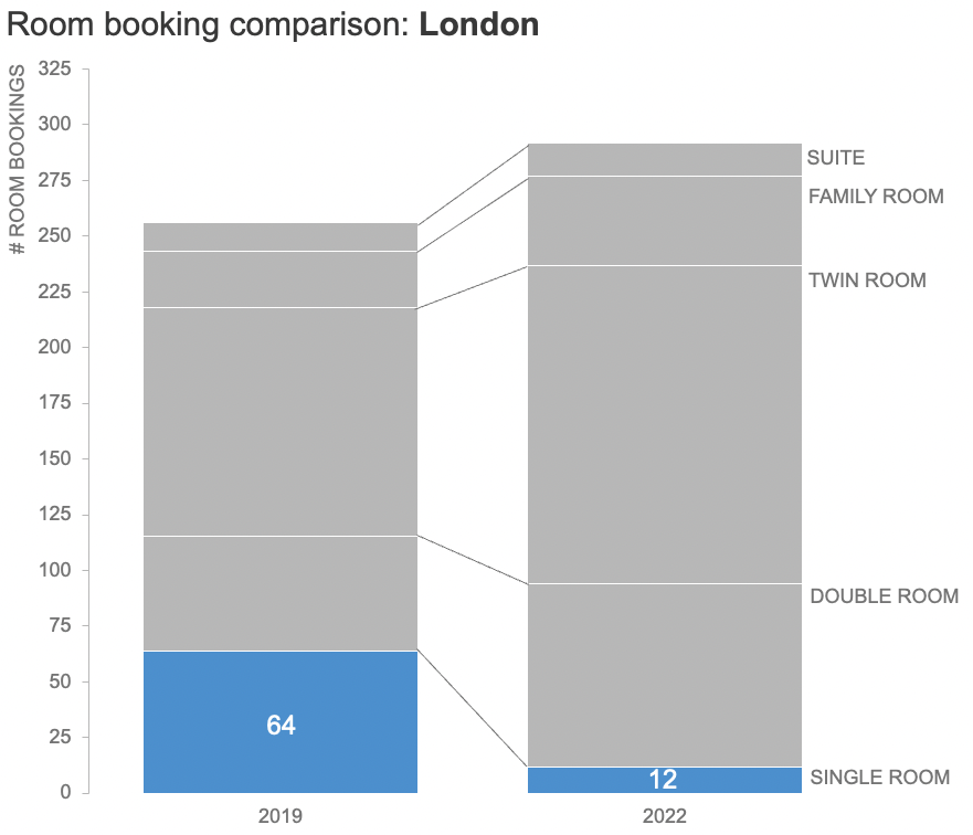
The stacked bar chart provides a clear view of the total room bookings and the positive story that overall bookings have increased. When you intentionally order and selectively colour the room types in the stack, however, you can also make this concerning decrease in single room bookings (from 64 to 12) clearly visible and attention-drawing.
Having been cognisant throughout of those original audience goals, you were able to use a variety of chart types to identify two compelling stories, which can now be presented to the hotel management team in a clear and impactful way with a recommendation for an intended course of action.

All of this data was present in the original visual, but multiple cycles of revisions and added layers of detail had buried the critical insights deep inside of it. Your focus on bringing your audience’s most valued comparisons to the foreground, and eliminating the less-important or extraneous material, made exploration of the data easier, and the findings more relevant. This process ultimately involved making different chart choices before creating a final slide centred on these actionable insights, rather than on the data outputs alone.

If you’d like to practice implementing these steps, browse the related Excel file to experiment with the datasets and created graphs.
For more examples of visual transformations, check out the before-and-afters in our makeover gallery. Then, practice honing your data storytelling skills by undertaking an exercise in the SWD community.