a glimpse inside our latest book
Long before I joined storytelling with data as an employee, I was a fan. Back then, in 2016, I was an analyst, and I discovered a book that would change the way I thought about my work: storytelling with data: a data visualization guide for business professionals. (Or, as we have come to call it within the company: “the white book”.)
I loved how practical it was, especially Chapter 9, "Case Studies." There was something magical about seeing the strategies described throughout the book applied to real business examples. Comparing the before and after views brought home for me just how dramatically visuals could be improved through simple, common-sense modifications.
After reading the book, I started following the blog, specifically for the makeover articles. Despite each transformation being rooted in the same core principles, each scenario felt fresh. There was always a unique challenge to consider: comparing data series with extremely different magnitudes; dealing with a large number of categories; or navigating a less-than-ideal brand color palette.
This is what I love most about data visualization and storytelling. It’s never the same! Every dataset and audience presents a different set of constraints to solve.
Since joining the company in 2019, we’ve added three (soon to be four) new books to the SWD library. Let’s Practice! (“the blue book”) is a workbook featuring hundreds of exercises to hone specific skills like choosing the right graph type and decluttering charts. In 2023, “the yellow book”, storytelling with you, was published as a guide for public speaking so that anyone—data professional or not—could learn to deliver better presentations. And last year, we ventured into the children’s space with Daphne Draws Data, showing kids that math and data can be fun! This year, we are returning to adults with “the teal book”.
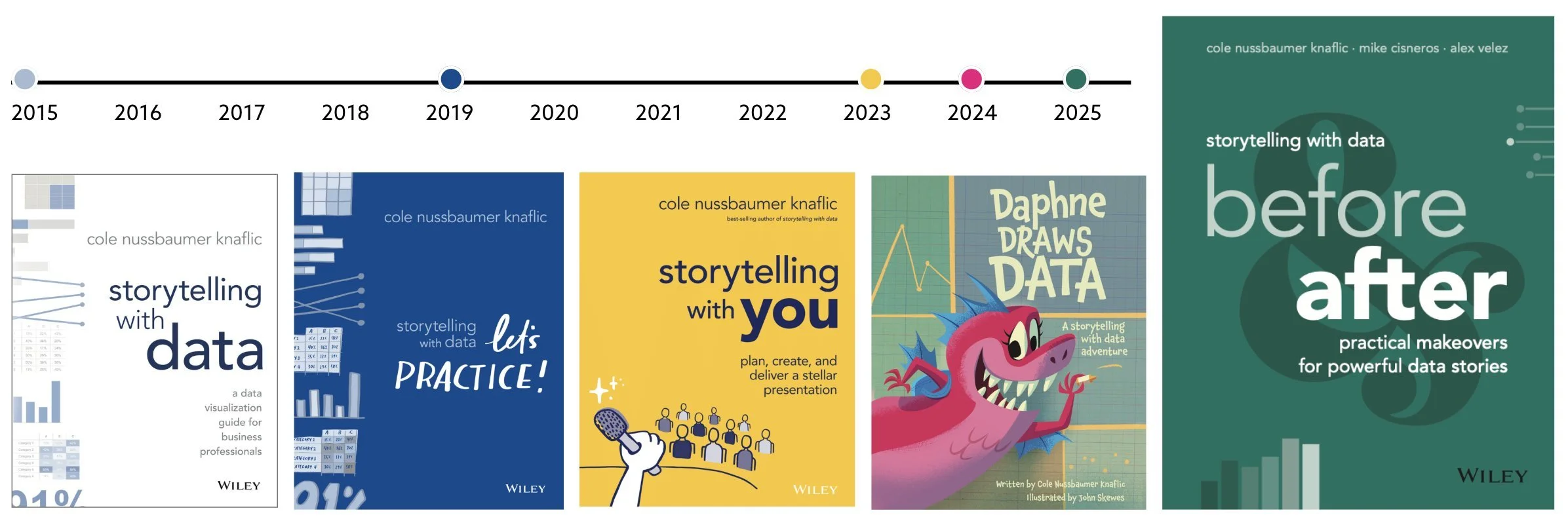
Announcing our new book
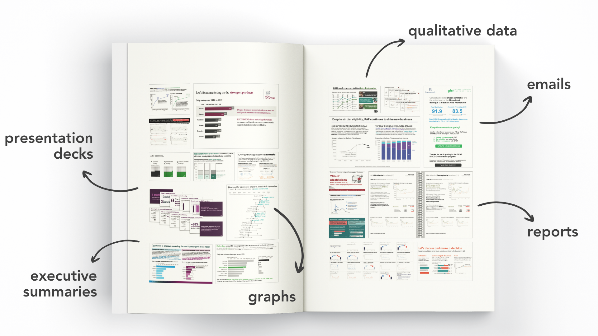
Reflecting on my journey creates a "pinch-me moment". It’s hard for me to grasp that I’ve gone from reader and fan, to employee, to author of the latest addition to the SWD library, storytelling with data: before & after. I wrote this book alongside my colleague and friend, Mike Cisneros, and, of course, our CEO and Founder, Cole Nussbaumer Knaflic. As a team, we’ve helped clients refine hundreds of real-world communications over the years. From those experiences, we’ve put together 20 case studies for before & after, sharing the process and lessons learned while we transformed their examples, all of which were carefully anonymized to protect confidentiality.
Because these case studies represent real client work we've done across various industries, the examples vary significantly. We show makeovers for ad hoc graphs, emails, dashboards, scorecards, reports, executive summaries, and even entire slide decks. There are qualitative datasets, maps, violin charts, survival curves, and, of course, the standard lines, bars, and pies.
Source: Knaflic, Cisneros, Velez. storytelling with data: before & after, Wiley, © 2025.
This is the book I wish I had when I was an analyst (before my time at storytelling with data). I can’t tell you how many times I searched online for inspiration or good examples of business graphs and slides that I could emulate. Most of the results were disappointing and could be grouped into two categories:
Overly colorful and dense visuals (a.k.a. bad examples), or
Diagrams and dashboards packed with circles. (Why are there always so many circles? Also, dashboards aren’t great tools for storytelling!)
I hope that storytelling with data: before & after will become a reliable reference and inspiration for others. But beyond that, I hope that with each makeover, readers will learn something new that they can apply well beyond the example.
What you’ll find inside
Step-by-step visual makeovers of real-world communications
From the folks who attend our workshops, to readers of our blog and earlier books, to viewers of our instructional videos, everyone unanimously agrees that they love the before-and-after visual transformations we create. We get it—we love to watch makeovers, too!
That’s why twenty of the twenty-two chapters are makeovers, each one illustrating a particular theme or constraint our clients faced.
For example, Mike worked with a client who struggled to find the right level of detail to share in their graphs. This client collected real-time data to monitor their call center, using graphs that resemble the following.

Source: Knaflic, Cisneros, Velez. storytelling with data: before & after, Wiley, © 2025.
Mike helped them understand that while high-frequency data is great when monitoring performance, it’s often too detailed to use in a presentation or report. For example, when providing an update on an outage in the call center, the data needed to be grouped into 10-minute intervals and broken down by day of the week (shown below). Throughout the chapter, he cycles through even more ways to aggregate the data depending on the message.

Source: Knaflic, Cisneros, Velez. storytelling with data: before & after, Wiley, © 2025.
By the way, if you want to explore this makeover in more detail, download our sample pack. It’s free!
Slick and thoughtful design
While I think the examples themselves are powerful, I’m also quite proud of the way the book’s visual aesthetic came together.
As you scanned some of the spreads shown throughout this article, you may have taken notice of the bold but clean designs. We worked hand-in-hand with our design team at Flight to make this book both accessible and visually interesting.
The final spread of each makeover chapter features a before-and-after comparison, along with a summary of the steps and lessons that made the transformation possible. Our goal for you, the reader, was to make it easy to quickly reference strategies as you apply the learnings to your own projects.

Source: Knaflic, Cisneros, Velez. storytelling with data: before & after, Wiley, © 2025.
Links to additional tutorials and live presentations
Throughout the book, we’ve added QR codes. These lead to video tutorials that demonstrate how to create specific charts, such as dot plots, or add animation to your charts in PowerPoint. For a handful of the presentation slide makeovers, we created video companions so you can not only read about how we redesigned the deck, but also watch the final presentation.

Source: Knaflic, Cisneros, Velez. storytelling with data: before & after, Wiley, © 2025.
I can only hope you’re just as excited about before & after as we are. The book will be available this September (available for preorder now). In the meantime, we’ve got you covered with some sneak preview content:
Watch Cole’s live presentation of her makeover in Chapter 20, where she transforms a colorful dashboard into a detailed presentation that drives action.
Download a free sample of the book featuring three chapters: the introduction, my first makeover in the book (Chapter 1), and Mike’s call center scenario shared above (Chapter 17).
Here’s to your next data makeover, whether it's a work-related visual, something prompted by our community site, or just a personal project. I hope you enjoy the process—there’s also something new to learn!
Do you want to learn to create and communicate a powerful data story? Join our upcoming 8-week online course: plan, create, and deliver your data story. Data storytellers Amy and Simon will guide you through the world of storytelling with data, teaching a repeatable process to plan in helpful ways (articulating a clear message and distilling critical content to support it), create effective materials (graphs, slides, and presentations), and communicate it all in a way that gets your audience’s attention, builds your credibility, and drives action. Learn more and register today.
