a wordy slide makeover
We enjoy sharing our makeovers with readers, both as inspiration for you and to synthesize and document our learnings. We’ve even created a page highlighting some of our past favorites, almost all of which center on numeric data, in the form of graphs.
Recently, I facilitated a workshop for a client that used very little numeric information. Given their specific needs and ways of working, I modified my typical teaching content to emphasize how to use other means of communication, like images and text, more effectively.
Oddly enough, while my slides looked slightly different, my talking points were essentially the same. With this latest round of makeovers, I learned that many strategies to improve quantitative charts also work for qualitative data communications.
Let’s consider an example.
A non-numeric example
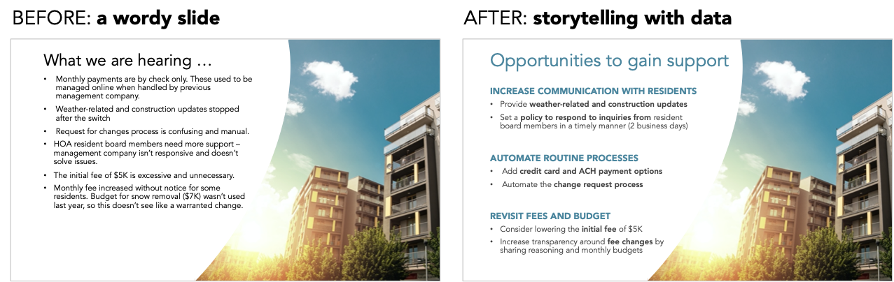
Imagine the following slide comes from a real estate company—let’s call them Mowers Realty—that manages several homeowner associations (HOAs). Mowers recently replaced another management company for a local community of condos. Unit owners were asked to complete a survey and give feedback on the management change.
The slide below summarizes the results.

I've seen countless business slides that resemble the example above. There is a bulleted list of related statements and an image on the side to fill the excess white space.
This slide doesn't immediately tell the story about the survey results. You have to read all of the bullets to understand the purpose, and probably ignore the image altogether.
Let's improve this slide by making three relatively minor design changes.
1. Create balance in the layout
Without going deep into design principles, think about creating balance in your slides, especially when two elements are on each side of the page. Symmetry is visually pleasing.
In the example above, the image on the right fills the entire height of the slide. This feels heavy when compared to the short block of bulleted text on the left. To improve the balance, I’ll adjust the line spacing of the bulleted list so that the text on the left fills the same amount of vertical space.

This may seem like a minor change—maybe even a step backward for some—but having both sides of the slide in balance, when combined with the upcoming changes, will make the final redesign more polished.
2. Format text to improve scannability
Having text-heavy slides when presenting live will cause you problems. While you’re talking, your audience will start reading what they see, and tune out everything you want them to hear. Many people mistakenly think that editing their slide text down from paragraphs to bullet points will be enough to counteract this. I like the intent behind this strategy, but just because there are bullets doesn’t mean a slide is no longer wordy.
Instead, see if there are additional ways to create scannable text. Can you use boldface or color to highlight important words? Can you add headers and sections to categorize similar items? Can you wordsmith your thoughts to be more concise?
I’ll make all of the suggested changes and even rewrite the slide title so that my audience understands the purpose of this slide without reading any of the detailed bullets. Scannable text is the goal!
The next iteration of this slide looks like the following.

There is a clear visual hierarchy now, which helps an audience process the information quickly.
The above iteration is an improvement, but you could even consider animating through the sections to control the amount of text shown at the same time during a presentation. The new section headers provide a clear structure to help you decide what to animate.

3. Use images that support the message
My final gripe with this wordy slide doesn’t have to do with the words at all: the challenge is the picture itself.
Images are powerful tools to use in presentations. There’s an entire chapter dedicated to using images in the latest SWD book, storytelling with you: plan, create, and deliver stellar presentations. To quote author Cole Nussbaumer Knaflic, “Pictures used well can be extremely powerful. They can help you explain concepts, increase understanding, maintain attention, reinforce content, improve memorability, and more.”
I’m not convinced the above stock picture of a residential building is doing any of those things.
My immediate reaction is to remove the image and lead with the text, but the picture is a legally approved slide design within the company-branded template. It makes sense why a generic photo is used, so I’ll keep this in the redesign. (Constraints are a reality. Try not to perceive them as limitations—with the right perspective constraints can help you uncover creative solutions.)
Consider how you feel when looking at the picture. Now, consider how you feel when reading the text. The picture is bright and sunny—it has a positive vibe. On the other hand, the text is negative—it feels bad. These two emotions are in direct contrast. If this image is required, I’ll adjust the framing of the message to lean more positively.

When I read ‘Opportunities to gain support…” and see the sun shining from behind a building, I can see the connection. There’s a light at the end of the tunnel; both the text and image feel hopeful when used in combination.
Check out the difference, starting at the beginning.
There are always opportunities to improve how you communicate, whether with quantitative data or without. The techniques I implemented above: aligning elements for balance, creating visual hierarchies, and matching words to images, apply to almost every form of business communication. These are fundamental skills that don’t require technical know-how, just a bit of thought at the onset.