an accessible makeover

We share data visualization makeovers to illustrate how seemingly minor changes can make data more accessible. Without additional context, the word “accessible” can take on a couple of meanings. “Creating graphs that are easy to understand” is one interpretation. Another is “designing charts that support people with various disabilities.”
Both of these meanings are valid and worthy goals. Unfortunately, many makeover efforts lean more heavily on the first interpretation—my own creations included. This isn’t to say that designing straightforward charts and being inclusive are separate endeavors, but more effort is required if the goal is to be accessible in all ways.
A few years back, Amy Cesal penned a guest post sharing five ways to make your data visualizations accessible—with the second definition in mind. You can read her post here, and I’ve also listed the suggestions below.
Add alternative text
Employ a takeaway title
Label data directly
Check type and color contrast
Use white space
Today, I’ll step through each of Amy’s best practices to create a fully accessible data visualization makeover.
I’ll leverage a chart from FlightView, a free resource to track flight and airport status. This is an awesome application I rely on regularly when traveling; however, I’ve always thought the charts could be more accessible.
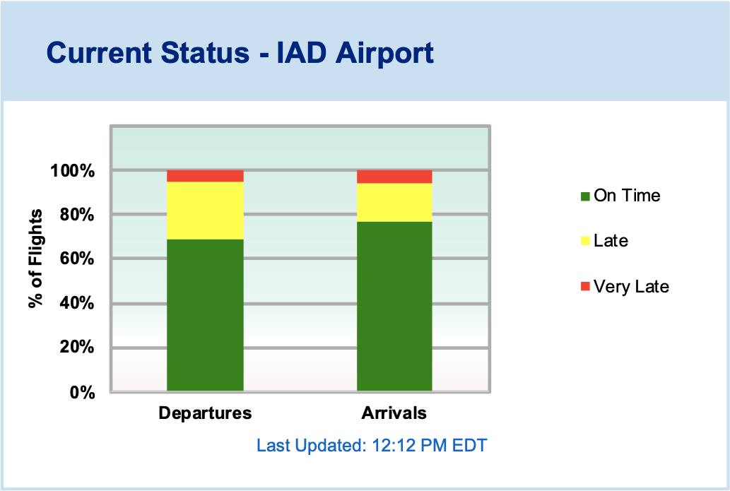
Source: https://www.flightview.com/airport/IAD-Washington-DC-(Dulles)/delay
So, let’s start with the first suggestion: to add alternative text.
Add alternative text
Now, I’ll be the first to admit that I’ve skipped writing alternative text too many times, and I need to do better. Alt text allows people using screen readers to interact with graphics and images. Amy suggests that alt text for data visualizations should be concise and include three things: the chart type, type of data, and the takeaway. Also, a link to the underlying data should be available in the surrounding descriptive text.
As far as I can tell, the original graphic does not include alternative text; however, a block of text nearby offers related information.

In the graph’s original context, this could be considered “enough” descriptive text to include; but often, graphs are plucked out of their original context and shared in other articles, presentations, and posts—just as I’m doing here. Including alt text in the original would mean that the explanation is then carried forward for any other future uses of the visual.
My alternative text for the above graphic could be, “100% stacked bar chart showing flight activity at Washington Dulles International Airport (IAD) by status with the majority of departures and arrivals currently on time or close.” For illustrative purposes, I’m assuming the graph is static, but the alt text would need to be dynamic if used on the FlightView site. I’ll also link to the data file at the end of this article.
Employ a takeaway title
Takeaway titles help all individuals looking at a chart understand the purpose. The current title is descriptive and leaves the interpretation to the user.
Let’s be more pointed.

Label data directly
By default, many tools add color legends to charts. Keep in mind, though, that the farther apart a legend is from the data, the more work it is for someone to scan between the two, which slows down and complicates the process of understanding the visual. Legends can also be problematic if the colors aren’t easily distinguishable, so removing the legend and labeling data directly is a good habit when possible.
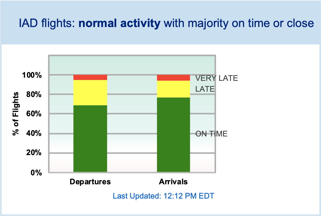
While I do have plenty of space on the right side of the bars, the gridlines and background shading make the labels look messy. We will address this in the next step.
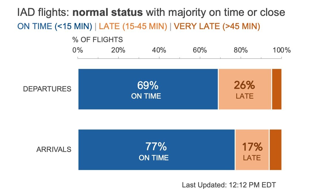
Check type and color contrast
Sufficient contrast among the colors in your viz, and between any text element and the background color it appears on, is essential for accessibility. Fortunately, there are several free, online tools available to help identify any problem areas. I’ll use the colorblind simulator Coblis and the WCAG contrast checker extension.
First, let’s look at the results of our colorblind simulation.

The red and green sections are not easily distinguishable. Fortunately because I labeled the data directly, one can still determine that the majority of flights are on time and a small portion are very late.
Next, let’s see what our contrast checker thought of this visual.

The contrast checker helps me realize that the tiny blue footnote could be challenging to read. Also some of the data labels are challenging to see against the chart background.
Let's update the stack colors to use complementary colors (orange and blue), remove the chart background, and improve the footnote's visibility.

Use white space
Typically, I advocate for removing outlines or borders around data, but white outlines are the exception. Adding a white border (on a white background) helps to visually separate each section in a stacked bar chart (or a pie chart) so that they don’t bleed into one another.

Final thoughts (and makeover)
I’m pretty happy with the improvements here. The best part is that all five of these steps were super quick to implement, which means that in a matter of minutes your visuals can go from impenetrable to accessible.

Now, are there more changes I’d like to make? Yes! I’m not a fan of the light blue background shading and border. I’d also prefer to orient this chart horizontally (a personal preference), widen the bars, clarify the categories, remove some of the boldfacing, and even label the key sections. Altogether my final tweaks could look like the following.
Creating accessible designs is important, and should become a regular part of the design process. (I’m speaking to myself!) If you’d like to practice implementing these steps, check out the exercise in the community to create your own accessible data visualization makeover, or browse the related Excel file to experiment with the above dataset.