better than a big bar chart
Maybe this has happened to you: you’ve been presented with either a super wide or super tall bar chart that compares two different data series across dozens of categories.
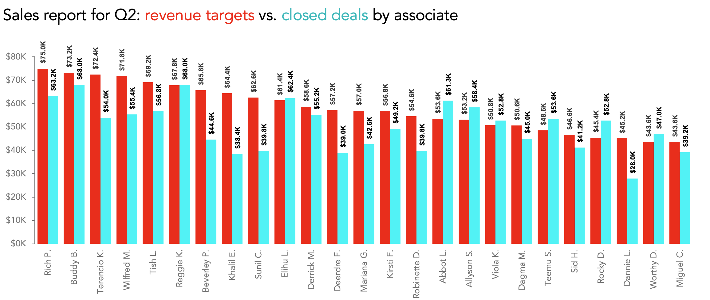
You try to make sense of the comparisons across the entire graph…but with so many bars of alternating colors, it looks less like a data visualization and more like a test pattern, or an old-school 3-D image that you can’t see without those red-and-blue glasses.

Let’s take a closer look at that extra-tall bar chart. I came across a graph like this one when working with a recent client. They created a visual to compare the quarterly sales revenues for each of 25 different sales associates against their individual sales targets.

I took two different approaches to strengthening this graph: the first one keeps the same chart type but uses more approachable design choices; the other leverages a less-common but powerful visual, specifically well-suited to making these pairwise comparisons easy to see.
Option 1: Fill the thermometer
The first option for improving this view stays within the bar graph family. Instead of pairing bars and asking an audience to try to keep track of those alternating data series, I took inspiration from traditional fundraising posters. As they encourage prospective donors to “fill the thermometer” in order to meet a revenue goal, I also created thermometers to represent our Revenue Targets series. Instead of teal, solid-filled bars, I changed them to be outlined but unfilled.

Then, I filled the thermometers with the actual sales revenue each associate generated in Q2:

Aside from the obvious improvement in aesthetics we gain by discarding the garish red and teal, we also benefit by getting more vertical breathing room for each row of data, since each associate’s two bars are now overlapping one another.
This is a good solution when most or all of the actual data is below the target value, but it’s still a challenge to see which, if any, sales associates exceeded their targets. In fact, eight of the 25 did, so we could also use different intensities of blue in our Closed Deals data series to highlight those overachievers.

As much as I like this visual metaphor of filling a thermometer, we can also use a different option that isn’t quite so ink-heavy.
Option 2: Connect the dots
If we don’t restrict ourselves to just using bar charts, we can use an even better way to highlight these comparisons. By implementing a slightly different graph type, we remove a lot of extra visual clutter, lighten up the view for an audience, and give ourselves the chance to add in thoughtful labels and annotations. The graph type I’m talking about is a connected (Cleveland) dot plot.
You could think of this visual as a variation on the “fill the thermometer” chart, except that instead of drawing full bars, you’d simply put data markers where the ends of the bars would be, as I did here:

Here, I chose to represent the target value as an open circle, and the actual sales as a filled blue circle. Sometimes (as in this example) you’ll see lines connecting the two dots—charts like these are sometimes called barbell graphs. If there are multiple dots per row, a line may connect the dot with the largest value to one with the smallest in order to make the full range for that row easier to see.
Since this view is sorted in descending order of sales target, there’s a visually appealing diagonal spine that runs down the center of our chart. From that spine, little lollipops pop out to the left (if the associate didn’t make their target) or to the right (if they did). The directionality of the solid marker, in contrast to the open Revenue Target marker, helps to show who made or missed their goals. My personal feeling is that more emphasis is needed, so I made more intentional use of color to make that message explicit.

At a glance now we can tell that anyone whose name is in orange, and whose marker is in orange, failed to meet their sales target. (The color of the barbell itself could also be changed to match the marker, but I chose to forego that just as a personal preference.)
When I was working on these visuals, I was not sure what relationship in the data my client cared most about. Did they want to highlight top revenue generators? Celebrate overachievers? Call out the people who missed the mark by the greatest amount? Our sort order would change depending on what point of emphasis they wanted.
For example, re-sorting based on the greatest difference between target and actual sales created a less elegant-looking graph, but one that drew attention to the associates who went above and beyond expectations.

Eventually I settled on a sort order that prioritized the amount of revenue each associate brought in, regardless of their target:

Having decided on a graph type, color choices, and a sort order, it was time for some finishing touches. There are a couple of inherent challenges with connected dot plots: the reliance on gridlines to connect the data labels to the data markers, and the distance your eyes have to travel to connect those labels and markers at all.
I do like the consistent alignment of the associates’ names along the vertical axis, but in the end I thought it was more important to bring the labels and the data markers closer together. I chose to align the names either to the left or to the right of the Closed Deals markers, depending on whether the associate beat the sales target. (I also included the actual sales amount in the data label.) This allowed me to get rid of the gridlines entirely and gain a bit more horizontal space for my plot area.

Dot plots are woefully underused in most business communications, and I have my suspicions as to why. Although you can create them in just about any tool, connected dot plots are not available as default graph types in Excel, PowerPoint, Power BI, Tableau, Qlik, Domo, Looker Studio, or MicroStrategy. (They are, however, in basic libraries for R and Python, and are easily created with online tools such as flourish.studio and Datawrapper.) Even so, it is fairly easy to find step-by-step instructions online for creating these charts in your tool of choice.

Whether you would prefer to stick with the “fill the thermometer” style bar chart, or are motivated to give connected dot plots a try, either option is an aesthetic and substantive improvement over the endless alternating bar chart. Your audience will thank you for it.