order in the sort!
When you’re visualizing categorical data, sorting the bars in your chart is usually a straightforward task. Or is it?
In most cases, you probably take the category with the largest value and stick that in the prime spot, the leftmost slot on the horizontal axis. Then, you proceed from left to right in descending order of value. Easy peasy.

OK, sure, sometimes you want to emphasize a metric where a lower value is better or more important, and in that case you might sort by ascending bar values instead.

Or perhaps you have a large number of categories, and you want to make it easy for a wide audience to find any particular category quickly. In that case, you may choose to sort your bars alphabetically by category, rather than based on any particular value.

Be careful, though! All of these sorting options presume that each of your categories is of equal weight, and that there’s no inherent natural or implicit order to them. When that isn’t the case, you can unintentionally confuse an audience by sorting your charts in a way that feels unnatural.
For example, which of these two charts feels “correct” to you?


Even though there’s a descending sort in the left chart, the categories themselves are ordinal—they represent a position in a sequence. It’s strange to see time, or ages, presented in a way that doesn’t follow their usual sequence. In the Western world, we typically perceive time as flowing from left to right, so an audience will likely find it challenging to consume a visual that depicts it otherwise.
What about these two charts? Which one feels more correct?


Again, there’s a natural sequence in these height ranges. A reader would expect them to be in that order in the graph, regardless of the values encoded in each bar. The version on the left is jarring to read, while the version on the right, with heights in a consecutive order moving from left to right, feels fully intuitive.
How about these?

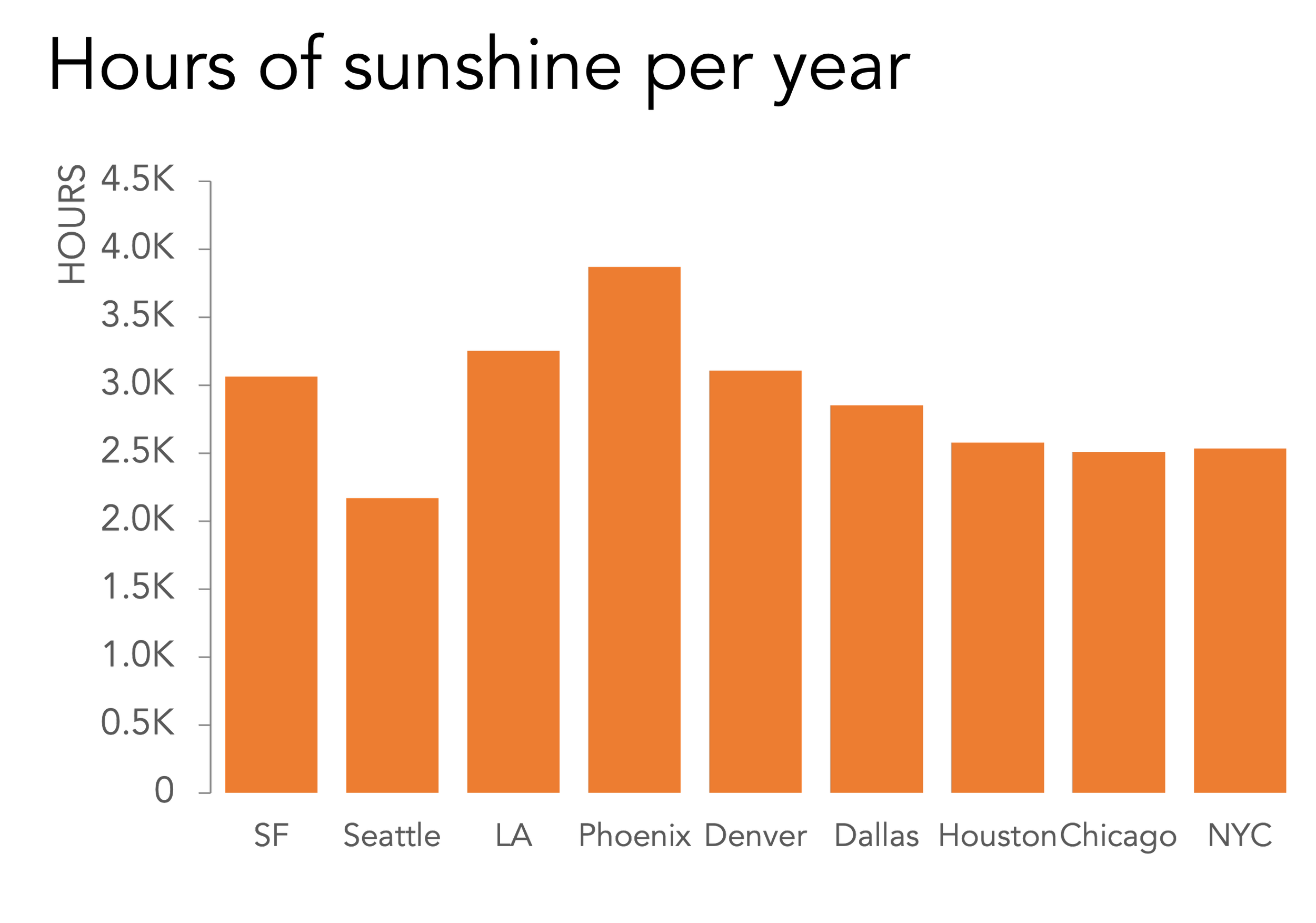
This one is a bit more of a gray area. Does it make more sense to depict these cities in geographic order, from westernmost to easternmost? It might, if the data itself were related in some way to longitude or geography in general. While this dataset, sunny days per year, is somewhat related to geography, it doesn’t have much of a west-to-east bias. Sorting these bars by value, rather than location, makes more sense here.
Finally, what about these graphs?


We might sort the actors who have played James Bond in the order they first took the role, rather than by the number of appearances. Is that preexisting sequence important enough to take precedence over ordering the chart by movie count? Perhaps you want to show that after the iconic Sean Connery, finding the next long-term Bond took a couple of tries, or that something similar happened after Roger Moore as well. It all depends on your audience and the particular message you want to deliver.
Although it’s often suggested that categorical data can be sorted and displayed in any order, it’s worth taking the time to think through our chosen layout. By considering any natural or commonly-understood ordered relationships among our categories, and weighing those against the message we want our audience to come away with, we’ll be able to select the ideal sort order for our chart, and avoid any unnecessary or unintentional confusion.