structure your slides
When we think about communicating with data, a lot of energy goes into the graphs themselves—which chart type to use, how to label it, what to highlight. But there’s another decision that shapes how well your message lands, one that doesn’t always get the thought it deserves: how do you structure the slide itself?
The layout of a slide—where the graph lives, how much space text gets, how the eye moves through it—is not only an aesthetic choice. It’s a communication choice. Get it right and your audience follows your logic effortlessly. Get it wrong and even great graphs can leave people confused.
One useful concept here is vertical logic. This is the idea that all information on a given slide should be self-reinforcing. The content reinforces the title and vice versa. The words reinforce the visual and vice versa. Nothing extraneous, nothing unrelated—just a clear flow where a reader’s understanding deepens with every element they encounter. (You can read more about vertical logic, alongside its companion concept horizontal logic in storytelling with data.)
My colleague Alex builds on this in storytelling with data: before & after, introducing two go-to layouts for putting vertical logic into practice. All of the examples in this post are drawn from that book.
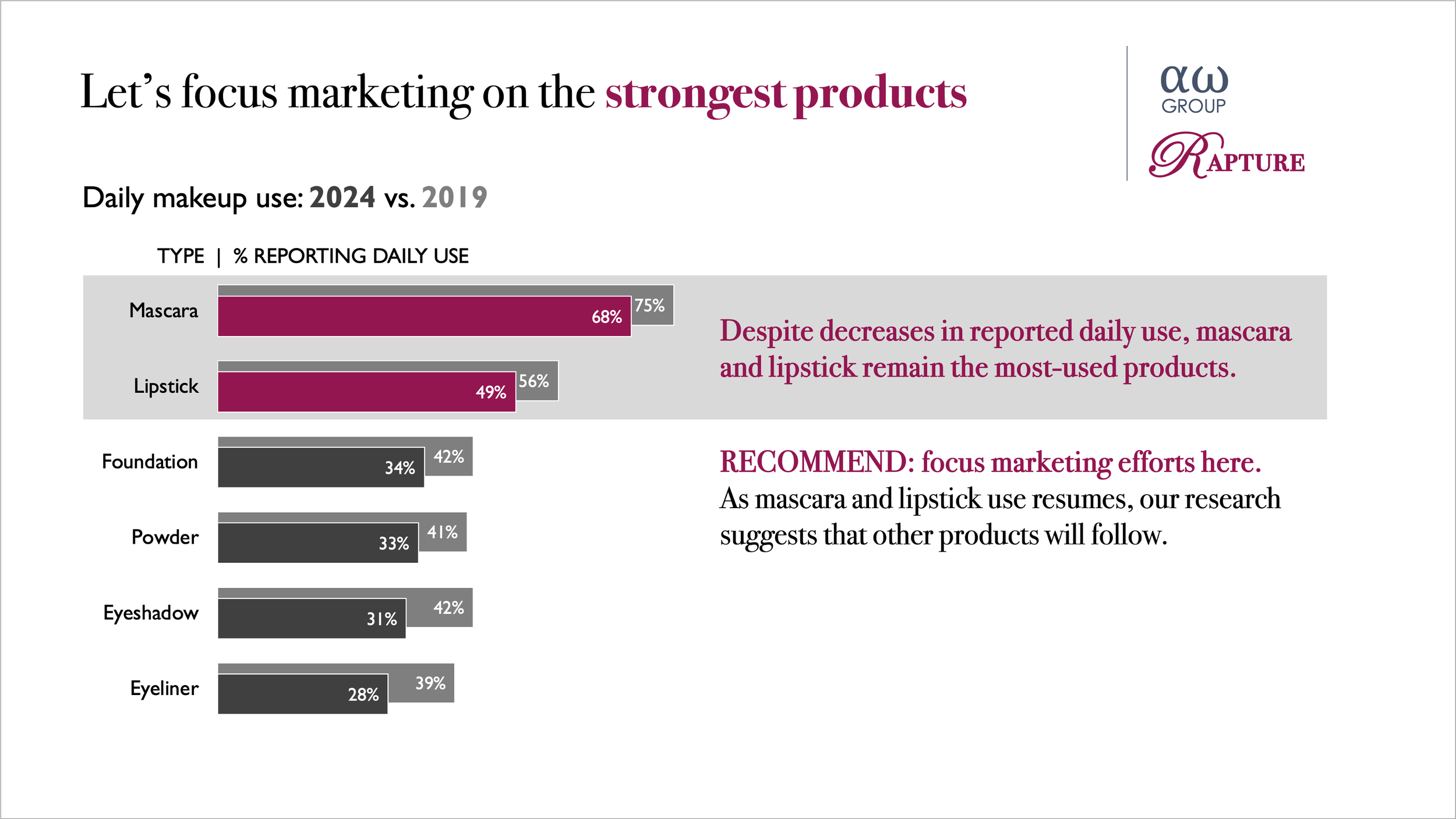
The one-sided layout gives a single graph a large, prominent position, with space for text across the top and to the right. This leverages the picture superiority effect: people notice images faster, understand them more easily, and remember them longer than words alone. Lead with the visual, let it do the heavy lifting, and use the surrounding text to frame and reinforce the message. In before & after, we use this structure to communicate a succinct marketing recommendation.
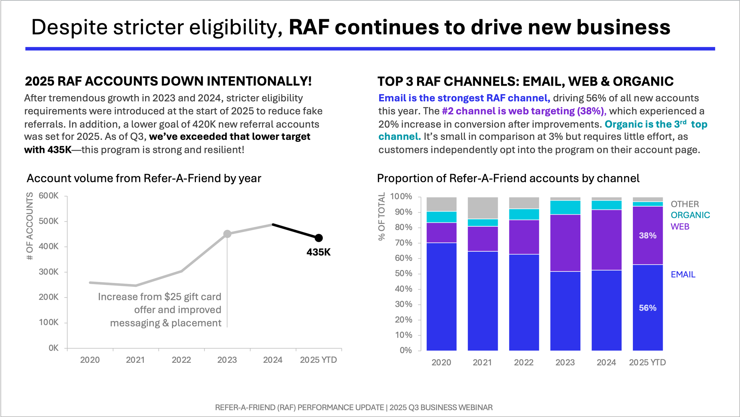
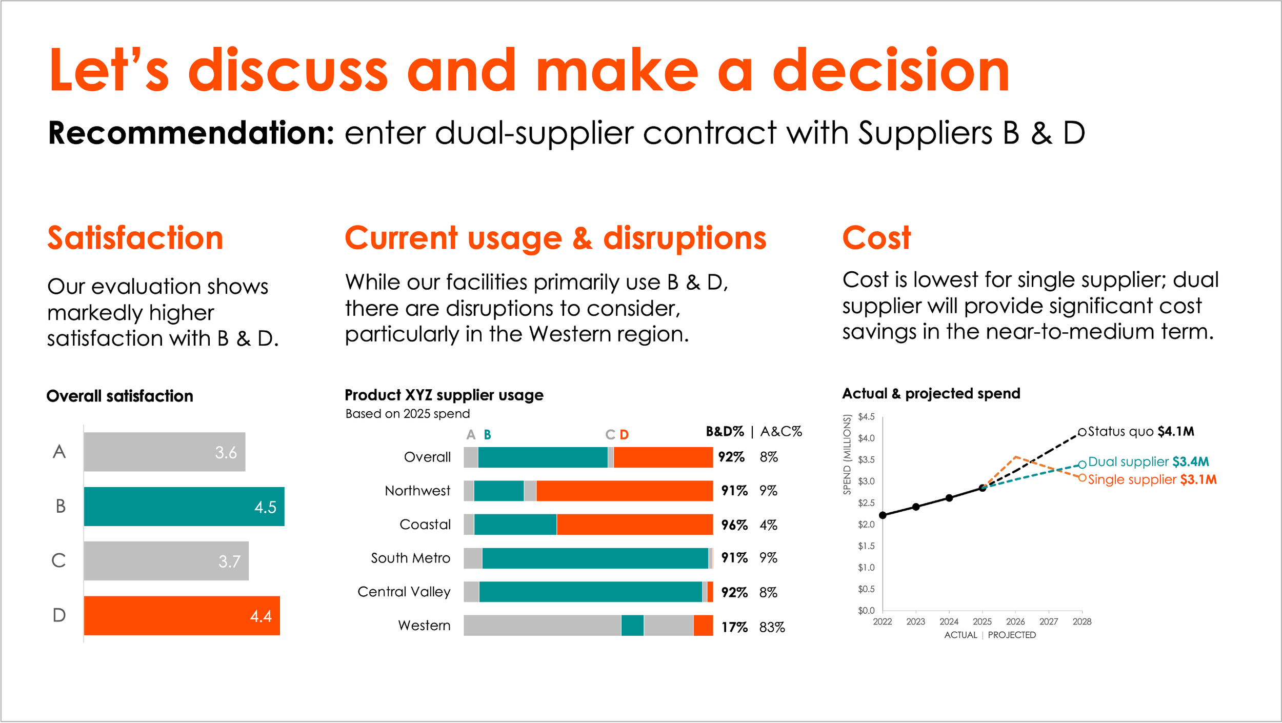
The two-sided layout divides the slide into vertical sections, with text and graphs on both left and right. This is a good choice when you’re working with a direct comparison between two scenarios—for example, a current state versus a proposed one—where you need the audience to hold both in view simultaneously. It also works well when your story has two natural paths that belong together on the same slide, for example trend over time and composition breakdown, as illustrated below.
Knowing which to use comes down to one key question: will you be there?
If you’re presenting live, you have much more flexibility. You’re present to guide your audience through the content. You can use animation and progressive reveal to build the story beat by beat. In that context, a single graph per slide often works beautifully. The slide supports you; it doesn’t need to stand on its own (or have many words).
If the slide needs to stand alone—as a leave-behind after a meeting, a one-pager for people who weren’t in the room, or a single slide within a larger update like a quarterly business review—the calculus shifts. Now the slide carries the full weight of the communication without you there to narrate it. That’s when structure and narrative text become essential, and when the one-sided and two-sided layouts we’ve discussed really earn their keep. You may also simply face the practical constraint that everything has to fit on one slide. These layouts give you a principled way to work within it.
It’s worth asking this question explicitly before you start building: Will I be there to walk people through this, or does the slide need to do the work itself? The answer shapes almost every layout decision that follows.
And of course, two layouts aren’t the only options. Sometimes the story calls for more. For example, below is a three-graph slide I created—more visual evidence to support, still laid out in a way that preserves clarity and flow.
Whatever the configuration, the goal is the same: a slide where every element earns its place and the whole is more than the sum of its parts.