#SWDchallenge: known to novel
“Just a handful of common visuals will meet the majority of your everyday needs.” This is a sentence I’ve said more than once when teaching people to create graphs that make sense in a business setting. That doesn’t mean that there aren’t situations that call for a more novel approach. It does mean that we need to be thoughtful in how we approach these scenarios when we are using the less familiar visual to communicate to others.
When I’ve needed to do this in the past, one strategy I’ve relied on is to show and explain the transition from known to novel. Let me illustrate.
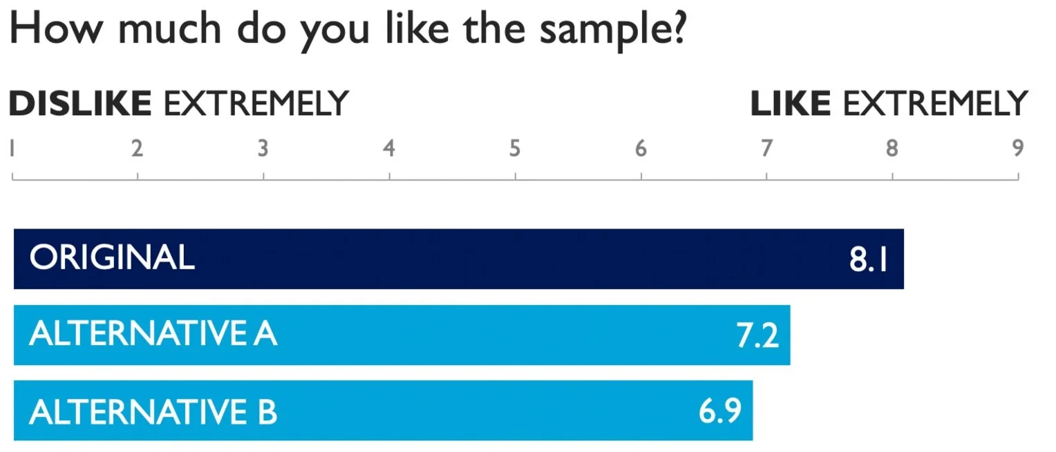
In my new book, storytelling with you: plan, create, and deliver a stellar presentation, one scenario uses a bar chart to introduce a dot plot to a mixed audience in a live setting. Below is the initial bar chart.
After building up to the bar chart and explaining how to interpret it, I replace the ends of the bars with circles. This is particularly powerful live, when you see the circles appear over the ends of the bars.
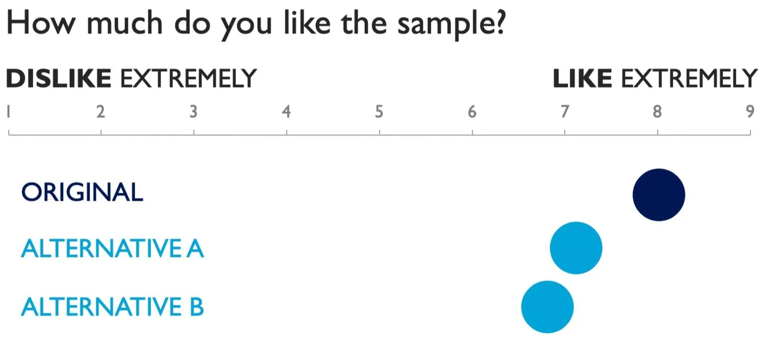
When transitioning from known to novel in a live setting, it can be useful to focus people on a specific data point in the known view, and then use that to reorient your audience in the novel view. For example, I could call attention to the 8.1 overall liking score for the Original bar, and then call attention to the circle for Original in this latest view, which depicts that same score of 8.1.
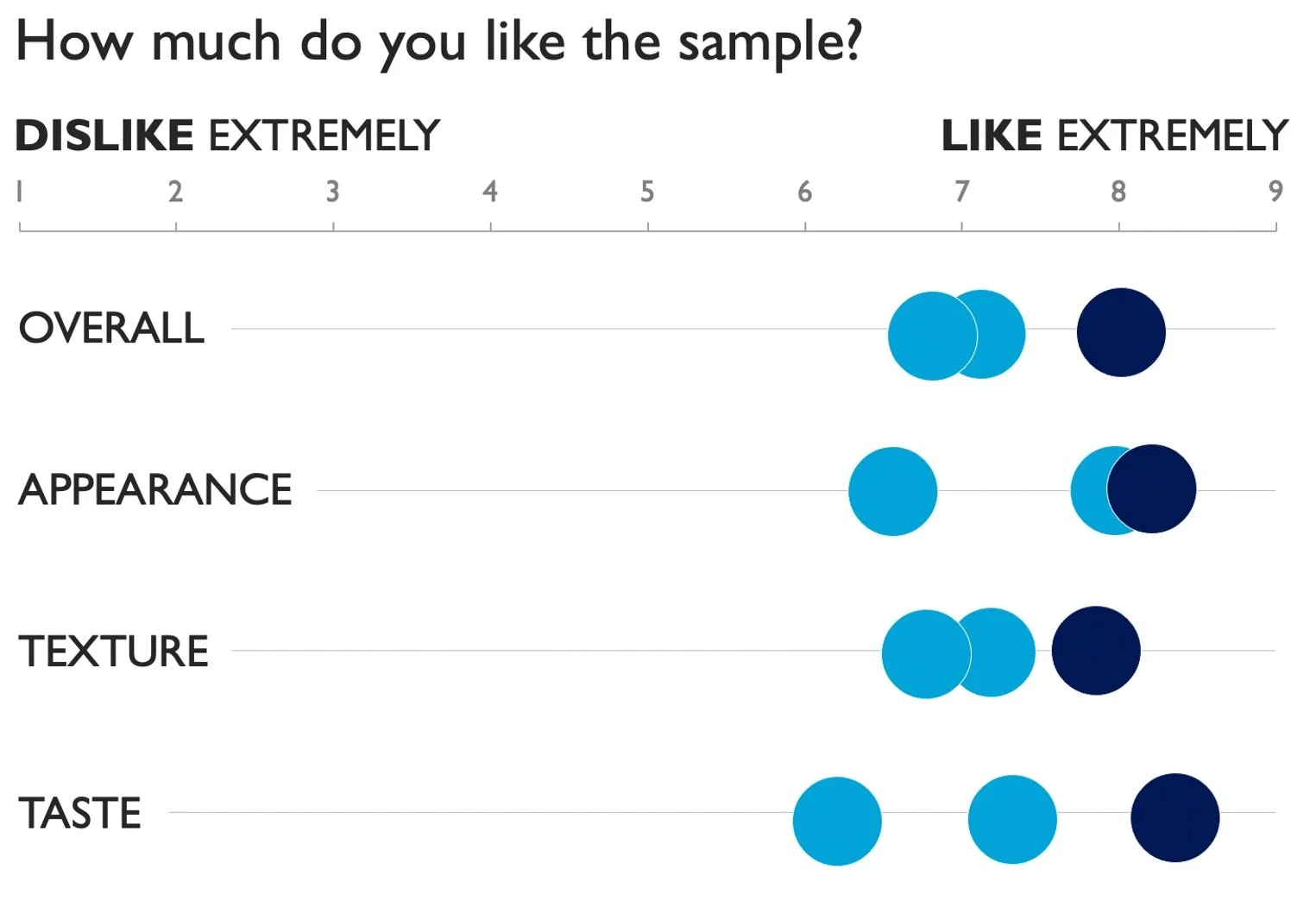
I then collapse the three circles onto a single line so that I can layer on additional dimensions, eventually building up to the following dot plot.
I mentioned earlier that this progression comes from a case study used in my new book, storytelling with you. I’ll be delivering that full presentation live, and you can watch the worldwide premiere of it on September 22. (Premium members can see it sooner, and chat with me, one week earlier, in a special preview event on September 15.)
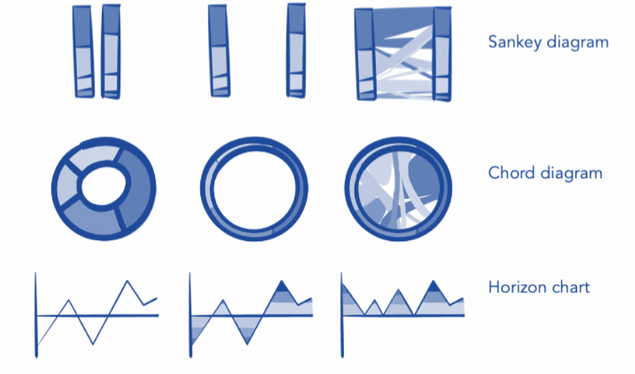
For another example, here’s a summary visual of steps Alex used recently to demystify the horizon chart:

Alex also shares sketching as a strategy she uses to get from a standard graph to something new. You can see an example of this in the intro image to this post.
These are just a few examples. Consider how you might start with a typical stacked bar chart and move from that to a diverging setup or add a second dimension to a simple line graph to yield a connected scatterplot—there are so many possibilities!
The challenge
Identify and explain or illustrate the transition from a commonly known graph to a less familiar form. Feel free to upload multiple images if needed (similar to what I’ve done in the first example shared), or create a single view that shows the progression or transition (similar to what Alex did in the second example above). In the case where you upload multiple images, I recommend making the complicated or less-familiar visual the primary one. I’ll also suggest that you title your submission following this structure: From [insert name of common graph] to [insert name of less familiar varietal]. Following this naming structure, I’d title the first example I shared From bars to dot plot (don’t forget to tune in September 22nd to see me talk through it!).
Share your creation in the SWD community by Friday, September 30th at 5PM ET. If you need help sourcing data, check out this list of publicly available data sources. If there is specific feedback or input that you would find helpful, include that detail in your commentary. Take some time also to browse others’ submissions, and share your input via comments and datapoints over the course of the month.
Related resources
Here are a few related resources. If you are aware of other good ones, please share in your submission commentary.
Book: Better Data Visualizations (it’s like an encyclopedia of graphs!) also check out the related YouTube series One Chart at a Time
Video: what’s a horizon chart?—see Alex’s demonstration to yield understanding
Check out the SWD chart guide for an explanation of many common graphs
Tune in September 22nd (or September 15th for premium) to see me deliver the final presentation from storytelling with you: plan, create, and deliver a stellar presentation