my plea for tick marks

Lately, I’ve noticed that more and more graphs don’t include gridlines. If it’s unclear, I believe this to be a positive trend. I, myself, rarely use gridlines, and often remove them when I find them in a graph I’m reviewing. But I don’t stop there.
More often than not, if a chart has gridlines, it will be lacking tick marks along the axis, and possibly an axis line as well.
Let’s look at an example.

This chart is already busy, and the heavy lines cutting across the data are adding to the clutter. But before we consider how this graph looks without gridlines, I want to discuss their value in this chart. The vertical axis has neither tick marks nor a line, so the gridlines are serving a useful function in this instance. They provide a visual connection between the data and the numerical labels, bringing some much-needed structure to the graph. Were I to remove the gridlines…
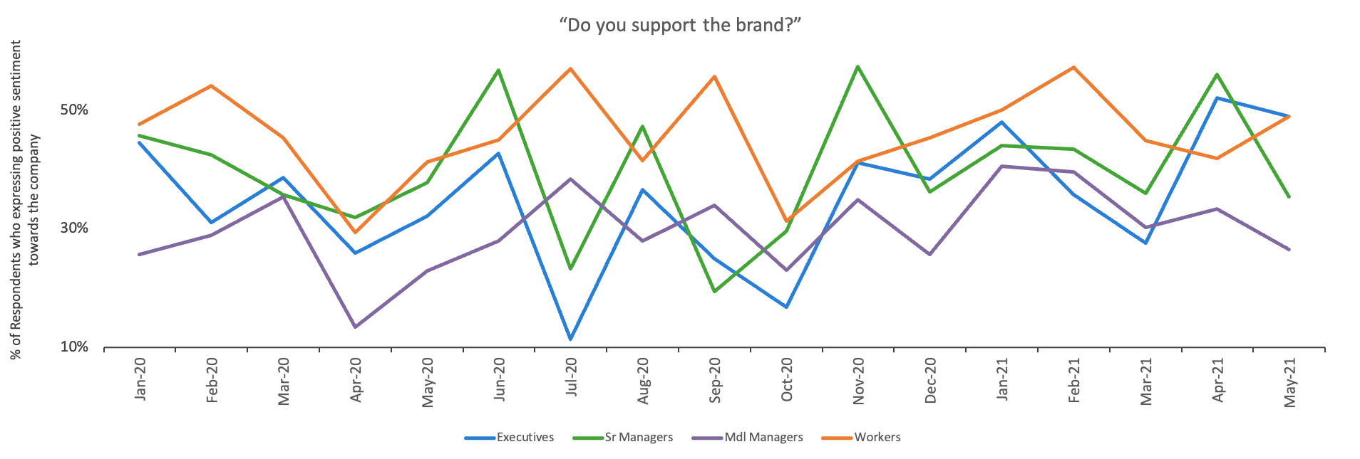
…we’d be left with a cleaner, but less effective, graph. The axis is now hanging in mid-space; there is no longer any structure along the vertical axis; and we’ve lost some precision, as it’s unclear where each value exists along the numerical axis range.
I see this happen too often, so this is my personal plea: if you remove the gridlines, consider preserving or adding in tick marks along the axis. They have such a small footprint that they will maintain the cleanliness of the graph, while bringing back a visual connection between the axis and the data.
Let’s have a look.

In this final iteration, I’ve also taken the opportunity to fully format the y-axis by using a pithier title, increasing the intervals, and adding an axis line. You can read more about formatting the skeleton of a graph in this guide. Or if you’ve been staring at this graph and thinking that you'd want to make even more changes, I invite you to check out the related YouTube video for a full makeover.
Tick marks and gridlines may seem trivial, but the more time I spend learning about graphs and communication, the more I realize that even minor changes can have a major impact on the readability of your graph.