two tips for better graphs

When creating a graph to explain something to someone else, I recommend that you declutter and focus attention. These concepts are not new. We have taught and written about them—directly and indirectly—many times before. I wrote about them again when drafting my new book, but then decided to take a different approach. Rather than relinquish my original words to a dismal fate in my computer’s trash bin, I thought perhaps they might still be of use here. After all, even if we’ve shared good advice before, sometimes it bears repeating.
One thing that is new since I’ve fully written about these topics in the past is research that backs up our empirical reasons for recommending that you declutter and focus your graphs. I partnered with the Visual Thinking Lab at Northwestern University on research summarized in the paper Decluttering and Focus: Empirically Evaluating Design Guidelines for Effective Data Communication. Participants were shown a mix of cluttered, decluttered, and focused and decluttered data visualizations. They were asked to evaluate the visuals on aesthetics, clarity, professionalism, and trustworthiness and also to redraw and recall topics and conclusions of the previously seen visuals. While the decluttered designs had higher ratings on professionalism, adding focus led to higher ratings on aesthetics and clarity and improved recall.
In other words, there are measurable benefits to decluttering and focusing your audience’s attention when you communicate with graphs. Let’s take a closer look.
Declutter your graphs to remove distractions
One way to help the data we want to communicate stand out is to remove potential distractions. This can be achieved by pushing elements visually to the background or removing them altogether. See the following iterations of the same graph.

In the initial graph at the far-left, every detail is black. Because of this, everything feels equally important and implicitly asks the viewer for comparable attention. In the middle version, some elements have been made gray. Notice how this helps the data—still black—stand out more. We can take things a step further and eliminate unnecessary details altogether; see the far-right graph.
Focus attention so others know where to look
When you make a graph or a slide, you are familiar with it, so you know where to look and what to see. For this to be as obvious to others, however, we need to take explicit steps in our design. One way to do this is to create sparing contrast to indicate clearly to your audience where you would like them to look. This can be achieved through a variety of means. See below.
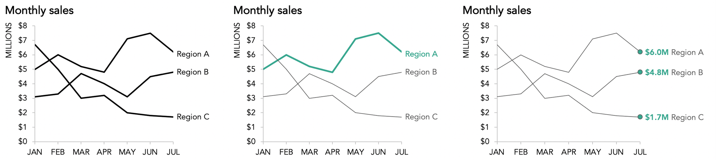
You may recognize the far-left graph in the series above—it’s the decluttered iteration I shared previously, with two additional data series added. Notice how your eyes move about as you explore it. Contrast that with what your eyes do when looking at the second and third iterations. In the second version (middle graph), I’ve used color sparingly to direct your attention to Region A. Much in the same way that this line caught your attention when we deemphasized the gridlines in the middle declutter iteration, after removing those we can achieve the same effect by pushing less important data to the background (in this case, the lines for Regions B and C, so they remain there for comparison but with clear focus on Region A).
The third iteration (far-right graph) focuses your eyes on the final data point in each series because of the sparing inclusion and special formatting of data markers and data labels. Note how this makes the comparison of sales in July across the various regions an obvious one to make. You can imagine how we could do this sparingly at other data points to direct other comparisons, too.
If you’d like to practice applying these tips in a supportive space, I invite you to check out our exercise bank in the online SWD community. In particular, I’ll point you to the declutter exercise to practice identifying and eliminating clutter, and there are a variety of exercises that will encourage you to direct attention.
The lesson: take a few moments to declutter and focus attention when designing graphs to communicate to others. These simple steps will lead to better graphs—and better communication.