when below goal is a good thing
We all develop constructs of the world around us—especially with information perception. For instance: I associate red with bad and green with good; seeing time flow from left to right is more intuitive to me than top to bottom, bottom to top, or right to left; and anytime I see the date 07/08, I think July 7th, not August 8th (I’m American).
Sometimes, though, these natural tendencies differ or don’t hold for our audiences, which can cause confusion—as I was reminded during a recent workshop.
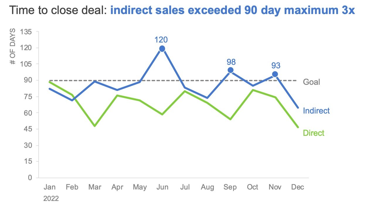
Consider the following line chart.

When quickly scanning, I wonder why the direct and indirect sales teams underperformed in 2022. Mostly, they fell below the goal of 90 days, exceeding their target only three times.
Now, pausing to think more critically about the context of this scenario, I realize I’ve misread the graph—specifically the goal line. Targets and goals are often seen as minimum thresholds, not maximum limits. But in the sales industry, the goal is to close a deal as quickly as possible. In this visual, below the goal line is actually a good thing!
This graph challenges my standard construct of targets and goals, which could lead to confusion or, worse, the wrong conclusions if I'm not careful.
I’ll explore five ways to make it visually obvious how the goal should be interpreted.
Option 1: Use clarifying labels
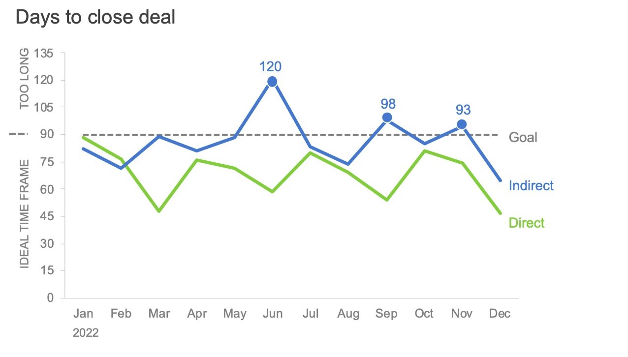
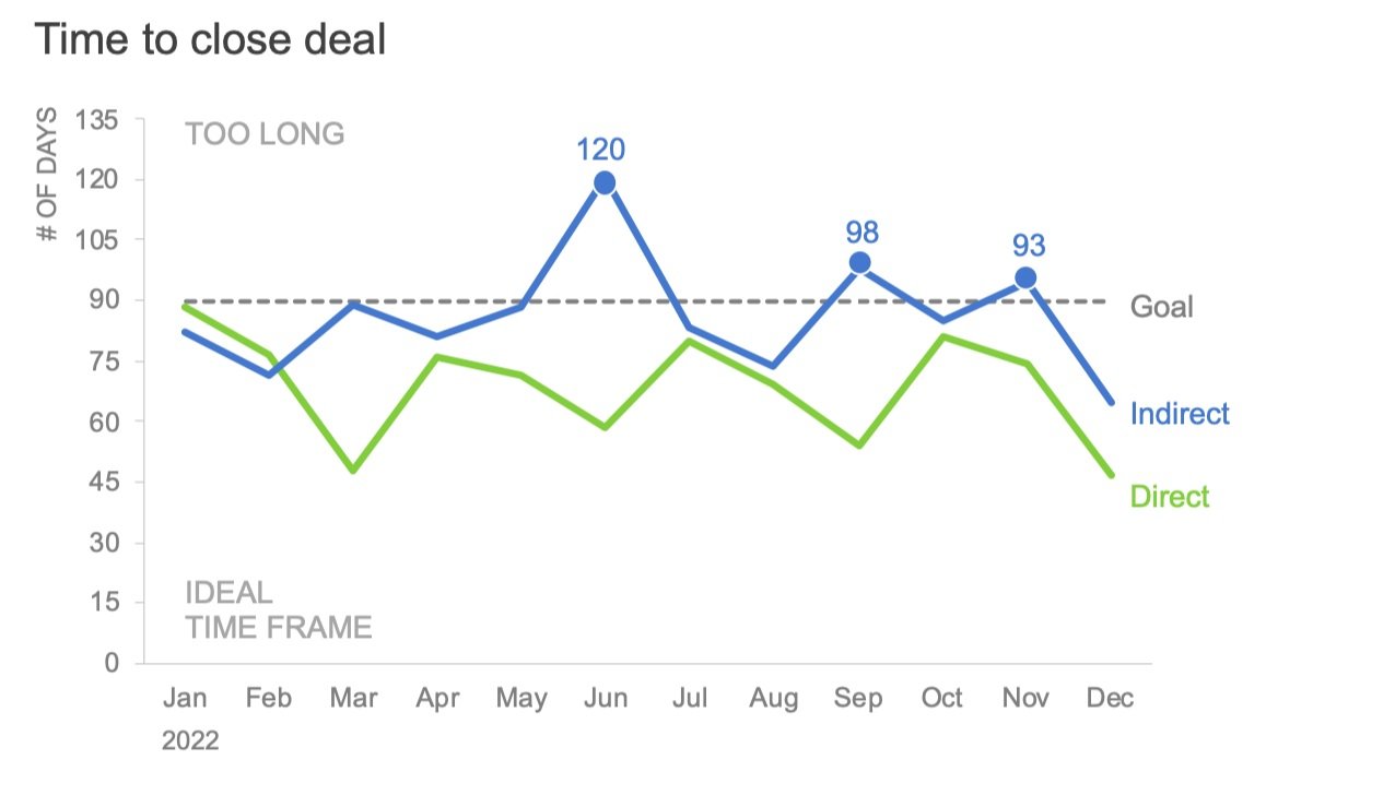
There is a natural tendency to interpret the words “goal” and “target” as a reference to a minimum acceptable amount rather than a maximum threshold. To avoid this association, replace or augment these words with language that describes how to interpret the reference line instead of leaving this up to the reader. I might use “Maximum” or “Upper Limit” for this specific example. If I had to use the word goal to label the dashed line, I’d expand it to something like “Goal: below 90 days”.

Option 2: Add additional instructions
Adding additional context or instructions can help someone determine how to read the graph. This could mean using a more detailed graph title, chart annotations, footnotes, or even clarifying axis titles. I’ve included a few options below for you to compare.
Option 3: Verbalize and explain your charts
When we talk through data directly with people, we have additional control over how they interpret the numbers. Whenever I’m concerned about my audience’s understanding, I’ll try to chat with them directly instead of sending a report via email to be consumed independently. This will allow me to start by setting the context.
Another benefit is that I can see firsthand how my audience is processing the information, so I will know whether I need to reiterate or further explain any particular points. Being there live, I can also answer any questions that come up. The additional control and clarity one gains in a live setting can go a long way toward avoiding confusion, even without changes to the original chart.
To see any example of how you might talk through this chart and set expectations, see the below clip from a past YouTube video. (This is a different example, but similar.)
Option 4: Use a shaded region, not a line
Shaded regions in a graph are used to focus attention, group data points, and visualize a range of values. This latter use case can be helpful in this specific scenario. Instead of visualizing the 90-day threshold with a dashed line, we could use a shaded region to define the full range of ideal values.

Option 5: Invert the axis
During the workshop in which I found inspiration for this blog, the original graph was shown to attendees. A few people pointed out the confusing goal line and offered alternative designs. One popular idea was to invert the axis by placing zero at the top of the chart and then increasing values as you moved down toward the horizontal axis.

I understand the logic and admit that seeing ‘good performance’ above a goal line feels right. However, at a closer glance, this chart could be confusing. Usually, the vertical axis is in descending order, not ascending from top to bottom.
It’s harder to conclude that the direct sales team typically closes faster than the indirect sales team because the direct line (green) is above the indirect line (blue). The values look bigger. (An object’s position in space is a preattentive attribute to which we naturally assign a quantitative assessment—that is, we naturally think that “higher” means “more.”)
I’ve written about the challenges of deviating from common graphing conventions before. Here’s a case where in an attempt to maintain one graphing convention, you could accidentally introduce another. This is not to say that inverting axes is wrong and you should never do it—just be cautious when doing so. On that note, Stephen Few encountered a similar challenge when visualizing key sales metrics against targets and decided to invert axes. Check it out here.
While each of these five design options is an improvement over the original, when trying to overcome cognitive challenges it’s best to use multiple encodings to ensure the interpretation is clear.
My final version could look like the following.

Let me know in the comments if you’ve faced this target/goal challenge before too, and what creative solutions you came up with to ensure it was clear for your audience.