
US prison population revisualized
This visual breaks pretty much every best practice out there when it comes to effective graph design. Check out this post, where I comment on the design choices and demonstrate what this data has the potential to be.

more on slopegraphs
Slopegraphs can be useful to show comparisons between groups. For example, when reporting employee survey results, a slopegraph can be used to show a given team's feedback across survey categories compared to the overall company. Check out this post to see an example and read more about slopegraphs.

color considerations with a dark background
When it comes to slides that communicate data, I don't typically recommend anything other than a white background. That said, sometimes there are considerations outside of the ideal scenario for communicating with data. Check out this post to see what I did to visualize data on a dark background.

more Americans are tying the knot
The Pew Research Center reports on some fascinating data. But I tend to be underwhelmed with the way they illustrate this data visually. In many cases, some relatively minor modifications would transform the graphs from "not horrible" to great. Check out this post for an example.
multifaceted data and story
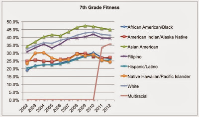
This is a rich dataset on 7th graders meeting fitness standards by race over time from kidsdata.org in terms of the number of facets one could focus on and the number of stories one could use it to illustrate. In this post, I look at some of these stories and how to make them visually clear.

student makeovers
This fall, I had the pleasure of teaching Intro to Information Visualization for MICA's MPS in Information Visualization. It was a 4-week course, where we explored some fundamentals of data visualization and storytelling as it relates to communicating effectively with data. One of the assignments was a visual makeover, where students were asked to select a less-than-stellar visualization from the media, identify the underlying story and create a new and improved visual using data together with narrative to tell an effective visual story. Check out this post to see some of the impressive before-and-afters!
how I would visualize this data
Check out this post for my remake of a data visualization challenge I posted to my readers.

logic in order
There should be logic in the order of your data. While I would say this recommendation is universally true, I'll focus in this post on a very specific example to illustrate the concept: leveraging order for categorical data in a horizontal bar chart.