
#SWDchallenge: your choice makeover
Less-than-ideal graphs are prominent in the world around us. The July challenge should be a fun one: find one of these and work to make it better. Improving upon an existing graph can be a great way to build your skills and reflecting on this process and sharing is a great way to also bring benefit to others.

72 splendid slopegraphs
The slopegraph challenge was a popular one, with topics ranging from economics to entertainment. We noted overall good use of color and words, with many illustrations of how slopegraphs can be used to show a ton of data without being overwhelming when visual hierarchy is clear. Follow the link to see the full recap post, including each submission and related commentary.
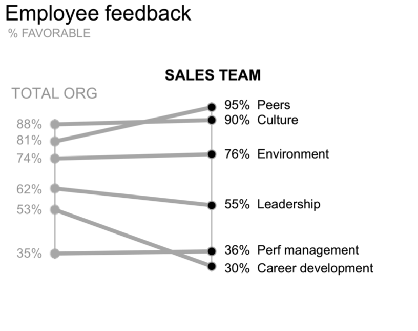
#SWDchallenge: slopegraph
Slopegraphs can be great for visualizing change or differences between two points in time or categories. Check out the challenge post to learn more and see some examples of slopegraphs used effectively, as well as potential issues to watch out for.

May #SWDchallenge recap: the waterfall chart
45 people shared their waterfall creations in May, with huge variety of tools and more business-related topics than recent challenges. Click the link to see the full recap post, including each submission and related commentary.

#SWDchallenge: the waterfall chart
Waterfall charts can work well when you have a beginning quantity, additions and deductions, and an ending quantity. Click the link below to see the full details, including an example and submission instructions for the May #SWDchallenge.

April #SWDchallenge recap: square area graphs
88 people shared their square area graphs in April. While some people were stretching to find appropriate data for this view, there were also a ton of awesome examples shared. Click the link to see the full recap post, including each submission and related commentary.

#SWDchallenge: square area graph
April’s challenge was a square area graph. This is a less common visual that can work well to show numbers of vastly different magnitudes. Click the link for more commentary on good use cases, including a few examples.

bring on the bar charts
We had a huge response in March with basic bar charts: 85 people shared their creations! Click the link below to see the full recap post, including each submission and related commentary.
#SWDchallenge: basic bars
March’s challenge was a bar chart. Whether vertical, horizontal, stacked or divergent, bars are one of our best friends when it comes to visualizing categorical data. Click the link below to see the full details, including an example and submission instructions.