#SWDchallenge: happy new year! let's try something new
It’s a new year: time to reflect and consider how can we push ourselves out of our comfort zones? I’m an advocate of productive discomfort and trying new things. In this challenge, I encourage you to try a new tool for visualizing data and share your results and related commentary.

happy holidays!
Holiday music, cookie calories, winter temperatures, and more! Many tools, graphs, and festive encodings were used to visualize data related to the holidays. Hope you enjoy browsing the great variety of topics and designs—happy holidays!

let's visualize the holidays!
‘Tis the season to be merry (irrespective of which holiday you celebrate), so let’s combine that festive cheer with something near and dear to us all: data visualization! This month, your challenge is to visualize data related to the holidays.

stickies!
People shared examples of sticky notes used in a variety of ways in response to the November challenge. They are small, which forces concision, lend themselves to being easily rearranged and remove the constraints of our tools. Pick up a pack of post its the next time you find yourself needing to communicate with data! Check out the post for inspiration of how others have used stickies as a strategic tool.

#SWDchallenge: sticky notes
This month, we’re using one of my favorite low tech tools: sticky notes! I use stickies to storyboard nearly every time I communicate—with data, or otherwise. Use them to brainstorm, to arrange (and rearrange) and edit. Employ them however you will find helpful: pick up a pack of post its and have fun!

scores of scatterplots!
Forty-seven people created and shared scatterplots! Many made their visuals accessible through clear titling, labeling, and in some cases adding reference lines. There were a handful of connected scatterplots, many bubblegraphs, and some standard scatters on a variety of topics and created with an impressive mix of tools this month!

#SWDchallenge: scatterplot!
October’s challenge is to create a scatterplot. We encourage you to make your scatters accessible with clear titling labeling and reference lines where appropriate. We also welcome the variations of connected scatterplots and bubblegraphs. Click for more details and examples!

September #SWDchallenge recap: MAKEOVER edition
We had a record participation in September with 96 people sharing their makeovers of the dual pie chart visual. Submissions ranged from slopegraphs to bar charts to dot plots and beyond. Click the link below to see the full recap post, including each submission and related commentary.
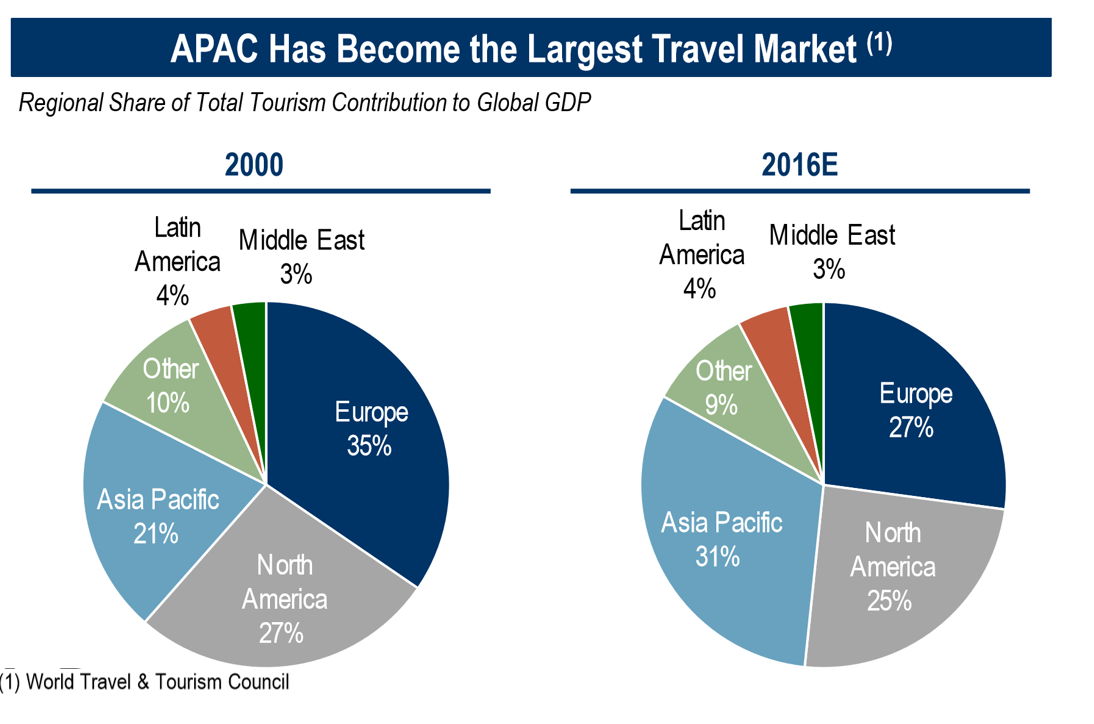
#SWDchallenge: how would YOU makeover this graph?
September's challenge was a slightly different flavor of the makeover theme: how would readers make over this dual pie chart visual? We challenged you to apply data storytelling best practices and a thoughtful critique in improving this visual. Expand the full post for more detail.