
crushing on your data viz
I like the idea of "crushing" on one's data viz. I find myself saying this again and again, but plotting data in a graphing program should be the first step in data visualization, not the last. After doing that, in this post I outline the typical steps I find myself going through and questions I routinely ask to get to the final ready-for-consumption visual.
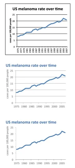
gridlines are gratuitous
Gridlines typically act as nothing more than clutter, unnecessarily competing for attention with your data. Don't let them. In this post, I discuss gridlines, why they usually aren't necessary and look at an example illustrating the power removing gridlines from your visuals can have.

death to pie charts
I hate pie charts. I mean, really hate them. In this post, I discuss why and show an illustrative makeover.

what makes good data visualization?
Looking at David McCandless' illustration of what makes for effective information design inspired me to articulate my own point of view. In this post, I briefly discuss the importance of affordances, accessibility, and aesthetics in data visualization.