

color considerations with a dark background
When it comes to slides that communicate data, I don't typically recommend anything other than a white background. That said, sometimes there are considerations outside of the ideal scenario for communicating with data. Check out this post to see what I did to visualize data on a dark background.

more Americans are tying the knot
The Pew Research Center reports on some fascinating data. But I tend to be underwhelmed with the way they illustrate this data visually. In many cases, some relatively minor modifications would transform the graphs from "not horrible" to great. Check out this post for an example.

HelpMeViz
We've all created a graph before and thought: Does this work? My advice when this situation arises is to seek feedback. Jon Schwabish has brought this critical feedback loop online, with his recently launched site, HelpMeViz, which was designed to "facilitate discussion, debate, and collaboration from the data visualization community." Check out this post for more info on this resource.
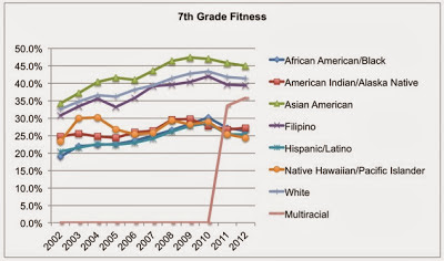
multifaceted data and story
This is a rich dataset on 7th graders meeting fitness standards by race over time from kidsdata.org in terms of the number of facets one could focus on and the number of stories one could use it to illustrate. In this post, I look at some of these stories and how to make them visually clear.