graph & slide
makeovers
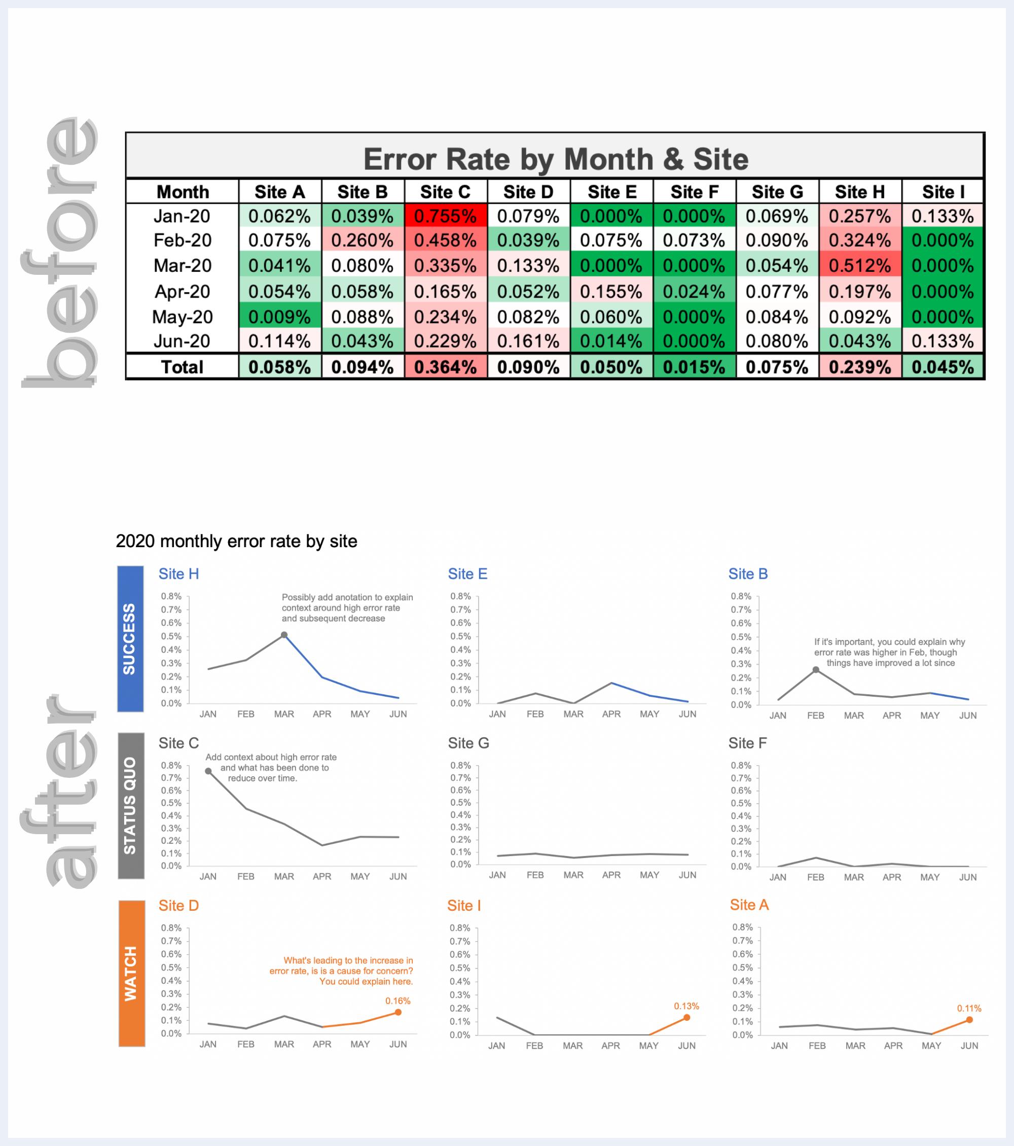
a sample of lessons & redesigns we’ve shared with clients as taught them to improve their data communications


love learning
via examples?
Our latest book features 20 makeovers with in-depth explanations & plenty of practical tips that can be applied well beyond the example.

want your own
custom makeover?
We’ll train your team using your data, so you not only learn the SWD process, but get to see it in action as we transform existing graphs, reports, & presentations.