
EPISODE 116
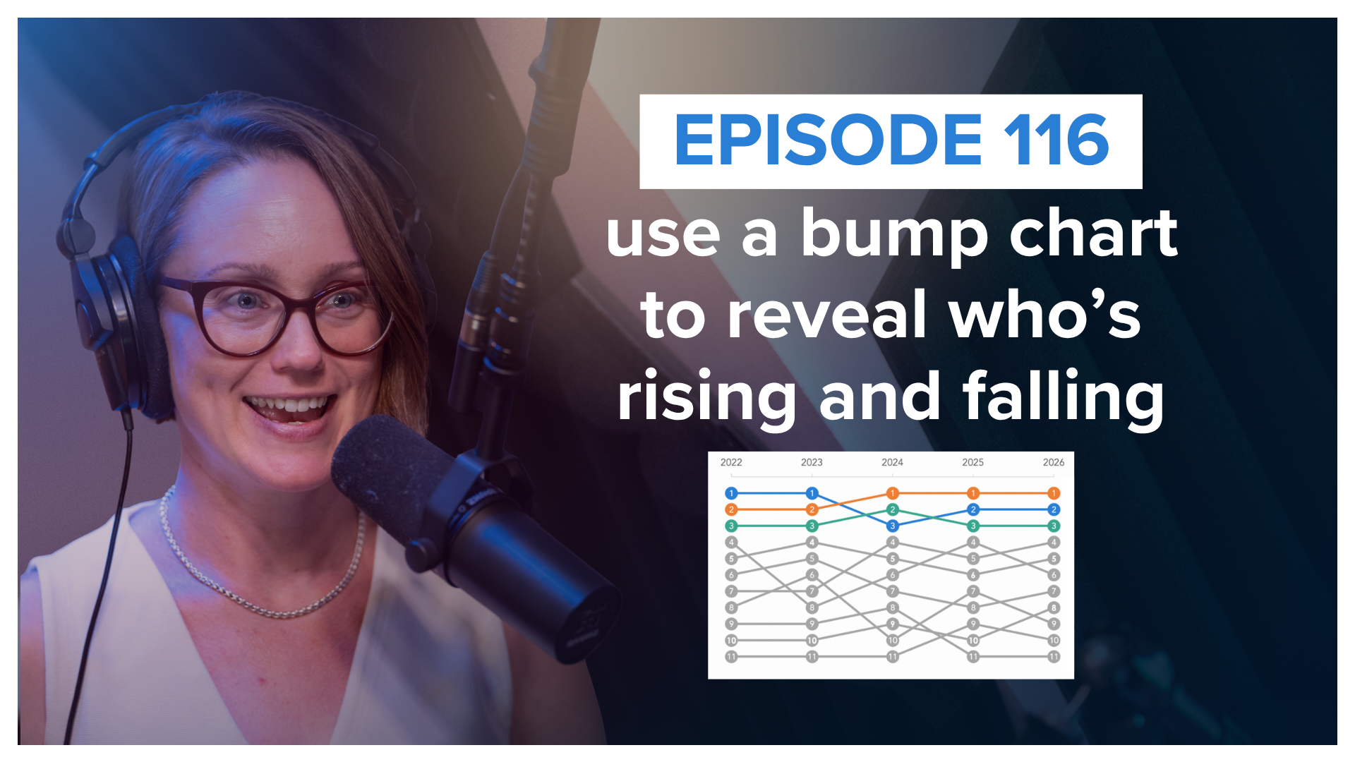
use a bump chart to reveal who’s rising and falling
Bump charts are great at showing who's rising, who's falling, and who's staying on top—but they don't tell you the whole story.
In this episode, Alli explains what a bump chart is, when to use one, and what to watch out for when comparing rankings instead of actual values. Plus, she highlights three creative examples from the storytelling with data community that use color, added context, and an unexpected layout to make changes in rankings easier to see and understand.
RELATED LINKS
Register for the Nov 5th live, public workshop
Use the code PODCAST10 for 10% off!
Datawrapper: How to create a Bump Chart (Article)
WE’D LOVE TO HEAR FROM YOU
Did you enjoy this episode? Do you have ideas for future episode guests or topics? Let us know!
Listen to the SWD podcast on your favorite platform
Subscribe in your favorite podcast platform to never miss an episode.
Like what you hear? Please rate & review. Thanks for listening!


