I like this chart
David McCandless does some beautiful work (if you aren't familiar, check out his website here or TED Talk here). His latest post is on sunscreen and features a massive infographic titled The Suncream SmokeScreen.
As is the case with many infographics (and here, I use infographic in what I consider the true sense of the word - when many different aspects on a single topic are shown through multiple visualizations and compiled together to form a single master infographic), you have to have the desire to spend some time with it to really understand what's going on, because there's a lot going on. But that's kind of the point. What I like about it is that each segment within the infographic is really straightforward: it demonstrates good use of preattentive attributes (e.g. color, size) and is very clean - no clutter to distract from the data.
Here's a segment I particularly like:
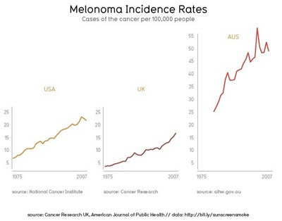
Attention is drawn to the data through the preattentive attribute of color (my only gripe is that I wouldn't have gone with an orange/red color scheme, which is not so colorblind friendly, but I imagine this choice was made to be in keeping with the topic and reminiscent of the sun). There is no presence of unnecessary gridlines or tickmarks. The rest of the stuff (chart axes, labels, sources) is pushed to the background by making it grey. This simultaneous emphasis of the important stuff, elimination of the unnecessary, and de-emphasis of the other stuff that needs to be there but doesn't need to compete for attention really makes the data sing. And it sings beautifully.
Until you start to think about what you're looking at. Cancer is clearly the antithesis of beautiful. And the instances of it in Australia dwarf the US and UK. Capping the y-axes on the US and UK charts and allowing Australia's to continue upward is really clever and helps to emphasize just how much higher the melanoma incidence rates are in Australia.
Showing each trendline in its own graph prompts a different sort of data discovery than it would if all were shown on a single chart. I have to think this was a very explicit choice. Because we read left to right, top to bottom, placing all three lines on the same chart would mean you'd encounter the Australia line first. Instead, with the three broken out, our eye looks first at the US, then to the UK (hm... lower than the US, but overall less sunny so makes sense), then to (holy sh**!) Australia, where the trend is not only much higher, but also following a steeper trajectory than observed in the other locations.
This visual tells a clear story because of all of these explicit choices made on the part of the designer. This information is beautiful (even if the underlying story is not).
Interested in the full infographic? You can find it here.