The storytelling with data guide to charts and graphs
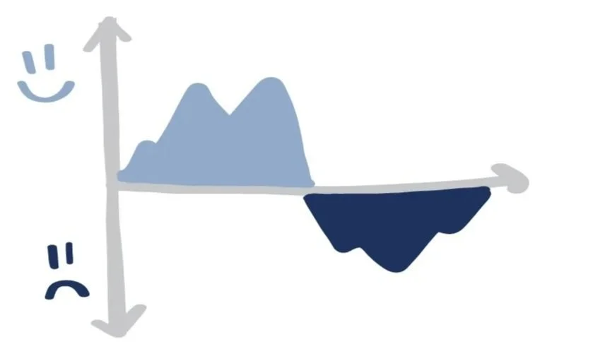
AREA CHART
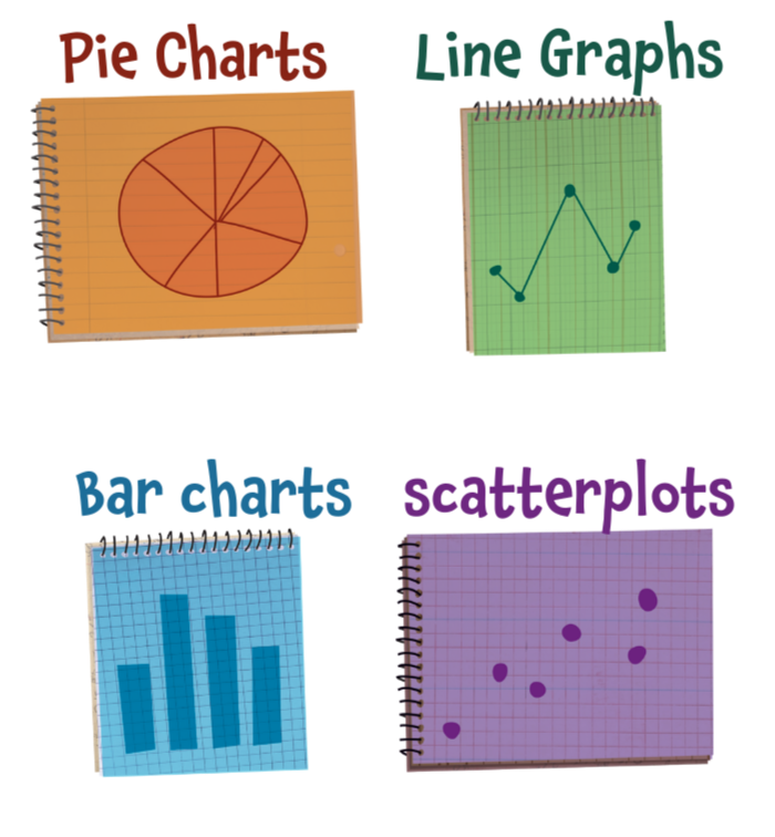
BAR CHART
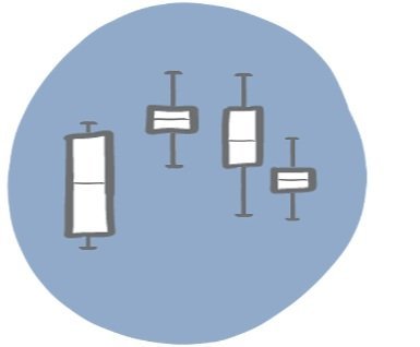
BOXPLOT
BUBBLE CHART


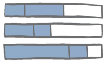
BULLET GRAPH
CHOROPLETH MAP

DATA TABLE
DOT PLOT

WATERFALL CHART


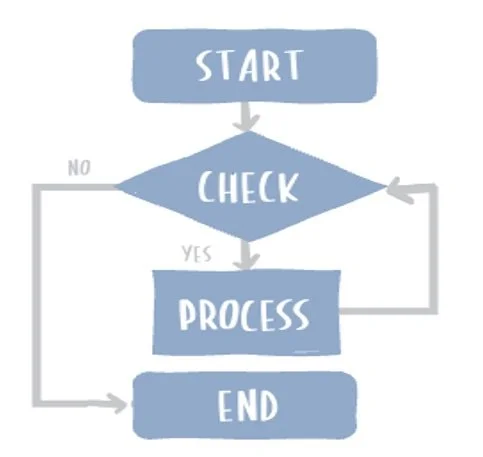
FLOW CHART
GANTT CHART
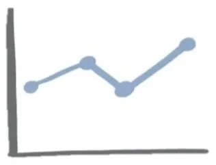
LINE GRAPH
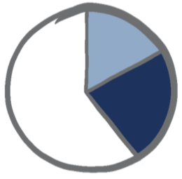
PIE CHART

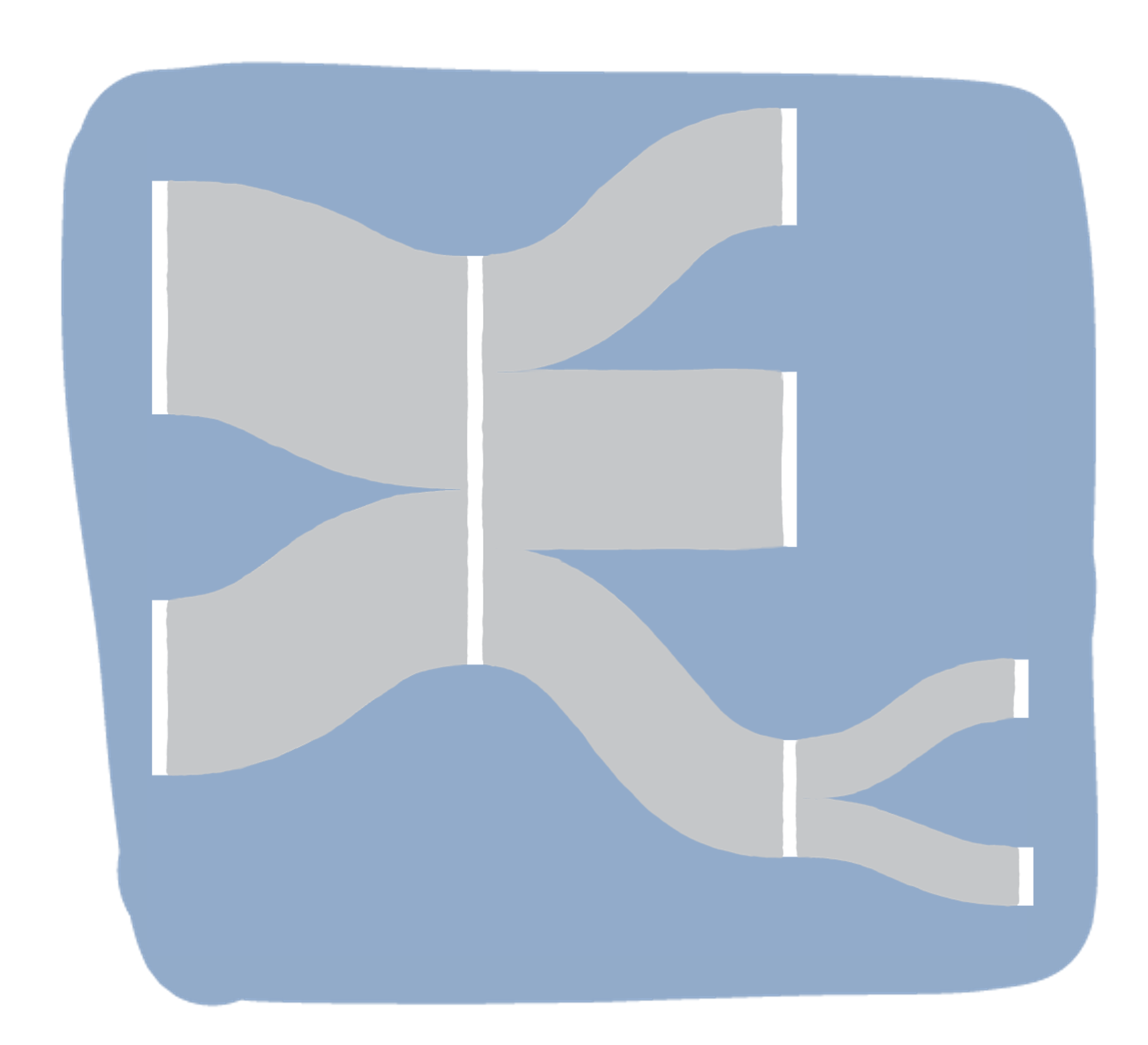
SANKEY DIAGRAM
SCATTERPLOT

SLOPEGRAPH

SPIDER CHART

SQUARE AREA CHART
STACKED BAR CHART

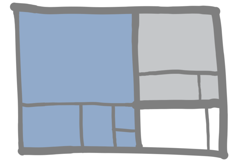
TREEMAP
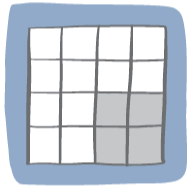
UNIT CHART

Not sure how to
make these charts?
Our on-demand courses show you how to go beyond the basics of PowerPoint and Excel to create bespoke, custom charts and slides that your audience will love to look at. You don’t need fancy tools to master data visualization and storytelling—just a bit of know-how and creativity!
Teach kids the
power of graphs
Imagine if you'd learned about best use cases for graphs at a young age! Daphne is a data-drawing dragon that makes data and charts both fun and informative for kids. Check out our educator and parent resources at DaphneDrawsData.com or order the book.