what is a unit chart?

This article is part of our back-to-basics blog series called what is…?, where we’ll break down some common topics and questions posed to us. We’ve covered much of the content in previous posts, so this series allows us to bring together many disparate resources, creating a single source for your learning. We believe it’s important to take an occasional pulse on foundational knowledge, regardless of where you are in your learning journey. The success of many visualizations is dependent on a solid understanding of basic concepts. So whether you’re learning this for the first time, reading to reinforce core principles, or looking for resources to share with others—like our comprehensive chart guide—please join us as we revisit and embrace the basics.
What is a unit chart?
Unlike other charts that use line length, position on an axis, or area to represent values, unit charts are made up of individual markers—geometric shapes, icons, or images—that encode quantities based on how many of that unit are shown. Examples of unit charts are ISOTYPE charts, square area charts (also known as waffle charts), symbol charts, and pictorial charts. They are commonly used in media, advertisements, and infographics.
For example, in the unit chart below, each square represents one response in a survey.

In the following graph (from Daphne Draws Data), each banana represents five peels.

When should I use a unit chart?
There are broadly recognizable symbols that could make your communication more memorable or easily understood. These can make unit charts intuitive enough for most audiences to easily discern what’s being graphed (like the banana graph above). In the following example, it’s quickly clear that this is a comparison by sport.
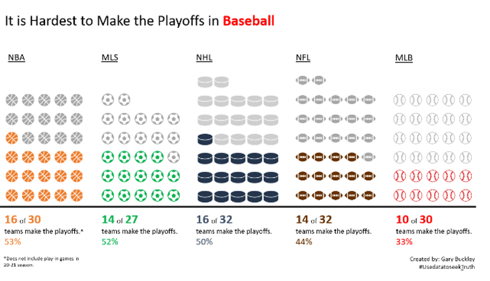
Created by Gary Buckley (SWD challenge July 2021 submission)
You want to display part-to-whole relationships. Unit charts, particularly those that use regular shapes and repeating structures, can convey quite a bit of information about the proportions of a dataset. In the example shown below, each unit represents one senator. The designer used different colors of units to denote the generational cohort for each senator in the 37 most recent U.S. Congresses.

You want to remind an audience that the data describes people (and is not just numbers). Compared to the standard bar chart, unit charts can be more inviting and evoke a more human connection. For instance, if we use silhouettes of individuals or faces, it reminds us that we aren’t just communicating numbers and data, but rather information about discrete individuals. In the example below, created by Yuki Lai for a recent SWDchallenge, using icons brings a different life to the data, rather than just simply saying “75% of people.”

Created by Yuki Lai (SWD challenge July 2021 submission)
When should I NOT use a unit chart?
Your audience desires a more standard chart. Unit charts can be polarizing. Critics often argue that unit charts are chart junk or childish. They disagree with the concept of showing data individually or in units, especially when it could be displayed in an aggregated format.
You have more than one dimension. This is challenging for an audience to keep track of, particularly with odd or irregular icons. In the employee survey example introduced at the beginning of this article, let’s replace the squares with something irrelevant—like chess pieces— and add a time component: this year vs last year.

Instead of presenting the data clearly and memorably, now this unit chart has gone in the opposite direction: it feels more daunting to interpret, undermining the reason for using a unit chart in the first place.
How do I design an effective unit chart?
Be consistent with the size of the symbols. The units must appropriately encode the value they represent. Inconsistent sizing across categories will invalidate the visual comparison.

Ensure your symbols are legible and recognizable. The smaller an icon or a shape is, the harder it will be for an audience to recognize it. Consider that our tools will often take our symbols and force them to fit in our graphs, which means that really detailed icons and shapes will become illegible. If a viewer can’t figure out what the symbol is, your unit chart has lost its value.
Include a legend. The symbols in a unit chart encode a quantity…but the proportion of quantity-to-icon varies from chart to chart One silhouette of a person could represent one individual, ten people, or half a million. For that reason, a legend is critical to include. At a minimum, your audience should be clear on what each symbol represents.
Leverage animation when presenting live. This square area chart shows patient preferences for an anti-anxiety medication compared to its competitor.


Because of the visual density and novel visual type, the designer (Cole) opted to animate the graph to appear piece by piece so that the audience could better understand the nuances of the data. Here is a short clip of that presentation.

How do I create a unit chart?
A simple web search for “how to create a unit chart in [your tool of choice]” will return helpful how-to’s and detailed instructions for tools such as Tableau, Flourish and R. While Excel doesn’t have unit charts in its default menu, there are add-ins and brute-force methods to create this chart by hand. As with any data communication, your tool will never know what you’re trying to communicate as well as you do. Ensure that you’re applying both what you’ve learned in this article—specific to unit charts—as well as the principles of effective data communication.
Where can I learn more about unit charts?
The SWD community practiced creating unit charts for the July 2021 challenge. We captured some of the lessons learned in a short recap. You can also see a number of unit charts used to represent soldiers and casualties in the April 2024 challenge to visualize Napoleon’s march.
Jon Schwabish’s One Chart At A Time Video: Unit, Isotype & Waffle Charts (ft. Nigel Holmes)
Now that you’ve finished learning about unit charts, be sure to check out the other articles in our in-depth SWD chart guide.