what is a square area chart?

This article is part of our back-to-basics blog series called what is…?, where we’ll break down some common topics and questions posed to us. We’ve covered much of the content in previous posts, so this series allows us to bring together many disparate resources, creating a single source for your learning. We believe it’s important to take an occasional pulse on foundational knowledge, regardless of where you are in your learning journey. The success of many visualizations is dependent on a solid understanding of basic concepts. So whether you’re learning this for the first time, reading to reinforce core principles, or looking for resources to share with others—like our new comprehensive chart guide—please join us as we revisit and embrace the basics.
What is a square area chart?
A square area chart—also known as a waffle chart—is a square display. They often consist of a 10x10 grid containing 100 individual squares. The squares are then coloured based on the data that's being visualised. The chart gets its food-based name from its resemblance to a tasty waffle. (Sometimes this type of chart is referred to as a “unit chart,” although that term applies more appropriately to a broader category of visualisations, which tend to use discrete icons, rather than squares, to represent the values.)

When would you use a square area chart?
As an alternative to the pie chart
The square area chart can work as an alternative to the pie chart. In both of these chart types, we’re comparing regions by their areas, which our eyes are not especially skilled at doing. However, a square area chart does more to make this process easier for us: the gridlines forming the squares give us guidance for judging the length of each edge; and the rectangular shapes are simpler to compare than pie wedges of varying orientation.
To compare numbers of vastly different magnitudes
When comparing numbers of different magnitude, it might seem appealing to cut or truncate the lengths of bars in a bar chart to fit everything in. Resist this temptation! Bar charts work by letting us assess the relative lengths of different items, and chopping off parts of them invalidates the visual comparison. The square area graph can be an alternative here. With bars, you only get bar length, whereas with a square you get both height and width. This allows us to compare numbers of different magnitudes in a more condensed space.
When presenting live
Square area charts are less common than a bar chart or a line graph. This can create a barrier if your audience is unfamiliar with what they are seeing. Live presentations provide you the opportunity to introduce the chart to your audience and ensure that they understand how to make sense of what they’re seeing. In a live setting, consider showing the chart without any data, then build it up, piece by piece, with data.
The following video shows a square area chart live progression. Note - only images, no audio.
How can we show data in a square area chart?
One category as part of a whole
Shading the element of interest, and leaving the remaining squares blank or neutral, is the simplest type of square area chart. Only whole squares are shaded—never fractions of a square—so values are often rounded.

Multiple categories as portions of the whole
Create a stacked category square area by using two or more categories, each placed on top of one another.
Whilst this provides a holistic, part-to-whole view, comparison of the categories can be challenging. In the example below, Products B and C are on partial rows, requiring some mental maths to compare effectively. Consider the use of extra labeling and annotations when using this chart type.

Progressions or funnels
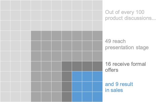
Square area charts can show progression. This view can work with survey data where the amount of invited participants drops to the number of respondents which further falls to the final question response, or in sales funnels as individuals move from potential customers to active leads to converted buyers.
The image below shows a product pipeline example. There have been nine sales resulting from 100 initial conversations. At each subsequent step of the sales pipeline, the color used becomes more intense and attention-grabbing, going from light gray to gray to dark gray to bold blue. This progression of color and intensity reflects the commitment level of an individual at that stage of the process. Likewise, the orientation of each category is such that the closer to the bottom right corner a square is, the farther along in the sales pipeline that person is. This progression is easier to see when it is presented live, so it is important to annotate the progression with careful labeling for reference.
Measuring a category vs. a target
This type of square area chart can show achievement against a target. Useful for KPI monitoring, they represent the target with a different shade or, more elegantly, a line.


How do you create a square area chart?
In most visualisation tools, square area charts don’t come “out of the box,” so you will need to be creative, and explore how best to achieve this look in your tool of choice. While a specific how-to tutorial is beyond the scope of this article, searching “square area/waffle chart in [your tool of choice]” will result in a wide array of blogs and videos detailing the process. Your choice of which approach to take will likely depend on how automated the chart needs to be; if you are intending to make a one-off, static visual, then any drawing tool that allows you to draw, format, and align squares would also work just fine.
You can also check out this video tutorial which goes step-by-step through the process of creating a square area chart in both Excel and PowerPoint.
Where can I see more square area chart examples?
For additional examples, check out our SWD challenge where we received nearly 80 wonderful square area charts.
You can continue your journey through the rest of our “what is...?” chart series by browsing common visuals like bars and lines, or explore our comprehensive chart guide page for additional graphs.