when should I use a map?
Through virtual and in-person workshops around the globe, we have taught tens of thousands of people how to communicate effectively with data. This series captures some of the noteworthy questions we hear during those sessions—and our answers.

When should I use a map to show data by region?
People seem to love maps. I’m sure I’m not the only one who had maps on their walls as a kid. Something about the aesthetic of a map—any map—draws us in, invites us to explore, encourages us to find ourselves in the visual, and spurs ever-deepening investigations into finer and finer levels of detail.
As a Gen-Xer, the maps I grew up with probably feel a bit archaic these days: physical globes; road atlases; automobile-club-produced customized journey flipbooks, bound and highlighted by a travel agent; and later on, computer printouts of MapQuest directions. Today, our phones make the experience of finding our destination, our areas of interest, or ourselves on a map a seamless and ubiquitous part of navigating the world.
That ubiquity has given all of us an increased familiarity with maps, as well as a deeper affinity for them. (Probably a dependence as well!) It’s natural, then, to want to use a map to visualize data that has a geographic dimension. Why not, right? There is an obvious upside: audiences are drawn to the way they look, as it’s a more memorable image than the same old bar chart or line graph. Not to mention: it’s fun to make maps!
The problem is that maps look interesting, but their very nature limits our options for visualizing data within them. Per a recent paper by Franconeri, Padilla, Shaw, et. al., here are a couple of the comparisons that people are very good at making, perceptually:
Position (is something higher than something else on the screen, or farther to one side?)
Length or relative distance (is one thing longer than something else, or is one pair of things farther apart than another pair of things?)
…and here are a couple of comparisons we are NOT good at making:
Area (the relative size of circles, or comparing how two dimensions change simultaneously)
Intensity (how much bolder or more-faded-out is one color than another)
Think about what a map, inherently, is: an abstract representation of the position, relative distances, and areas of geographic regions. That means that a map already is taking up both of the visual comparisons we are good at making (position and length) AND another one that we’re not great at (area).
What in the world do we do when we want to overlay data onto a map? Our options are pretty limited.
We can apply a heatmap to the regions in our map—leveraging a color’s intensity, which we aren’t good at making fine distinctions about; or
We can plot a secondary layer of points on top of our base map, and then size those points by the value of the data we’re representing. This still means that we are using the points’ areas, a less-than-optimal dimension, to depict our data.
Given these challenges, we should limit our use of maps to those cases when the values being visualized have some specific correlation with the geographic locations of the items in the data set.
For instance, the type of weather you experience is 100% correlated to your geographic location, so a map is a great choice for visualizing this type of data.

This choropleth map shows the number of tornado watches U.S. counties have experienced in 2022, as of late May. Weather- or climate-based maps, like this one, are excellent use cases for showing data geographically, since physical location is inherently related to the measured and visualized information.
On the other hand, the total payrolls of the 30 teams in Major League Baseball would be a poor data set to visualize on a map. Even though each team has a physical, geographic location, the specific payroll a team spends is dependent on many other factors. Even if we were to try to use a map for this data, we’d have to use area (by sizing each team’s circle appropriately) to show the differences in payroll; once I add in a few colors to categorize teams by their respective leagues and divisions…well, see for yourself:
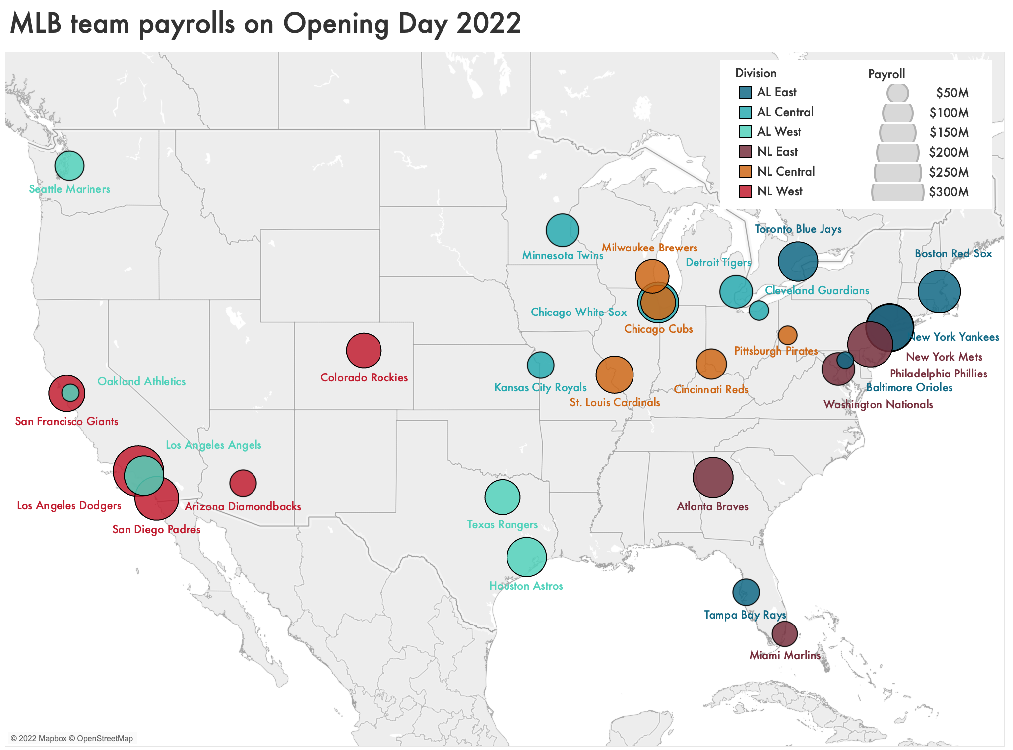
A map is a poor choice for visualizing the total payroll of the 30 teams in Major League Baseball. Physical location is a small part of what drives payroll, and the loss in readability isn't worth the gains from visualizing each team's location.
With data like this, you’d be better off visualizing with, yes, the boring old bar chart:
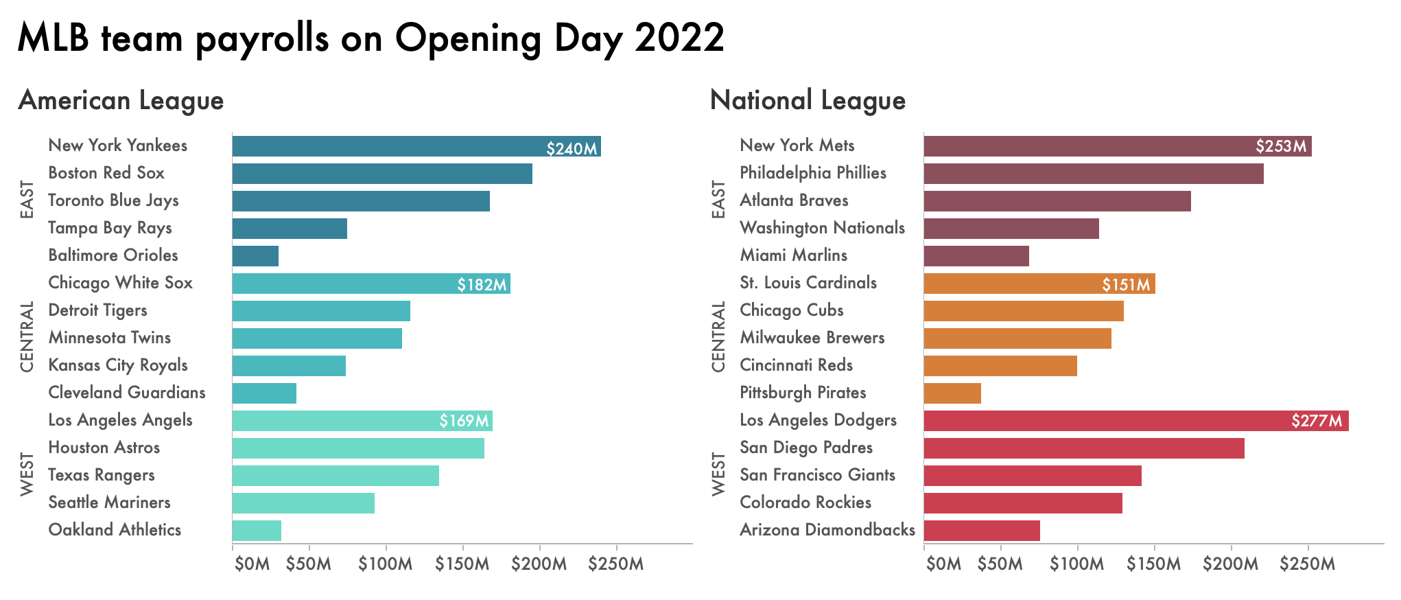
With a bar chart, comparisons within divisions, across divisions, and across all of MLB are easier to see. Even though we’ve retained color from the original map—not the most effective use of hue—the data itself is much clearer for a reader.
Any organization with multiple offices, branches, regions, or stores will face these kinds of visualization choices frequently. Especially as our tools make it easier and easier to create maps on the fly, it’s worth pausing to consider: does the data I’m analyzing depend on the specific locations of my offices, branches, or stores? Are there insights that are only going to emerge if I visualize their specific geographic position? If so, then give maps a shot—otherwise, stick with a simpler chart type that’s likely to communicate your key messages as effectively as possible.
This only scratches the surface of what maps can, and can’t, do. (For instance: we didn’t even touch on electoral maps, cartograms, or misleading map projections.) Check out our recent podcast episode with Kenneth Field, the author of Cartography, for a more in-depth discussion; and look through the 58 submissions our community members created during our March MAPness challenge last year.