what is a bubble chart?
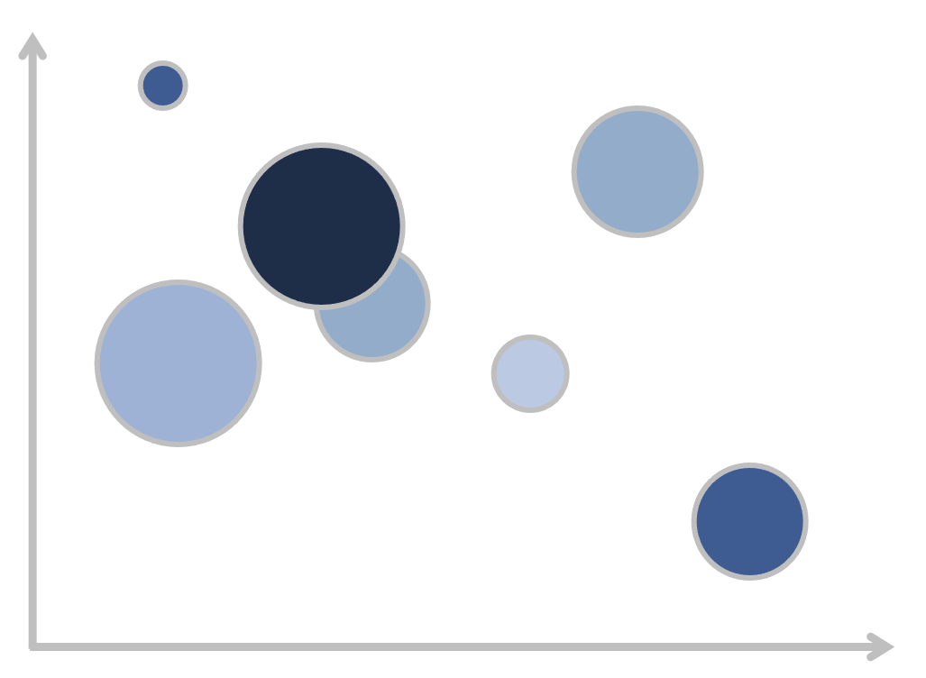
An extension of a scatterplot, a bubble chart is commonly used to visualize relationships between three or more numeric variables. Each bubble in a chart represents a single data point. The values for each bubble are encoded by 1) its horizontal position on the x-axis, 2) its vertical position on the y-axis, and 3) the size of the bubble. Sometimes, the color of the bubble or its movement in animation can represent more dimensions.

In this post, I’ll discuss:
How to interpret a bubble chart
How to identify the appropriate use case
How to design an impactful one (and related ways to practice)
How do you interpret a bubble chart?
I’ll illustrate how a bubble chart works by building it piece-by-piece. Imagine you work for a global organization and are gathering some data for a competitive analysis. You’ve pulled together the following table, which shows each competitor’s market share, sales volume, year-over-year sales growth, and its primary region (North America, Europe/Middle East/Africa, and Asia-Pacific).

The first two columns of data (market share and sales volume for each competitor) are displayed in the graph below. This is called a scatterplot, which visualizes the relationship between two series: the x-axis (market share) and the y-axis (sales volume).

A bubble chart expands on the scatterplot by adding additional dimensions. We can add YoY sales growth as the third dimension, encoded by the size of the bubbles:
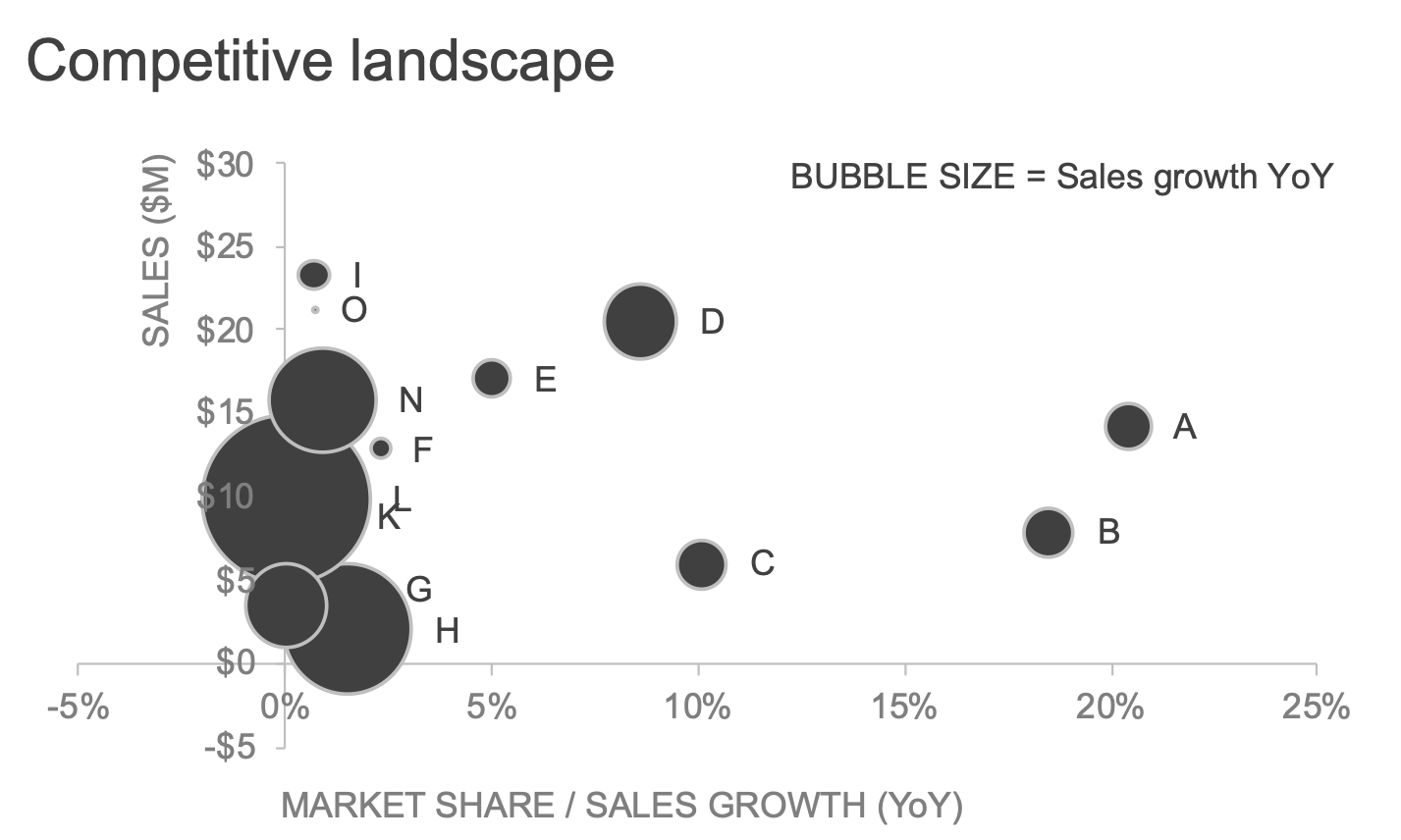
This third dimension gives a visual sense of how much the competitors differ from each other with respect to their sales change: the higher the growth, the larger the bubble. We could even take it one step further and encode the fourth variable (Region) by color:
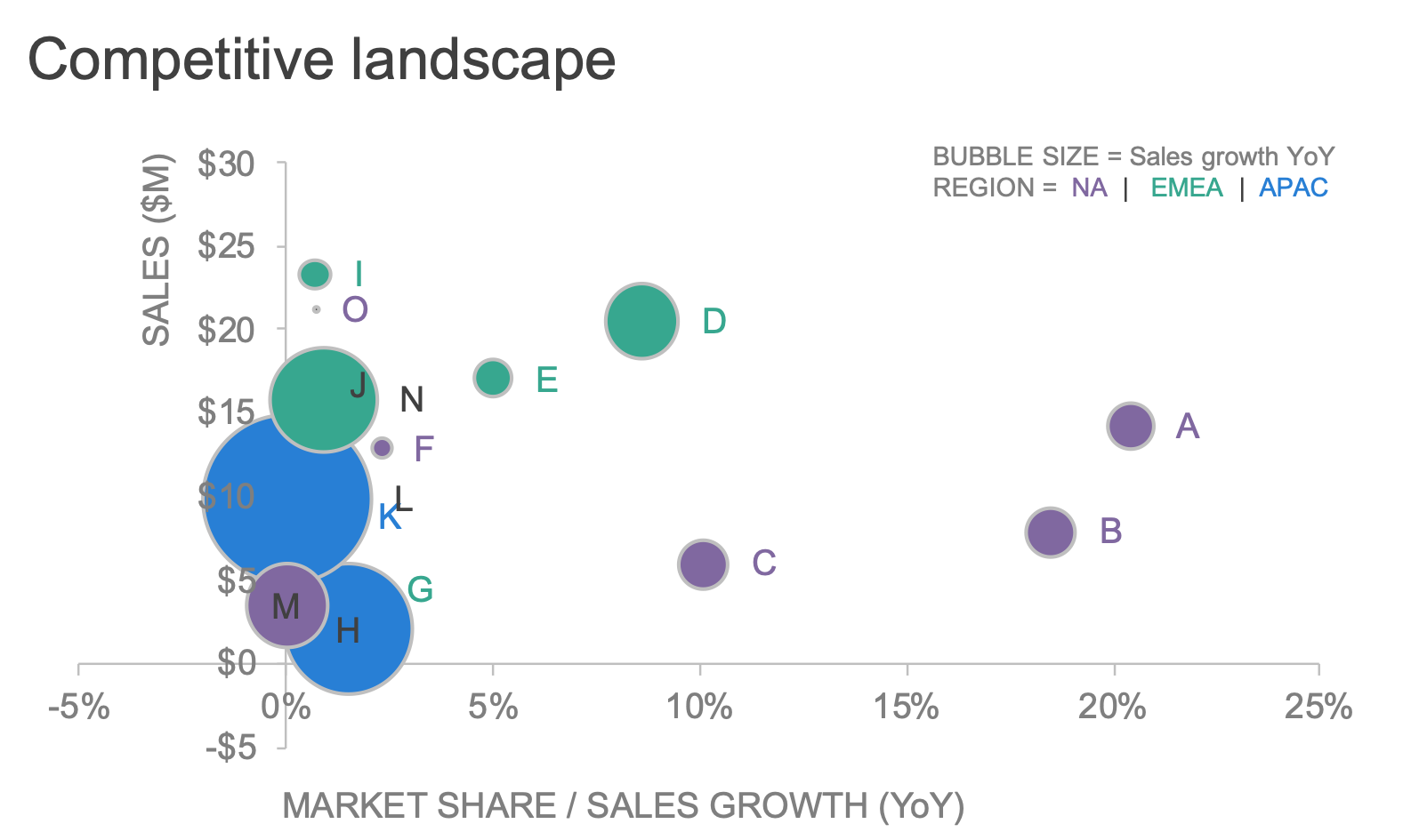
A four-dimensional bubble chart for the competitive landscape
How do you know when to use a bubble chart?
We are asking a lot of an audience when we show them a bubble chart. Because it’s so much information for viewers to keep track of, we need to be thoughtful about when the benefits of the bubble chart outweigh the costs. You might consider using one when your data has at least three dimensions—use a scatterplot for only two dimensions—and there’s enough variation in the metrics for a compelling three-way visual comparison. It’s important, even in this use case, to assist your audience by making smart design decisions; I’ll outline some best practices for designing effective bubble charts momentarily.
There are other scenarios in which a bubble chart may not be the most effective choice. For instance, you should not use a bubble chart...
...when the additional dimensions don’t add enough incremental value to make up for their presence.
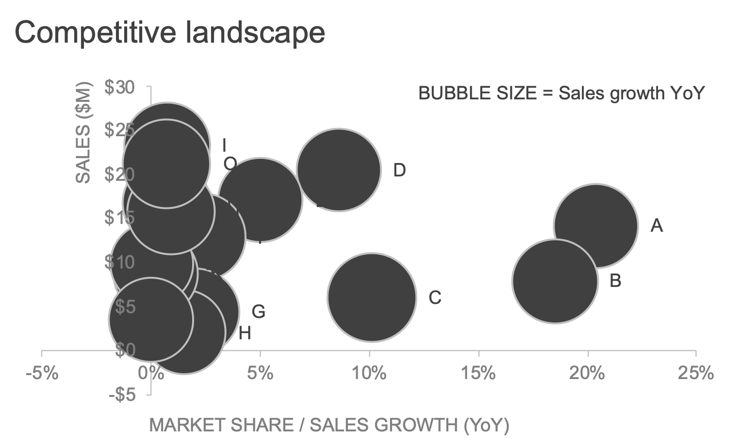
For the purposes of illustration, let’s slightly modify the year-over-year sales growth by making it more consistent amongst competitors:

The resulting bubble chart is shown below. Due to minimal variation, the bubbles render so similar in size that it’s hard to glean any meaningful insight from this additional dimension. Humans’ eyes aren’t well equipped to make accurate visual comparisons by area, which I’ll address in more detail below.
...when your audience needs to easily judge the relative differences in magnitude between variables.
This is a hard task anytime we encode data by area—whether in bubbles, pies, donuts, or other geometric shapes that lack a consistent baseline for visual comparison. For example, check out how your eye can more easily detect the small nuances of the variation when I use a bar instead of a bubble:

...when the cognitive effort it takes to process the chart isn’t worth your audience’s brainpower.
The human brain’s short-term memory can store only about four pieces of visual information at once, so a four-dimensional bubble chart—encoded as 1) x-axis position, 2) y-axis position, 3) size, and 4) color—tests the limits of our working memory. If you’re unsure, ask yourself how much time and effort you want to spend explaining how to read the graph. The alternative is allowing yourself to use multiple graphs and not overwhelm the audience with too much information at once.
What are design tips for creating an effective bubble chart?
As I mentioned earlier, even the best bubble chart can be a challenge for a viewer to understand at first glance. Here are some things you can do for your audience to make interpreting bubble charts easier.
Narrate and build the chart piece-by-piece. The uninitiated reader needs to understand how to read a bubble chart and be convinced the benefit will be worth the effort. The most noteworthy examples of effective bubble charts are seen in Hans Rosling’s data stories 200 Countries in 200 Years in 4 Minutes and his TED talk The Best Stats You’ve Ever Seen. Hans’s excitement is contagious as he steps you through the story as it unfolds over time. While not everyone could pull off Hans’s delivery, it does highlight the important role YOU play in how your graph is received. Consider how your audience will be consuming your bubble chart and be available to talk them through it if necessary.
Use interactivity. Dynamic visuals can educate the audience about how to read the chart through tooltips and navigation features like animation and filters. The following example was created by the JSCharting team comparing crime rates and unemployment rates by U.S. region.
Particularly for a static bubble chart: include words. It’s always a good idea to label your axes, provide clear chart titles, and annotate important data points with illuminating context. This is especially true when you are using a data-dense chart type like a bubble chart, and you aren’t standing next to it ready to explain away any confusion that viewers might have at first glance.
For related practice, try your hand at improving an unfamiliar bubble chart with the SWD community exercise what's the story here?, adapted from Exercise 8.5 of storytelling with data: Let’s Practice!
To learn more about other charts, browse the full collection in the SWD Chart Guide, or for resources to teach younger audiences, check out DaphneDrawsData.com.
Master complex charts in our NEW! on-demand learning course
Learn in-depth techniques for creating, designing, and effectively presenting more novel views in PowerPoint. Through step-by-step video lessons, you'll master radar charts, box plots, scatterplots, horizon charts, and bubble graphs. With optional exercises to reinforce your learning and bonus materials covering additional graph types, this course will elevate your data presentation skills. Enroll today!