what is a bullet graph?

This article is part of our back-to-basics blog series called what is…?, where we’ll break down some common topics and questions posed to us. We’ve covered much of the content in previous posts, so this series allows us to bring together many disparate resources, creating a single source for your learning. We believe it’s important to take an occasional pulse on foundational knowledge, regardless of where you are in your learning journey. The success of many visualizations is dependent on a solid understanding of basic concepts. So whether you’re learning this for the first time, reading to reinforce core principles, or looking for resources to share with others—like our new comprehensive chart guide—please join us as we revisit and embrace the basics.
What is a bullet graph?
A bullet graph, or a bullet chart, is a variation of a bar chart, typically consisting of a primary bar layered on top of a secondary stack of less-prominent bars. Bullet graphs are best used for making comparisons, such as showing progress against a target or series of thresholds. For example, an organization may want to measure the current year’s sales against a goal, while contrasting it with the performance of the prior year.
Bullet graphs leverage our familiarity with bar graphs to deliver a lot of information in a compact space. If you want to display metric performance against a goal or reference point, a bullet graph offers a nicely consolidated design.
How do you read a bullet graph?
A traditional bullet graph encodes three different data elements: an observed value; a target value; and a range of values used for grading. In the example below, we are measuring survey response rates for a single month. We can see that the rate in August 2022 was 68% (shown in the grey bar), which was above the target value of 50% (depicted as the horizontal black line) and fell in the medium range of historically-recorded values (represented by the shaded stacks in the background).

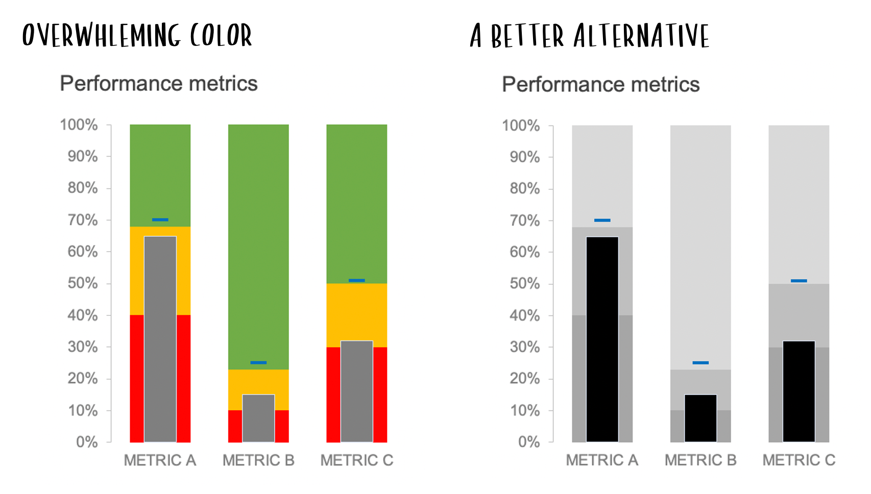
What are tips for designing bullet graphs?
Given the dense display of information in a bullet graph, they can be challenging to interpret, especially for unfamiliar audiences. Choosing a different display altogether may avoid confusion for those who do not know this chart type.
If you are presenting a bullet graph, make intentional design choices to ensure your audience understands the information accurately.
Choose color carefully. Using too much color can overwhelm and confuse your audience. To reduce cognitive burden, use a darker color for the observed value and lighter colors for the range of values. For the range of values, vary the intensity of the color (usually from darker to lighter, as values progress farther from the baseline), but keep the same hue across all bars in the stack. Aim to choose color combinations that work well together and are visually pleasing.
Use words wisely. Chart titles and annotations provide useful context for your audience. If bullet graphs are new to your audience and you are not presenting in a live setting, liberally annotate the graph (or iterate to a simpler chart type) to help viewers understand how to interpret the information.
Apply animation thoughtfully. A complex chart type such as this can be intimidating when presented all at once. When presenting live, narrate while you build a bullet graph using animation to walk your audience through the meaning of each metric and visual component.
What are other variations of a bullet graph?
Like bar charts, bullet graphs can be horizontal or vertical. A horizontal bullet graph is a good option for long category names, while a vertical orientation can be a better choice if ordering the categories left to right is more logical, like with time series data. Being thoughtful about the chart orientation you choose can improve readability and understanding of the data.

Bullet graphs can be simplified by removing the background shading that defines different ranges of values. This is an approach worth taking if you care primarily about the comparison of actual value vs. a target value. In the view below, a bar still represents the observed value, and the target value is a line, but the stacked bars in the background have been removed.

If the added context of the background grading is not needed, then overlapping bars of different widths can also be used to represent the observed and target value. In this variation, the thinner bar in the foreground represents the observed value, while the thicker bar in the background represents the target value, as shown below.

Where can you see more examples?
Bullet graphs are not typically a standard chart type in our graphing tools. The links below show how-to steps for creating bullet graphs in some commonly used tools, as well as ways to explore various use cases for a bullet graph.
Instructions to create a bullet graph in Excel
See a variety of bullet graphs in our November 2021 challenge
You can also check out this video tutorial which goes step-by-step through the process of creating three versions of the bullet chart in Excel.
You can continue your journey through the rest of our “what is...?” chart series by browsing common visuals like bars and lines or by exploring our comprehensive chart guide page for additional graphs.